1
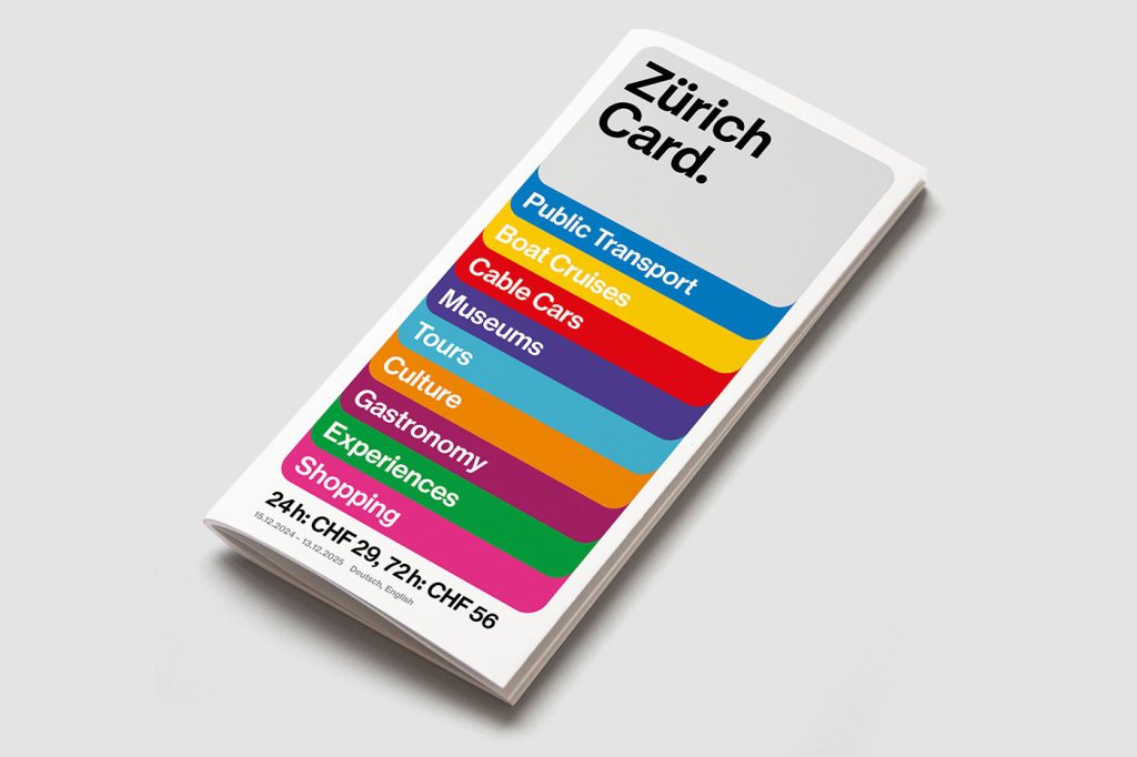
Most city passes look like something you’d shove in your wallet and forget about. The Zurich Card just got the opposite treatment—thanks to Studio Marcus Kraft, it now looks like a piece of design you actually want to show off.

The redesign is built around a stylised card shape, and it’s surprisingly versatile. On one poster it frames a moody photo, on another it morphs into a mosaic of bright squares, and online it flexes into animations.
It’s not just a logo—it’s a design system with Swiss-level precision. Think grid logic meets emotional storytelling.

And yes, the typography is exactly what you’d hope for from Zurich. Clean, no-nonsense, and very much in line with the Swiss International Style—but with just enough personality to keep it from looking like Helvetica’s sensible cousin.
The type works hard, the layout feels modular, and everything connects back to Zurich Tourism’s broader identity system (also created by the same studio, back in 2017).

The visuals have rolled out everywhere: tram wraps, giant posters, social feeds, digital screens, video clips, even the Zurich City Guide app. It’s cohesive without being boring—which is kind of the holy grail of tourism branding.

And here’s the kicker: the Zurich Card itself just leveled up. Alongside free transport and discounts, it now offers free admission to almost every museum in Zurich. Pair that with the new design and suddenly the card feels less like a ticket and more like a cultural invitation.
“The new design creates a visual stage to showcase the numerous benefits of the Zürich Card in an even more emotional and flexible way: from free admission to museums and free travel on public transport to discounts on tours and experiences,” says Janine Rupf, Head of Marketing at Zurich Tourism.

In true Swiss fashion, the whole thing is neat, rational, and ridiculously well put together—but it also has warmth and flexibility. It’s proof that even something as mundane as a city pass can double as a design object.
See the full announcement from Studio Markus Kraft here

Moving Beyond UX: The Rise of the Agentic Experience (AX) Designer
AX Design stands for Agentic Experience Design. It is an emerging design discipline focused not on creating human-facing user interfaces (UI), but on designing, structuring, and auditing the environments where autonomous AI…
7 Best Design Tools & Resources for Faster Web Builds in 2026
Best design tools and resources are those that can lay claim to characteristics that typically include ease of use and related workflow characteristics, future-readiness, easy integration with supporting tools or…
Not Useless: Why Experimental Websites Matter More Than You Think
Every once in a while, a site comes along that makes you pause, grin, and think: Wait—websites can do that? Maybe it’s a portfolio where the cursor morphs into a liquid blob,…
How Aspect Ratios Define Perception, Rhythm, and Flow
Designers talk about color, typography, and hierarchy constantly. But proportion—the silent structure beneath everything—rarely gets the same respect. Every card, photo, video, and module in an interface lives within a…

Token Fatigue: When Abstraction Eats Itself
In theory, design tokens were supposed to save us. They were the missing link between design and code, a neat way to abstract decisions—colors, spacing, typography, motion—into a unified language…

Product Thinking for UI Designers: Decisions Beyond the Pixels
For a long time, the industry treated design like a relay race. The Product Manager (PM) would run the first leg, defining the “requirements.” They’d then pass the baton to…