1
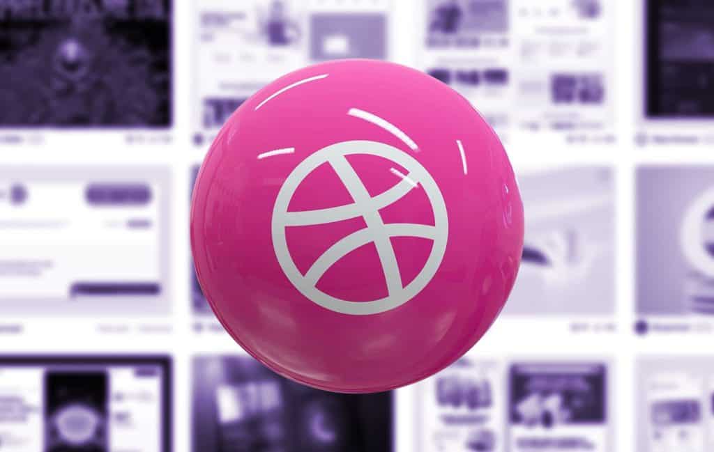
It started with a shot.
Not a launch. Not a live site. Not even a prototype. Just a shot — a single, glossy rectangle of design, cropped, polished, and posed for applause.
That’s how Dribbble trained an entire generation of designers to value aesthetics over experience, polish over purpose, applause over users. And somewhere along the way, real web creativity died.
The Rise of the Dribbblization of Design
Let’s be clear: Dribbble wasn’t always the villain. In its early days, it was a delightful, invite-only clubhouse for visual designers to share snippets of work in progress.
But then the Likes came. And the followers. And the recruiters. And suddenly, it wasn’t about showing your process—it was about showing off.
The platform became the Instagram of interface design. You didn’t need to build a working site. You didn’t even need a full idea. All you needed was a sexy button in a color that looked expensive.
And boy, did the industry respond.
What We Lost
In chasing the likes, we lost something more valuable than we realized.
We lost functionality. Buttons drenched in 6px glassmorphism and layered with 14 shadows might look stunning in a static shot, but they don’t exactly scream “click me.” They were made to be admired, not used—perfect for a dark canvas at 800 pixels wide, not for an actual user journey.
We lost context. These designs live in a vacuum—no scrolling, no navigation, no content. Just isolated UI elements, perfectly posed and completely detached from the messy reality of user interaction. Real users? They don’t exist in Dribbbleland.
And we lost grit. Remember that? The constraints of ugly CMSs, legacy codebases, accessibility audits, impossible deadlines, and limited budgets. That’s the real world of design. But in the curated universe of Dribbble, those things don’t matter. It’s all staged for other designers with retina displays and zero context.
Somewhere along the way, we stopped designing websites and started designing artifacts—portfolio bait, style traps, eye candy. It wasn’t design anymore. It was decoration.
The Aesthetic Echo Chamber
Let’s talk about sameness. Dribbble is filled with the same gradients, the same icons, the same rounded corners, the same pastel SaaS dashboards. You could scramble ten designers’ work and no one could tell who did what.
That’s not community-driven design. That’s aesthetic groupthink.
We used to celebrate sites that bent the web. Think Y2K chaos, Flash fever dreams, the weird CSS-only experiments of the 2010s. Now we celebrate design that’s safe enough to sell a CRM.
You’re Not Designing for Users. You’re Designing for Designers.
And the worst part? Most of the people liking those shots aren’t clients. They’re not developers. They’re not even users.
They’re other designers.
We’ve become our own echo chamber. We praise designs that look slick in isolation, but would crumble under the weight of real content or real users. We high-five over color palettes while ignoring loading states. We spend hours animating toggle switches no one cares about.
We’re performing design, not practicing it.
But Isn’t Visual Craft Important?
Of course it is. This isn’t a call to abandon aesthetics. A beautiful interface does matter. Craft does matter.
The problem is when beauty becomes the product, not the interface. When we prioritize visual sugar over usability. When we make every website look like a pitch deck and every product feel like a Dribbble shot that never grew up.
Real design is about solving problems under constraints. It’s messy. It’s contextual. It often looks ugly in early stages. It doesn’t photograph well.
And that’s okay.
The Legacy of the Shot Economy
Dribbble taught us to think in 800×600 slices of fantasy. It shaped hiring. It shaped portfolios. It shaped what junior designers thought “good” looked like. And in doing so, it decoupled visual design from the actual experience of the web.
Some of the most successful digital products of all time wouldn’t make it past a first Dribbble scroll. Craigslist. Reddit. Wikipedia. Gmail. All hideous. All successful.
Because users don’t browse Dribbble.
What’s Next?
Maybe it’s time to break up with Dribbble. Or at least relegate it to its rightful place: a moodboard. A visual playground. A space for visual polish—not product design.
Designers should start shipping again. Start showing real flows. Real edge cases. Real responsiveness. Real accessibility.
Maybe instead of another glassy login form, you post the onboarding flow that made retention jump 20%. Or the crappy modal you shipped in a week but actually converted better than your fancy Figma mock.
Maybe the future of creative web design doesn’t live on a pastel grid of perfectly kerned shots—but on messy, complex, user-driven interfaces that work.
In Defense of the Ugly, the Real, the Functional
Let’s reclaim creativity—not as pixel-perfect fakery, but as experimentation with purpose. Let’s get weird again. Let’s build things people use. Let’s celebrate the functional, the fast, the accessible—even if it’s not “dribbble-worthy.”
Because the real web doesn’t come in shots.
It comes in systems. Constraints. Tradeoffs. Context.
And when we embrace those again, maybe—just maybe—real creativity will come back from the dead.

What Is Web Design in 2025?
Let’s start with a gentle truth: web design in 2025 no longer means what it used to. And that’s okay. Once, it meant Photoshop mockups and pixel-perfect slices handed to a…

Confessions of a Web Design Generalist (a.k.a. The Person Who Does Literally Everything)
There’s a special kind of web designer out there. You won’t always spot them in the wild because they’re usually busy fixing something someone else forgot to do. Or weren’t…

Exciting New Tools for Designers, September 2025
Web design tools that use artificial intelligence are still dominating new and beta launches, while hopefully making your workflows a little bit smoother. One of the most talked about launches…

Simplicity in Web Design? It’s All Smoke and Mirrors
Let’s get one thing straight: Simplicity in web design? It’s a lie. We’ve all been told that making things simple is the holy grail of design. But here’s the truth…

The Evolution of Web Design: From Pixel Art to AI-Generated Experiences
Web design has always lived at the intersection of creativity and technology. It’s a practice that’s evolved not just in response to technical advancements, but alongside shifts in culture, taste, and…

20 Footer Design Myths You’re Still Believing (And How to Fix Them
Footers—often treated like the forgotten bottom shelf of your website’s pantry. Designers pour their energy into flashy homepages and slick navigation, leaving the footer to fend for itself with a…