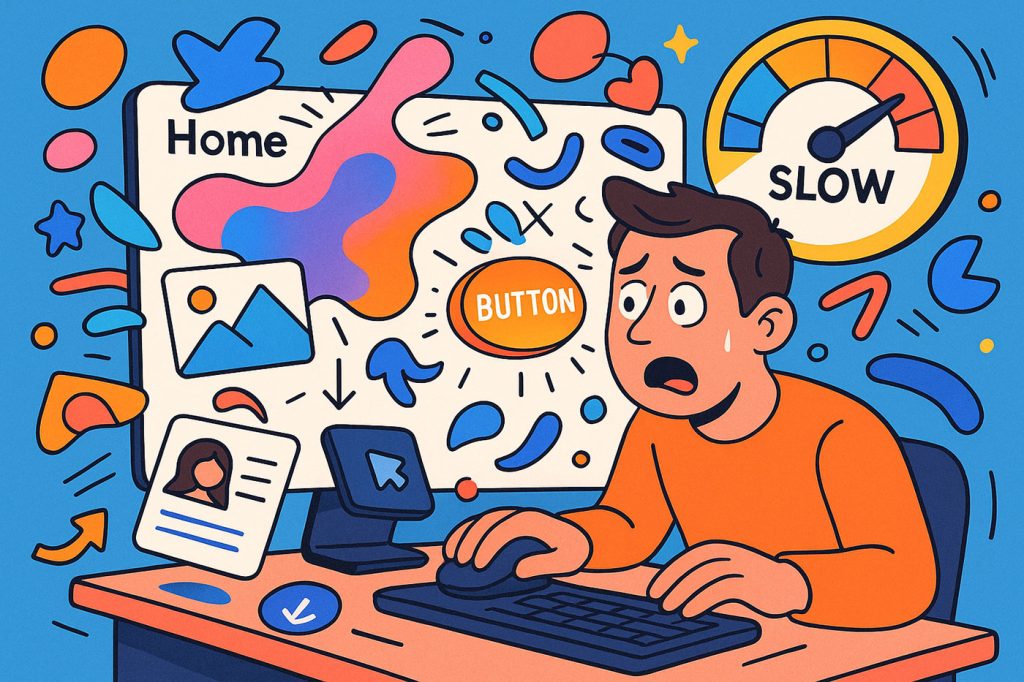
It’s 2025. Can we finally say it out loud? Nobody—and I mean nobody—cares about your lovingly crafted, buttery-smooth, pixel-perfect animations.
That parallax effect you spent 6 hours tweaking? Skipped. That fancy hero section with the floating blobs and scroll-triggered fades? Ignored. That 2-second entrance animation on your modal? Actively resented.
We are designing for attention spans measured in swipes, not seconds. And yet, somehow, we still build websites like our users have time to watch a motion showcase every time they scroll.
This isn’t just about impatience. It’s about misreading the room. Most modern websites today are built like short films, but users are treating them like fast food menus. So why are we still overproducing?
Let’s Get Real: Animations Are for Designers, Not Users
Every designer has been there. You open your site-in-progress, hit refresh, and feel that little serotonin rush when your hero image gracefully slides in from the left, and your buttons softly pulse with life. Beautiful.
But here’s the hard truth: users don’t see it the way you do. They’re not admiring your transitions. They’re looking for the damn pricing page. They’re trying to reset a password. They’re trying to buy a thing and get out.
All that delightful motion? Invisible. Or worse—annoying.
The Parallax Delusion
There’s something deeply seductive about parallax effects. Layers moving independently! Depth! Storytelling! And yes, it can look cool… the first time.
But in 2025, everyone has done it. Now it’s just extra code that slows down your site and makes users dizzy as they scroll past six floating SVGs and a bouncing call-to-action they can’t actually click until the animation stops.
And don’t even get me started on scroll-jacked experiences. You know the ones. Where the scroll wheel no longer scrolls—it navigates. Usually in slow, rigid, locked increments, each one triggering a dramatic full-screen animation that no one asked for.
If your site needs a tutorial just to scroll through it, you’ve lost.
Performance Is UX—And Animations Are Killing It
Google doesn’t care how smooth your fade-in is. But it does care about your Largest Contentful Paint. Every second of animation before content loads is a second closer to user abandonment. We’ve gotten so obsessed with “wow” that we’ve completely torched speed, accessibility, and usability.
And users notice. Not your micro-interactions—but your load times, your choppiness on low-end devices, your jittery scroll performance. Especially now, when more users than ever are on mobile connections in weird corners of the world.
Your site isn’t slow because of bad hosting. It’s slow because of you.
The TikTok-ification of Attention
Let’s talk about why no one’s waiting anymore: it’s not just speed, it’s conditioning.
Thanks to TikTok, YouTube Shorts, and infinite-scroll everything, we now live in a world where content is consumed like snacks—not meals. Users are no longer visitors. They’re flybys. And in that environment, any animation longer than 300ms is a bounce risk.
Every millisecond you delay real content is an opportunity for users to say “nah” and close the tab. And they will. Because your site isn’t special. There are 100 more just like it, and half of them load instantly.
Animation Abuse vs Animation Intention
Now before you think I’m anti-animation, let’s be clear: intentional, purposeful motion is great. It can guide the eye. It can improve flow. It can even delight when used with restraint. But that’s not what’s happening anymore.
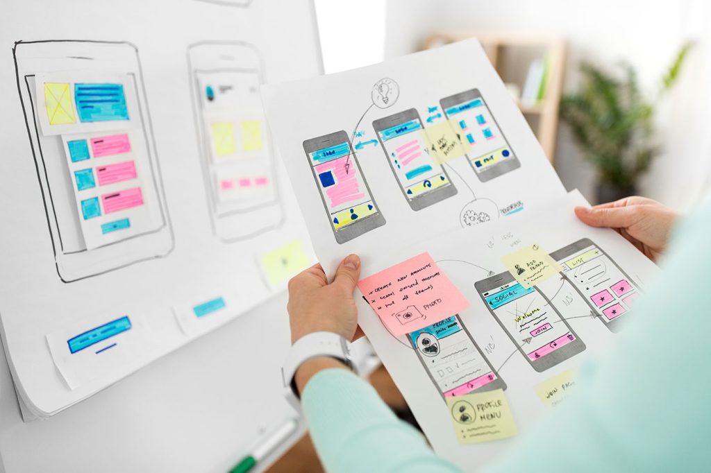
What we have now is animation abuse—motion for motion’s sake. We’ve let Figma prototypes and After Effects portfolios dictate the rhythm of real-life UX. But the web is not a Dribbble reel. It’s a tool. A platform. A destination people arrive at with goals.
Your job is to get them to those goals, not dazzle them with digital fireworks.
Real Talk: Why We Still Do It Anyway
So why do we keep building slow, animation-heavy sites no one cares about?
Because it looks cool. Because we’re bored. Because clients say, “Can you make it pop?” and we reach for motion like it’s hot sauce. Because portfolio culture and Behance clout have warped our priorities.
But deep down, we know the truth: users don’t reward over-design. They reward clarity.
What Actually Matters in 2025?
- Speed. Not perceived speed. Real speed.
- Clarity. Where’s the button? What’s the next step? Don’t make me scroll through an interpretive dance to find it.
- Usability. Especially on phones. Especially for non-tech users.
- Content-first. Deliver value fast. Don’t wrap it in a 5-second loading animation that mimics your brand story. Just show it.
And if you do use animation? Make it subtle, fast, and purposeful. Guide, don’t perform. Support the UX, don’t hijack it.
Final Thought: Your Animation Is a Speed Bump, Not a Feature
In the race to be more “immersive,” “expressive,” and “delightful,” we’ve turned the web into a bloated stage show. But users didn’t come for the show. They came for what’s on the other side of it.
So in 2025, let’s stop obsessing over transitions no one watches, and start focusing on experience that actually works.
Because no one ever said, “That site took forever to load, but damn, that fade-in was sexy.”
They just left.


