1
Remember clicking? That sharp, deliberate action where you made a choice, committed to a path, and opened the next door in the digital house? Yeah—clicking is dead. Or at least dying.
Slowly, awkwardly, like Internet Explorer clinging to life in a forgotten corporate IT department. Scrolling has taken over. And it’s not just a UX shift. It’s a philosophical one.
Let’s talk about why that matters—and why it might be both the best and worst thing to happen to web design.
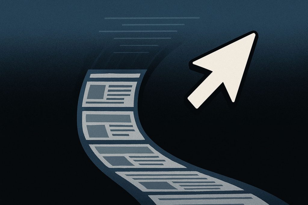
Scroll Is the New Click
You used to explore a website one page at a time. Click the About link. Wait for the page to load. Then the Contact link. Wait again. Clicking was decisive. It was the user saying, “Yes, I want this. Take me there.”
Today? You land on a site and you scroll. And scroll. And scroll. It’s not a journey anymore—it’s a feed. Infinite scroll, parallax scroll, horizontal scroll, scroll-jacking nightmares… the click is no longer your vehicle. Scrolling is.
We’ve reduced interaction down to a single finger twitch. And while that sounds accessible and smooth, let’s be honest—it’s also lazy design dressed up as convenience.
This Isn’t About UX. It’s About Control.
Here’s the real controversy: scrolling gives designers—and platforms—more control.
Clicks give power to the user. You see navigation. You make a decision. You follow your path.
Scrolling hides that choice. You’re on rails. The designer decides what you see and when you see it. Like Instagram or TikTok, the architecture is vertical, addictive, and passive. You’re no longer navigating—you’re consuming.
Don’t get it twisted: infinite scroll isn’t about better experience. It’s about metrics. Scroll depth. Time on page. Engagement. Retention.
More scrolling = more tracking.
Clicks were binary: clicked or didn’t. Scrolling? It’s a spectrum of behavior to be mined and monetized.
Scrolling Is the TikTokification of the Web
TikTok rewired the dopamine loop. You don’t click anything. You swipe. The content just arrives. The next thing is always there. There’s no decision fatigue, just content inertia.
Now look at modern websites: auto-playing video, sticky navigation, infinite modules, progressive disclosure that reveals just enough to keep you sliding. TikTok didn’t just kill YouTube—it’s eating the web.
Even serious platforms have bought in. Product pages stretch vertically forever. Portfolios unroll like social feeds. Landing pages have no visible nav, just hero > testimonial > CTA > pricing > FAQ > signup > footer > oh-wait-here’s-more.
This is not navigation. It’s content as conveyor belt.
The Illusion of Freedom
We tell users that scrolling is intuitive. Natural. But that’s a half-truth.
Scrolling is frictionless, sure—but friction isn’t always bad. Sometimes friction = clarity. Friction makes you stop and think. Make a decision. Choose a direction.
With clicks, users ask: Where do I want to go?
With scrolls, they ask: How much more of this is there?
One creates orientation. The other creates disorientation dressed up in sleek UX polish.
Designers Are Complicit
And let’s not pretend we’re innocent here. We adopted this pattern because clients want “modern” sites. Because stakeholders are allergic to bounce rates. Because metrics demand we keep people scrolling like zombies through carefully engineered fluff.
We jam everything onto one page to avoid “losing” users between clicks. We remove nav menus. We reduce choices. We smooth every edge of friction—and we end up designing for passivity, not agency.
We’ve turned web design into behavioral manipulation.
SEO and Scroll Don’t Mix (But We Pretend It’s Fine)
Here’s a dirty little secret: search engines are still built around discrete pages. Every time we kill a click and shove content into a longer scroll, we sacrifice indexable surface area.
Your 12,000-word pillar post crammed into a single page? It’s doing half the SEO work it could if it were broken into real, linkable subpages.
But we keep doing it. Why? Because scrolling “feels better.” Because it’s “modern.” Because someone saw it on Stripe’s homepage and copied it like a cargo cult ritual.
Click-based navigation is better for architecture. Scroll is better for vibes.
Guess which one wins in 2025?
Scrolling Hurts UX on Mobile—and We Know It
Mobile UX was supposed to benefit from scrolling, right? Fewer clicks, smoother transitions, thumb-friendly.
But guess what’s harder on mobile?
- Remembering where you are on a long scrolling page
- Navigating back to a section
- Bookmarking a subsection
- Sharing a deep-linked element
We solve these problems with anchors, sticky headers, and jump links—but at some point you have to ask: if you need to duct tape navigation back in, was removing clicks worth it?
Scroll-Only UX Is Hostile to Cognitive Load
When everything is on one page, and the only interaction is scrolling, you’re overloading the user.
There’s no mental segmentation. No break between contexts. Just a wall of content. It feels seamless, sure—but it’s like reading a 300-page novel with no chapters or page breaks.
Click-based navigation gave users breathers. It let them stop, evaluate, and choose.
Scroll UX assumes users want zero choices. But in reality, people don’t want friction—they want orientation. The more we rely on scroll-only layouts, the more we flatten the cognitive experience into an endless stream.
And streams are easy to get lost in.
There’s No Going Back—But There Is a Middle Ground
Let’s face it: we’re not going back to paginated websites with 7-click-deep nav trees. And that’s fine.
But maybe it’s time we admit scrolling has limits.
Maybe we design hybrid layouts: smooth scroll with modular click-based jump points. Pages that don’t force choice but offer it. Navigation that’s still visible. Content that’s chunked into mental zones, not infinite rivers.
Because when we design only for scroll, we’re not enhancing the experience. We’re turning websites into soft surveillance machines optimized for attention capture, not utility.
Final Scroll (Yes, Pun Intended)
The click didn’t die naturally—it was murdered in the name of engagement metrics, feed-thinking, and the delusion that infinite scroll is always better.
We traded clarity for smoothness. Agency for inertia. Pages for vibes.
And now, the web is full of beautiful, fluid, emotionally manipulative funnels where users scroll endlessly—until they forget what they came for in the first place.
Maybe it’s time we stop designing for scroll addiction and start designing for intent again.
Let’s talk about it. Are you still clicking? Or are you just… drifting?

The Death of the Double Click: How UX Finally Buried a Relic of the Desktop Era
Let’s be honest: double-clicking is dead. And if it isn’t, it should be. What began as a clever way to differentiate between selection and activation in the ‘80s desktop environment has somehow…

Intent-Based UI Is Replacing Navigation—Are We Designing Ourselves Out of the Interface?
We spent decades perfecting the art of navigation: breadcrumbs, sidebars, hamburger menus, sticky headers, site maps. We crafted taxonomies and ran heatmaps. We obsessed over the user journey like it…
The 10 Foundational UX Principles Every Designer Should Know
If you’ve ever rage-closed an app because it wouldn’t let you “go back” or stared at a form that made you feel like you were applying for citizenship in three…

Confessions of a Web Design Generalist (a.k.a. The Person Who Does Literally Everything)
There’s a special kind of web designer out there. You won’t always spot them in the wild because they’re usually busy fixing something someone else forgot to do. Or weren’t…
Simplicity in Web Design? It’s All Smoke and Mirrors
Let’s get one thing straight: Simplicity in web design? It’s a lie. We’ve all been told that making things simple is the holy grail of design. But here’s the truth…

Why Algorithms Are Ruining Your Web Experience
The internet was once a place for discovery. A space where curiosity could roam free, where you could stumble across something entirely new, and where every click could lead to…