1
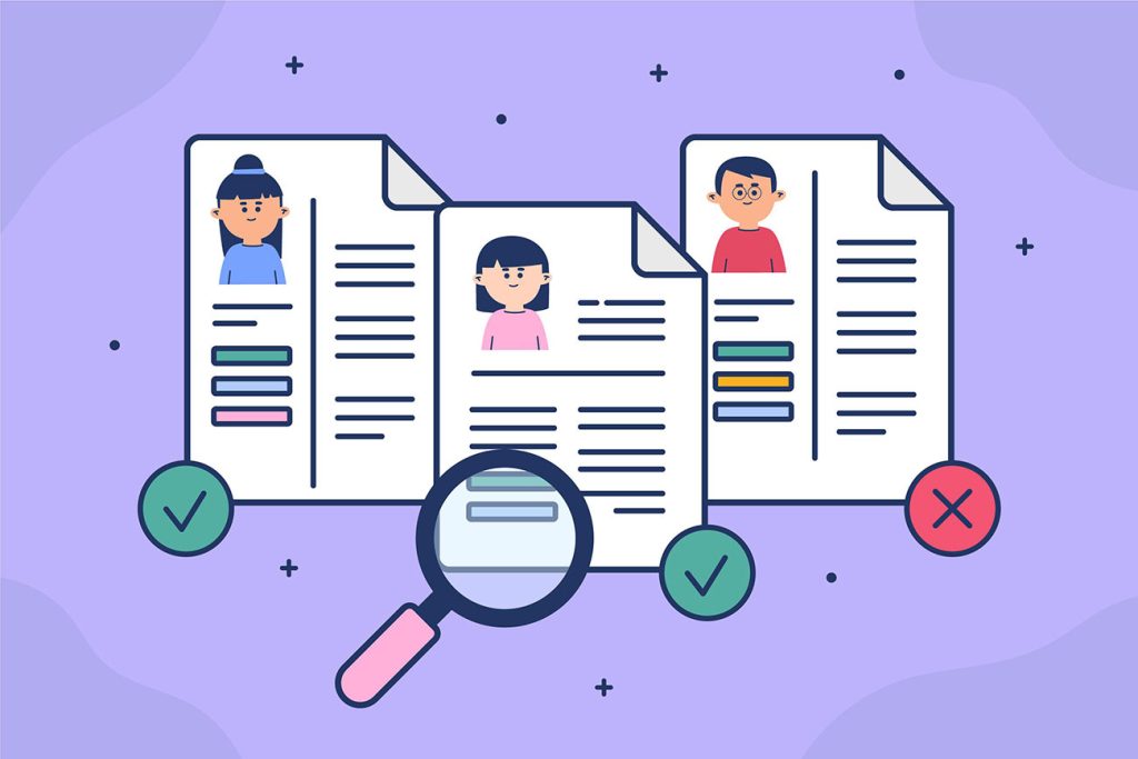
Let’s talk about something painful, yet incredibly important: Your portfolio. Yeah, that carefully curated collection of your best work. The one you’ve probably spent way too many late nights perfecting. But, here’s the kicker—most people won’t even look at it for longer than 30 seconds before deciding if you’re worth their time. Ouch, right?
You spent weeks, maybe months, putting together that portfolio. You obsessed over the design, the layout, the images. You fine-tuned your copy like you were writing the next great American novel.
Yet, in reality? That beautiful creation of yours might get only half a minute of attention before it’s dismissed faster than you can say “responsive design.”
So, why does your portfolio get such a short lifespan in the eyes of potential clients, recruiters, or employers? How can you make sure that 30 seconds works in your favor instead of against you?
Let’s break it down, and I promise, I’ll keep the design jargon to a minimum. (You’re welcome.)
1. First Impressions Matter…A Lot
Let’s do a quick exercise. Imagine you’re a hiring manager or a potential client looking for a designer. You open up a portfolio, and within three seconds, you’re already forming an opinion. It’s human nature.
We judge based on appearance, layout, and overall vibe. You know you’ve done it when you’ve glanced at a restaurant menu and immediately decided you weren’t interested because, well, the design just didn’t sit right. We all do it.
The same goes for your portfolio. In that brief, precious window of time, you need to make it abundantly clear that you are the person they’ve been waiting for. That means hitting them with something that’s visually arresting, and of course, relevant to what they’re looking for.
Your first image or project should pack a punch. This is your “wow” moment. It should immediately tell them that you’re not just good at what you do—you’re amazing at it.
That piece should encapsulate your style, your skills, and most importantly, your unique approach to design. Think of it as the first impression at a party: It’s the “Hi, I’m fun and also really good at making people laugh” vibe you want to project.
2. The 3-Second Rule (But Actually 30 Seconds)
Now, let’s talk about the 30-second rule. I know, it sounds harsh. It’s almost like a bad Tinder date where your portfolio is the equivalent of your profile picture, and that recruiter is the potential match. They’ll take a quick glance, and if your portfolio doesn’t impress them in the first few seconds, they’ll swipe left.
Why? Because people are busy. We’re all inundated with information every day—emails, Slack messages, TikTok videos, and the occasional existential crisis. So, no one has time to read paragraphs about your journey or dive into your elaborate design process.
You need to grab their attention quickly, and it has to be crystal clear what you do, how you do it, and why you’re the best at it.
Here’s where the recruiter’s limited patience comes in. Recruiters, hiring managers, and potential clients are busy. Like, too busy to waste even one second on portfolios that don’t get straight to the point.
They have resumes to skim, interviews to schedule, and a whole lot of emails to sort through. If your portfolio doesn’t grab their attention instantly, guess what? They’ll close that tab faster than you can hit “Ctrl+Z” on a design mistake. And let’s not even talk about how much attention span they have left after going through 50+ portfolios in one sitting. Spoiler alert: it’s about the same as a goldfish.
3. Be Concise, But Don’t Be Boring
Here’s the thing: When it comes to your portfolio, brevity is the soul of wit. Don’t overwhelm your audience with a five-paragraph essay about each project. No one has time for that. Instead, focus on keeping your descriptions concise, clear, and compelling.
Remember the elevator pitch? That thing that you’re supposed to have locked down in case you meet a potential client or employer in an elevator? Your portfolio needs one of those, too. And it needs to be visible within seconds. You need to answer the big questions immediately: What do you do? How do you do it? And why should I care?
Here’s an example of a terrible elevator pitch: “I’m a designer who likes to create artful, meaningful, and transformative experiences for clients.”
And here’s a better one: “I design sleek, user-friendly websites that drive conversions for e-commerce businesses.”
See the difference? The second one actually tells them what you do and what you’re good at without any fluff.
4. Don’t Overload on Fancy Features (And Other Potential Disasters)
Alright, we get it. You know HTML, CSS, JavaScript, and probably even a bit of React. You’ve been to web design conferences. You’ve experimented with all the bells and whistles. But listen up: when it comes to your portfolio, less is more.
If your homepage is a mess of sliding carousels, hover effects, and tons of animations, it’s going to look like an explosion in a tech store. Trust me, nobody wants that. Y
our portfolio needs to load fast (and we’re talking really fast), be easy to navigate, and provide a smooth user experience. Sure, you can sprinkle in some fancy animations and transitions, but don’t let them overwhelm the content.
Fun fact: 40% of people will abandon a website if it takes more than 3 seconds to load. And unless your design is the digital equivalent of a Beyoncé concert, it probably won’t get a pass for slow performance.
5. Your Portfolio is a Showcase, Not a Novel
One of the biggest mistakes I see designers make is getting too wrapped up in the backstory. I get it—you spent weeks perfecting your work, and you want to tell the whole world about your creative process, your inspirations, and the time you spent deep-diving into user research. But your portfolio isn’t a TED Talk. It’s a showcase of your best work.
Sure, sprinkle in a bit of process here and there, but don’t let it hijack the story. Employers and clients don’t need to know every detail of the journey unless it’s absolutely essential.
Show them the outcome, and let your designs speak for themselves. It’s like this: if a tree falls in the forest, the tree doesn’t need to shout about it. It just falls, and people are impressed.
6. Social Proof: Use it or Lose It
You may be amazing, but you’re not the only amazing designer out there. And potential clients and employers know this. So, what makes them pick you? Well, other people’s opinions. (It’s the sad truth, I know, but that’s the reality of our social-media-driven world.)
Add some social proof to your portfolio. Client testimonials, reviews, case studies, and even a few well-known company logos can go a long way in building credibility. It’s like putting a “5-star rating” badge on your Tinder profile—suddenly, you’re a little more intriguing.
Bonus points if you’ve got big-name brands or impressive projects in your portfolio. That’s like saying, “Hey, I’ve got experience working with the cool kids. You wanna join the club?”
7. Contact Info: Don’t Make Them Hunt for It
This might seem like a no-brainer, but you’d be surprised how many portfolios hide contact info like it’s a secret. Why? I have no idea. Make it obvious. Put your email address, phone number, and social media links in plain sight.
Think about it: if a client or recruiter loves your work and is ready to reach out, don’t make them play detective just to contact you. Put your info right there on the page, preferably at the top or in the footer (where it’s easy to find). Otherwise, you risk losing them in the time it takes them to search for your contact page, which—let’s be real—is about 5 seconds max.
8. Make It About the Client, Not Just You
Here’s a secret: Your portfolio is not just about you. It’s about them. It’s about how you solve problems, make their lives easier, and create something that has a tangible impact. Don’t just showcase your designs—showcase the results.
If you worked on a website redesign for a client and their sales increased by 20%, shout about that! If a client saw a boost in their user engagement because of your work, make that your headline.
No one hires a designer just because they can make something pretty. They hire you because you can make something that works.
The Bottom Line: You’ve Got 30 Seconds, So Don’t Waste Them
At the end of the day, you’ve got less time than it takes to brew a cup of coffee to make an impact. Don’t waste it. Your portfolio should make an immediate, lasting impression.
If you nail the first 30 seconds, you’ll have the chance to tell your story. But if you don’t, you risk getting tossed aside before you even had a chance to explain why you’re the right fit for the job.
In a world where attention spans are shorter than the length of a TikTok video, your portfolio needs to be fast, efficient, and memorable. So, stop overthinking it, cut the fluff, and make sure that when someone clicks on your portfolio, they know instantly that you’re exactly what they’ve been searching for.
And remember, in design as in life: less is often more, and first impressions are everything. Don’t mess it up!
Stop Asking ‘Is This on Brand?’ — It’s Killing Your Creativity
For a phrase that sounds harmless, “Is this on brand?” might be the quietest creativity killer in modern design. It’s the meeting-room equivalent of a wet blanket — a way to smother…

Why Designers Are the New Bureaucrats
There was a time when design meant making something—actually making something. You’d open Photoshop (or, if you’re older, Illustrator 9), throw ideas on the canvas, and wrestle with composition, hierarchy, rhythm,…
Blogging Is Dead. Long Live the Blog.
Let’s say it out loud: blogging, as we once knew it, is dead. That romantic era of handcrafted posts, quirky sidebars, and RSS feeds buzzing like bees in your browser? Yeah, that’s…
The Death of Ownership in Web Design — and Everything Else
There was a time when being a designer — or honestly, just being a consumer — meant owning the tools you used and the things you loved. You paid for…
How Designers Can Make Money on Gumroad in 2025
Let’s be honest: most designers who put something on Gumroad don’t make enough to buy a fancy coffee, let alone pay rent. It’s not because they’re bad designers — it’s…

How AI Took Over Stock Photography
Once upon a time, photographers dreamed of landing the holy grail: passive income from stock photography. Upload a few well-lit shots of businessmen shaking hands, a woman eating a salad…