1
Let’s talk about emojis. We all use them—whether it’s a quick 😂 to lighten the mood in a text or a ❤️ to show support.
But have you ever thought about how emojis went from being a fun extra to a universal way of communicating?
For UX and web designers, the rise of emojis isn’t just fascinating—it’s packed with lessons about design, simplicity, and creating experiences that connect with people.
How Emojis Started: Solving a UX Problem Before UX Was a Thing
Before emojis, we had emoticons. You know, 🙂 and ;-). These were a clever workaround to show emotion in plain text, dating all the way back to the 1980s. They were simple, but they worked—proof that even early on, people were looking for ways to add tone to their digital conversations.
Fast-forward to 1999, and emojis took that idea to the next level. Shigetaka Kurita, a Japanese designer, created the first emoji set—176 tiny 12×12 pixel icons—for a Japanese mobile platform. His goal? Make communication faster and more expressive, especially on devices with limited screen space.
Sound familiar? It’s a classic UX challenge: How do you pack more meaning into less space? Kurita’s solution—designing clear, intuitive icons—turned out to be revolutionary.

From Japan to the World: Emojis Go Global
For a while, emojis were a Japan-only phenomenon. Then the iPhone happened. In 2011, Apple included an emoji keyboard in iOS, initially for Japanese users, but the rest of the world quickly caught on. Emojis became a global sensation.
What really made emojis take off, though, was standardization. In 2010, the Unicode Consortium stepped in to make sure emojis would look consistent across devices. That meant whether you sent a 😊 from an iPhone or an Android, the recipient would see the same thing.
For UX designers, this was a huge win. It’s a reminder of how critical consistency is in design. Whether you’re building a design system or crafting a website, users need to trust that what they see will work the same way across platforms.
Making Emojis About Everyone
Here’s where things get interesting: As emojis went global, people started noticing a problem. Early emojis weren’t very inclusive. There was one default skin tone, limited gender representation, and almost no cultural diversity. For something meant to be universal, that was a big oversight.
In 2015, things started to change. Apple introduced skin tone options, and the Unicode Consortium began rolling out emojis representing different genders, professions, family types, and cultural symbols. Suddenly, emojis became a way for people to see themselves—and their identities—reflected in their digital conversations.
For designers, this was a wake-up call. Inclusivity isn’t just a nice-to-have; it’s a must. When you design for a diverse audience, you’re not just solving problems—you’re creating a space where everyone feels seen and understood.
Why Emojis Work: The UX of Emotion
At their core, emojis are brilliant microinteractions. They’re quick, intuitive, and packed with emotion. Think about it: How many times have you added a 😂 to clarify sarcasm or a 🙃 to soften criticism? Emojis help fill in the gaps that plain text leaves behind.
From a UX perspective, this is gold. Emojis show us the power of designing for emotion. They’re a reminder that the best interfaces don’t just function—they connect. Whether it’s a thoughtful loading animation, a playful empty state, or a simple “thumbs up” icon, small touches like these make a big impact.
Using Emojis in UX and Web Design
These days, emojis aren’t just for texting—they’ve found their way into web and product design too. Designers are using emojis to:
- Simplify Navigation: Emojis work as clear, recognizable icons in menus, CTAs, or even content tags.
- Add Personality: A touch of 🎉 or 🚀 can make interfaces feel more fun and human.
- Enhance Accessibility: Paired with text, emojis can act as visual cues, helping users process information faster.
For web designers, emojis are a great example of how small details can bring a lot of personality to a project. They’re playful, memorable, and instantly recognizable—everything you want in a great user experience.
What’s Next for Emojis?
So, where are emojis headed? The future is exciting. With the rise of augmented reality (AR) and virtual reality (VR), we’re starting to see animated and 3D emojis, which could add even more depth to digital communication. Imagine being able to send a holographic 🙌 to your friends—how cool would that be?
Personalization is also on the horizon. AI could help create custom emojis based on your preferences or even your mood in real time. And of course, inclusivity will continue to evolve, with new emojis representing even more cultures, traditions, and experiences.
What Can UX Designers Learn From Emojis?
The evolution of emojis is a treasure trove of insights for UX and web designers. Here are a few key takeaways:
- Simplicity Rules: Emojis show that you don’t need complexity to communicate. The best designs are the ones that are instantly understood.
- Consistency is Key: Just like emojis had to be standardized across platforms, great UX relies on consistent design systems and patterns.
- Emotion Matters: Adding emotional context—whether it’s a 😊 or a clever microinteraction—builds stronger connections with users.
- Inclusivity is Everything: Designing for everyone isn’t just the right thing to do—it makes your product better.
Emojis may be tiny, but their impact on communication—and design—has been huge.
They remind us that great UX isn’t just about functionality; it’s about creating experiences that resonate with people on a human level. And honestly, isn’t that what design is all about? 😊
Facebook’s Design Didn’t Evolve—It Regressed
There was a time when using Facebook felt completely effortless. You didn’t think about the interface because you didn’t need to, which is exactly what great UX is supposed to…
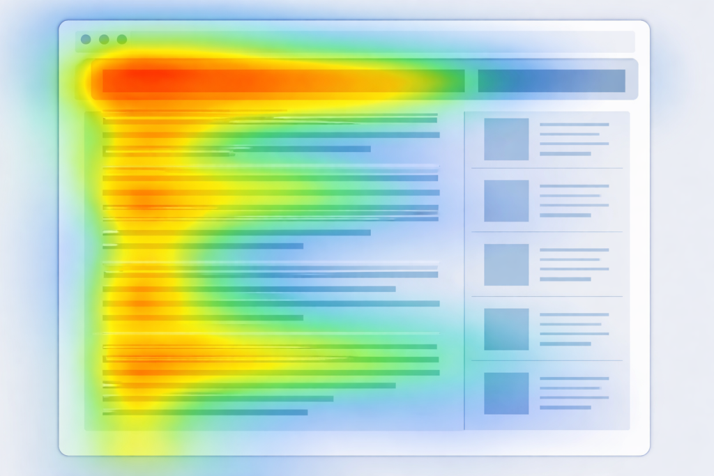
UX Hierarchy: How Users Actually Scan Pages in 2026
The year 2026 has ushered in a behavioral revolution in web design. For decades, designers relied on the reliable F-pattern and Z-pattern, which were essentially static maps of where eyes fell on…
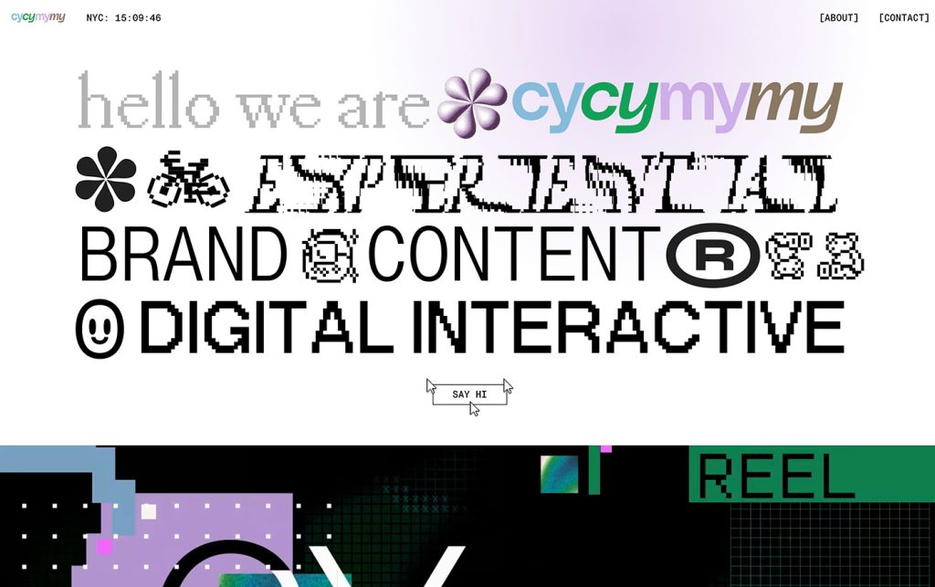
Not Useless: Why Experimental Websites Matter More Than You Think
Every once in a while, a site comes along that makes you pause, grin, and think: Wait—websites can do that? Maybe it’s a portfolio where the cursor morphs into a liquid blob,…

The UX Case Study of a Refrigerator
The refrigerator may be the most widely used interface on earth, yet it continues to operate with the quiet confidence of a product that has never once run a usability…

Stop Designing for Delighted Users (and Start Designing for Cognitive Strain)
For the last decade, the mantra of the UX industry has been a variation of the same theme: “Delight the user.” We have been obsessed with reducing friction, eliminating clicks,…
How Aspect Ratios Define Perception, Rhythm, and Flow
Designers talk about color, typography, and hierarchy constantly. But proportion—the silent structure beneath everything—rarely gets the same respect. Every card, photo, video, and module in an interface lives within a…