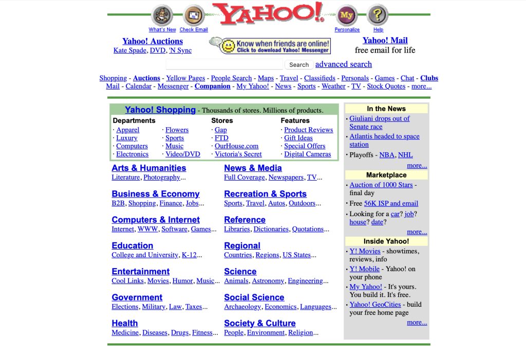
1
Remember the classic blue hyperlink? An icon of the early web era. For decades, they stood like the denim jeans of the internet: versatile, timeless, and everywhere.
Clickable blue text was the digital beacon signaling, “Hey, you! I’ve got something interesting over here!” But lately, it seems like the trusty blue link is being edged out by a more colorful, daring, and downright rebellious wardrobe.
Let’s take a lighthearted look at what’s happened to this once-dominant hue.
The Rise and Fall of the Blue Link
When Tim Berners-Lee gifted us the World Wide Web, hyperlinks were blue because… well, computers were limited, and blue stood out on those chunky gray CRT monitors…. or maybe something else
Blue was neutral yet noticeable, the internet equivalent of a polite tap on the shoulder. It said, “I’m here if you’re interested, no pressure.”
And we loved it! We clicked blue links with abandon. They were consistent and trustworthy, a cornerstone of web navigation. But then, like skinny jeans and avocado toast, blue links started to feel, well, basic.
Designers began to question the status quo. Did links really need to be blue? Couldn’t they be—dare we say—more fashionable?
A New Era of Link Chic
Fast forward to today, and web links have undergone a style revolution. They’re strutting their stuff in every shade imaginable: fiery reds, electric greens, soft pastels, and even underlined invisibility cloaks of plain black. Some links are bold and oversized; others whisper quietly in italics, hoping you’ll notice their subtlety.
Hover effects now add an extra splash of drama. Links don’t just change color when you hover; they shimmer, pulse, or spin like they’re auditioning for America’s Got Talent. It’s as if hyperlinks collectively decided they were tired of being taken for granted and now demand our full attention.
The Good, the Bad, and the Confusing
This chromatic revolution has its perks. Links can now blend seamlessly into a brand’s aesthetic. A minimalist website might use sleek, monochrome links, while a funky, retro site might go for neon and gradients. They can be fun, unexpected, and, frankly, gorgeous.
But let’s not pretend there aren’t drawbacks. Ever tried to find a link on a website that insists on using a barely-different shade of gray for hyperlinks? It’s like a digital game of Where’s Waldo, except Waldo is actively hiding because he doesn’t want you to click him.
And don’t even get me started on the sites that ditch underlines altogether. We get it; you’re edgy. But how are we supposed to know what’s clickable without running a cursor over every word like a metal detector?
Nostalgia for the Blue
Despite the modernization, there’s a part of us that misses the simplicity of the blue link. It wasn’t fancy, but it got the job done. You never had to wonder, “Is that text clickable, or is it just weirdly styled for emphasis?” Blue links were like a reliable old friend—dependable, approachable, and refreshingly low-maintenance.
Nostalgia for the Purple
The visited link purple is a also quiet classic, a shade that gently says, “Hey, we’ve been here before.” This humble color cue was the unsung hero of early web navigation, subtly reminding us which rabbit holes we’d already explored.
Purple links were like little breadcrumbs on our digital journeys, saving us from endlessly clicking the same Wikipedia article on velociraptors. But as links shed their traditional blue coats, visited purple seems to be going extinct too.
These days, many sites skip visited link styling altogether, leaving us stranded in a timeless loop of déjà vu. A world without purple links? It’s like forgetting where you parked your car—frustrating and slightly disorienting. Bring back the purple, we say!
The Future of Hyperlinks
So, what’s next for hyperlinks? Maybe they’ll continue their colorful rebellion. Perhaps AI will give links personalities, offering “sassy mode” for sarcastic articles and “calm mode” for meditation guides. Or who knows, they might circle back to blue eventually—because as every fashionista knows, trends are cyclical.
For now, we’ll embrace the rainbow of hyperlinks with open arms and (hopefully) well-calibrated monitors. Just don’t forget to underline them, web designers. Some traditions are worth keeping.
And to the OG blue link: you may be fading, but I’ll always remember and you’ll always be our first love! 💙💙💙
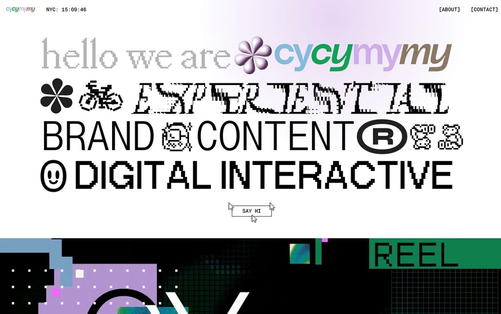
Not Useless: Why Experimental Websites Matter More Than You Think
Every once in a while, a site comes along that makes you pause, grin, and think: Wait—websites can do that? Maybe it’s a portfolio where the cursor morphs into a liquid blob,…

How Aspect Ratios Define Perception, Rhythm, and Flow
Designers talk about color, typography, and hierarchy constantly. But proportion—the silent structure beneath everything—rarely gets the same respect. Every card, photo, video, and module in an interface lives within a…
Token Fatigue: When Abstraction Eats Itself
In theory, design tokens were supposed to save us. They were the missing link between design and code, a neat way to abstract decisions—colors, spacing, typography, motion—into a unified language…

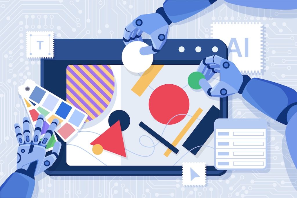
AI as Art Director: Can Machines Develop Taste?
Let’s get this out of the way: AI doesn’t have taste. It has statistics. It knows what’s popular, what’s trending, what’s most likely to earn a double-tap — but it…
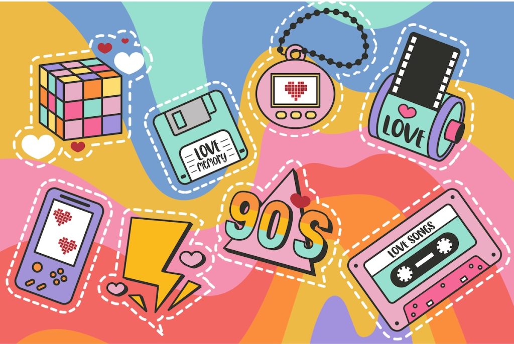
Pixel Nostalgia: Why We Miss the 90s Web (Even If It Was Ugly)
It’s easy to laugh at the 90s web now — the blinking GIFs, Comic Sans banners, table layouts held together with duct tape and hope. But beneath all that chaos…
Exciting New Tools for Designers, February 2026
There are so many new – and good – tools for designers out there right now. From tiny bits of artificial intelligence to icons that delight, there’s something to help…