It’s well known that Apple is one of the most creative and innovative companies in the world, so it’s no wonder that many software companies and web designers would choose to follow Apple’s style of branding.
The Apple website is one of the best websites out there due to its ease of use, functionality and the beautiful environment that it creates.
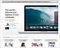
I looked at websites that use one or more design elements inspired by Apple.com. Some of these sites sell Mac software and apps, so it makes sense for them to keep the same Apple look and feel. Consider this though: How many software companies that develop for Windows, choose to brand their websites to look like Vista? I have included a few screenshots of the Apple website, just in case you haven’t never seen it before.
Apple.com
1. Icon Designer
2. iSlayer
3. Versions
4. Checkout
5. Small Transport
6. MacRabbit
7. 280 Slides
8. Disco
9. Warehouse
10. Cha-Ching
11. RapidWeaver
12. DeskLickr
13. Tangerine!
14. 1Password
15. Jumsoft
16. Roxio Toast
17. CandyBar
18. Cultured Code
19. Anxiety
20. Tao Effect
21. TaskMate
22. The Invoice Machine
Chad Mueller owns and runs the design inspiration blog; Inspiredology. He is also a freelance designer who enjoys working on websites, blogs, logos and anything to get his creative juices flowing.
Do you know of any other good examples? Please share with us…
