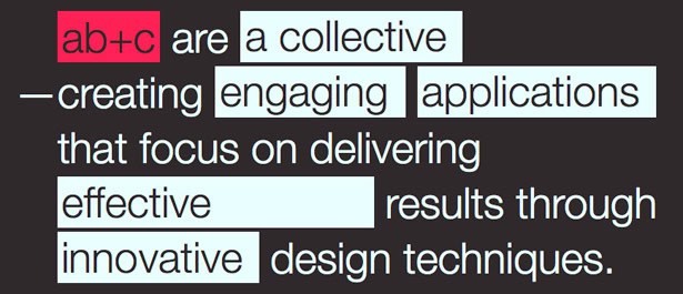
Typography is often a deciding factor in the success of a design. Its importance cannot be overstated. Effective typography can be achieved in so many different ways, as demonstrated in the 17 different categories below.
Some of the most common ways to treat type is with size, color variation, creative illustrations, and use of textures. The examples below are just the tip of the iceberg as far as the possibilities for type.
Don’t be afraid to flip it, color it, resize it, draw it, or even design your own.
Check out these fantastic 101 examples of beautiful text treatments and please let us know of any other great examples we may have missed.
1. Illustration
2. Background Shape
3. Color Change
4. Font Variations
5. Handwritten
6. BIG
7. Textures
8. Big vs. Small
9. Alignment
10. Overlay/Transparency
11. Angles and Curves
12. Highlight
14. 3-D
14. Custom & Unusual Fonts
15. Outline
16. Old Style/Western
17. Slashed Out
Combination of Techniques
Compiled exclusively for WDD by Michael Shelton. Michael is a freelancer web designer and runs his own website at Michaeladesigns.com
What’s your favorite method? What other ways can you think of to handle type other than the categories listed here?
