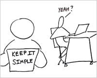
Let’s face it, we designers love to start from scratch. For example: How may times do we revamp our own portfolios? Staying simple is crucial when starting from scratch.
We hear this “staying simple” phrase a lot these days. Is it just a bunch of jargon or is there something to it? We found one approach that you probably haven’t considered.
We all know that we need to focus the website visitor’s attention on a few core features which bring value to the visitors. The minute you start adding too many features to please every visitor, you bargain for too much attention.
The result is that visitors get overwhelmed and confused without understanding the value. You’ve got to show the value to the user right away. You can’t waste too much of their time.
So the question becomes: what do you do when you have a crucial core feature that you want to add to a web product but you fear it might push the product too far from its core and overwhelm your visitors without showing value? The answer is: you build a new product. This is not just a theory. We tried it, and it worked like a charm.
Why a new product instead of new feature?
I know you’re a bit skeptical at this point in the article. You’re probably thinking: “Why should I really do this?” Here are the reasons we found:
● No clutter: New products don’t have existing customers to support and no pre-existing code to maintain. It’s an opportunity to start fresh.
● Greater freedom: This gives designers a lot of freedom to explore better solutions to similar problems. It makes it easier to be your own toughest competitor and have fun.
● It’s smaller: Turning a feature update into a new product forces us to make the product very small, very simple, and very focused. Your product can show value to the user without much clicking around. The side benefit of this is designers get greater depth in the details to delight people. It’s also fun to go deep into your design and development craft.
● The power of a “new” product
From a marketing standpoint a “new product” is a much better story than an “update” to an existing product. Fundamentally it’s open to a larger audience and offers you a chance to approach your old audience again. An existing product already has a position in the market with an existing audience to serve.
● Gradual engagement to paid products: If you want a route to gain exposure to paid products in a way that helps teach people how to use them before they buy them – this is the best way. A small free product that gives a user a taste of the real thing is the best way to show value without any barriers for the user.
● It’s opportunistic: Lots of opportunity on the table. Your goal is clear – develop more customers. You’ve got high energy and motivation from the team. It’s low cost development. It can be launched quickly.
What can you expect?
Here are our results… Rest assured that this is not a bunch of theoretical talk, we actually created an app from a feature in an existing product and had amazing results.
We took the annotation feature from Notable and turned it into a dead simple free product called Bounce.
Here are the results:
● Marketing exposure for both the free app and the paid product: This gave us an opportunity to spark new conversations with a new audience. In the first seven days after launch we had more than 30,000 websites covering Bounce from over 150 countries. Bounce went to #4 search result on Google for the word “bounce” in a month since it launched.
● Converting free app users to paid product: There is a clear upgrade path to Notable from Bounce. As a result of Bounce popularity, Notable sign ups increased.
● We learned how to rebuild a core feature 10x better: As a result of this exercise we made annotations in Notable much more intuitive and easier to use. Now that we have this awesome annotation feature we can use it in other apps. We’ve already folded the code and design from Bounce into our other private release app, Verify.
● Niftiness we can use going forward: We really focused on details when designing Bounce. We used some neat tools and techniques such as Bill Scott’s interaction grid to really focus in on every interaction. We also created some nifty fun bits like the bouncing ball and night/day themes. We can certainly use all of this niftiness in other instances moving forward.
Looking back at this endeavor – our hustle paid off. We’ve been blown away by the marketing success of Bounce.
We asked many Bounce users about the reasons they connected with the app. The same word kept coming up in their answers: “simple.” That was our goal.
Make it as simple as possible for anybody to understand the value. No sign ups. No multiple clicks. Just visit a URL, click a button, and get the value right away. One feature as a product.
This post was authored exclusively for WDD by Dmitry Dragilev, the Lead Marketer at ZURB a 12 year old interaction design firm which helps companies design better products & services through consulting, products, education, training and events. ZURB’s most recent claim to fame is their 10K Apart Competition entry Tiny Bounce.
What do you think of this approach? Please share your views below…
