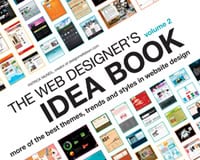
I have to admit, the idea of a book that aims to inspire web designers with example websites seemed a little repetitive to me when I first thought about it.
After all, there are dozens of excellent galleries out there online that we can access for free, that are updated on a daily or at least weekly basis.
Could a book compete with that? Or would it just be filled with the same sites we’ve all seen in every gallery and design roundup out there.
As someone who studies design galleries and roundups on an almost daily basis, I was pleasantly surprised to see that the majority of the designs included in The Web Designer’s Idea Book, Volume 2, by Patrick McNeil (who writes a monthly column for .net magazine and runs Design Meltdown), were not ones I remember seeing previously.
In fact, most of the designs in the book are fresh and new, and haven’t made the usual rounds of galleries and showcases.
Now, of course, just because something is new doesn’t mean it’s going to be useful. It takes a combination of new and well-organized to stand out.
And The Web Designer’s Idea Book really comes through in that respect, too. It takes the best methods of organizing content from a variety of online galleries and combines them to create what could be the most well-thought-out source of design inspiration available.
The book starts with a brief section on how to use inspiration to create a unique design that doesn’t copy any one existing design, but instead pulls elements from a number of sites to create something better than the sum of its parts. It’s a useful section for anyone, whether they’re a new designer or more established, especially since it uses a real-world example.
From there, the book is broken down into a few sections: Basic Principles of Design, Sites by Type, Sites by Design Elements, Sites by Styles and Themes, Sites by Structural Styles, and Sites by Structural Elements. Each section includes a number of chapters that cover individual elements, with some commentary on some of the examples.
Within in the Basic Principles of Design section, there are chapters on Emphasis, Contrast, Balance, Alignment, Repetition, and Flow. Examples include The Urban Mama, Tunnel 7 and Bryan Connor, among dozens of others. Some of the designs you’ll surely recognize, but there are plenty you probably won’t.
From there, the book moves on to Sites by Type. Here it covers websites by industry and purpose, including iPhone Applications, Bands, Events, Travel and Tourism, Portfolios, Real Estate, and Coming Soon pages.
In some chapters, there are “Notes from a Developer” sections that give tips on web design from a developer’s point of view. It’s sections like these that add a lot of value to the book that you won’t get with the majority of online galleries.
The Design Elements section is great if you’re stuck on one particular part of your design. This section does feel the most random of any in the book, though.
While the information and examples are all great, the choices for chapters feel very disconnected: The Pitch, Lighting, iPhone as Flourish, Social Media Links, Icons, Typographic, and Photographic Backgrounds. Again, the examples here are great, but there just doesn’t feel like much of a theme running through the chosen topics.
The next section pulls things back together and is very focused. Here, designs are covered by style and theme. While it’s not the most comprehensive collection of design styles, it does cover some of the most commonly seen (Ultra Clean, Minimali, Solid Colors, and Type-Focused) and some of the most popular in recent years (Sketchy, Collage, Illustrated, Fabric, and Wood).
Some examples in this chapter include Pro Theme Design (Ultra Clean), Studio Z Films (Modern), Saizen Media (Illustrated), and Kinetic Technology Group (Wood).
The second-to-last section has some of the most visually interesting design examples. The Structural Style section has chapters on Atypical Navigation, Atypical Layouts, Pseudo-Flash (sites using JavaScript to create Flash-like effects), Horizontal Scrolling, and One-Page sites. If you’re looking to create something a bit different, turn to this section first.
The final section in the book covers Structural Elements. This is where you’ll find examples of things like Tabs, Buttons, Form Elements, “Helpful Homepages”, “Functional Footers”, Homepage Slide Shows, and 404 Pages. Examples here include Fhoke, Panda Themes, and Gieves and Hawkes. This is a great spot to look if you need inspiration for just a specific part of a site design.
As already mentioned, I was pleasantly surprised by the content of The Web Designer’s Idea Book II. It’s not a book I would have typically picked up off a shelf, with the notion that buying a book about web design inspiration just feels a bit odd. But there’s enough value-added information in the book that it stands out from free online galleries and showcases.
It’s not just a book that shows you pretty pictures, but actually shows you how to use what you’re seeing to create your own unique designs without directly copying anything.
Be sure to check out Volume 1 as well, for more great inspiration. Links for purchase are included on the The Web Designer’s Idea Book website, including the link to Amazon (where it sells for less than $20, compared to the usual $30 cover price).
Reviewed exclusively for WDD by Cameron Chapman
Have you checked out the book? What are your thoughts? Feel free to share below…
