What if we lived in a world where the only available typeface was Comic-Sans? That’s the idea, or at least must have been what the Russian Belgorod-based designer Oleg Tarasov was thinking when he decided to re-design some of the most well know brands of our time using the usually frowned upon Comic-Sans type.
Oleg posted his designs over on his Behance profile. The comments there ranged from the very common “this looks funny” — well, what would we all expect from a font with the word comic in its name, right? — to the surprising positive response praising some of his versions over the originals.
What!? Ouch, I don’t know if I can agree with that, read on to get my views on them, but hey, you be the judge!
Here’s a selection with the best, well, I mean least worst of them. Check them out:
Adidas
The global sports Adidas logo and more friendly-looking mark. The type? Well, you know.
Android
Surprisingly the tiny little green robot, err, I mean android, looks quite cute.
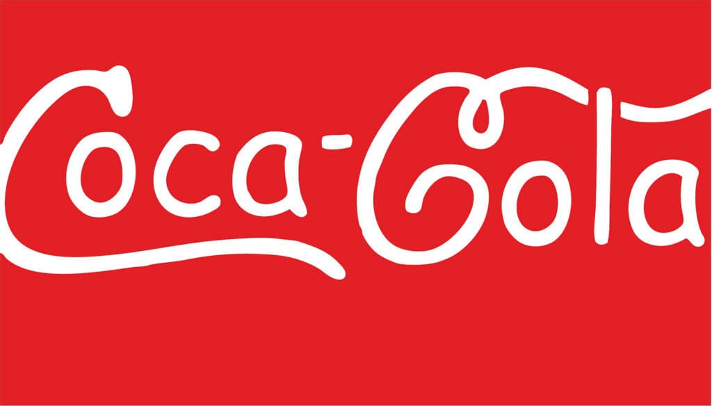
Coca-Cola
Improving Coca-Cola’s logo is a huge challenge in itself, who dares? A quick tip, using Comic-Sans to get there is not the right way of doing it.
EA Games
I wouldn’t be surprised if the guys from EA end up using this logo on a real game made for children. Or perhaps they already did, anyone can confirm that?
eBay
Here’s something funny, as if the above is not a joke already, but I bet some designers are going to say this version looks better than the official new eBay logo.
HTML5
I recall the launch of the HTML5 logo and how people said it didn’t make much sense at all. So, a big red shield with the number 5 in it, guess what? It makes even less sense now.
Lacoste
I can’t stop seeing a little green arm and a slighted elevated biceps, perhaps an alligator ate the arm of a fairly strong man.
Microsoft
If Microsoft was to launch a tablet made with children in mind, guess how the logo would look? I would go with the logo below; spot on.
Harley-Davidson Motorcycles
Tiny little motorcycles made for those rebel toddlers who don’t want to eat their meals on time.
Nestle
This comic-sans logo almost got me. Nestle is such an organic brand that this logo doesn’t actually look bad. Ok, I’m not making a case for it, obviously I prefer the original!
Nike
Remove the sharp edges and Nike is now an Australian boomerang manufacturer.
YouTube
Ahh, this one is easy, a YouTube made for kids, with safe and sound, quality educational videos.
Should we all be in favor of this change and live in a world made of happy-looking brands? If you ask me, certainly not, but many have already pursued the comic-sanstification of world renown brands before, such as the French design studio Cephalization — yes, I know, what a name — who are behind the Comics Sans Project, where they receive submissions of comic-sans-based logos from all over the world. Oh God, the agony!
If you haven’t pulled your eyes out yet and want to see a bit more comic-gore, be sure to check more logos over Oleg’s page on Behance and the Comics Sans Project. Good luck!
What do you think of multi-billion dollar multinationals adopting Comic-Sans in their logos? Have you ever successfully used Comic-Sans for branding? Let us know in the comments.
