When I was in middle school, I took a sign language class. At the time, it struck me as interesting that some words and letters looked exactly like the thing being described, while others seemingly had no relation.
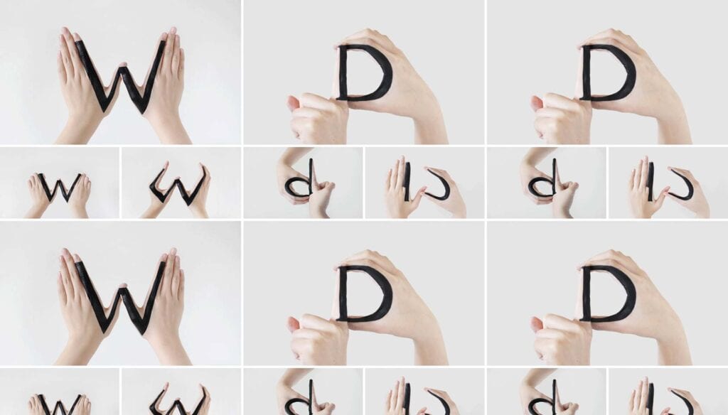
That’s why I’m intrigued by what New York designer Tien-Min Liao has undertaken as a typographic challenge. Her self-initiated experiment explores the relationships between uppercase letters and lowercase letters, using only some ink and her hands.
To further challenge herself, Tien-Min made the transformation between upper and lowercase symbols a test in and of itself. After drawing shapes on one or both of her hands, the artist manipulated her gestures until an upper-case letter was produced. Next, she maneuvered her hand movement or changed the viewing perspective in order to transform the letter into its lower-case counterpart. Now, here comes the tricky part — any removing or redrawing of the original ink is not allowed; the change must come through the gesture or perspective.
Tien-Min Lao’s inventive letterforms are clearly an outgrowth of an incredibly creative mind; she even came up with some italic and hand-written versions, not to mention a few new typefaces with the same shapes. The intricate relationship between upper and lower-case letters can inspire designers’ use of typeface, and perhaps spell out a whole new approach to putting words on a page — and making them come to life.
What letters do you think would be hardest to form with your hands? Could you make a whole alphabet? Let us know in the comments.
