Patterns can make a website design more interesting and appealing. Often mildly skeuomorphic in nature, they bring an element of real-world texture to a site. The variation in tone that they create mimics the multi-tonal nature of real surfaces.
What’s more, patterns that tessellate are particularly suited to responsive design, as they can be repeated infinitely across any number of screen sizes.
In this collection, we’ll share with you some beautiful websites with patterns that you can take inspiration from.
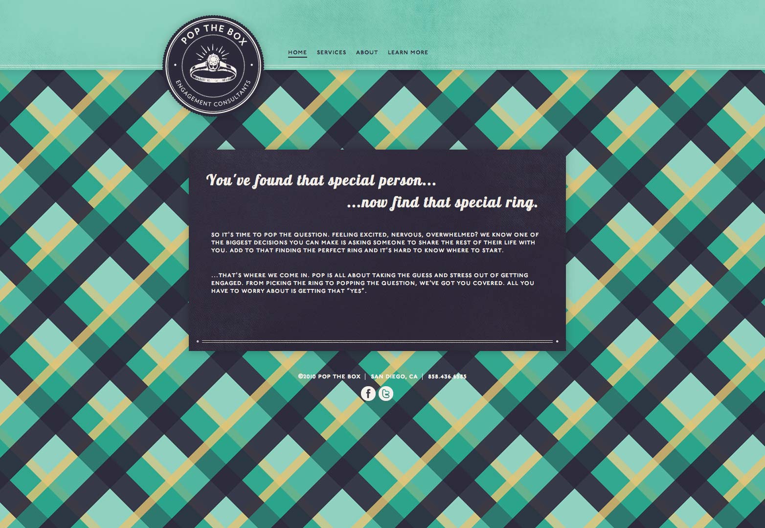
Pop The Box
This website features a bold and confident pattern. Modern and unique, it wouldn’t work everywhere, but works well here.
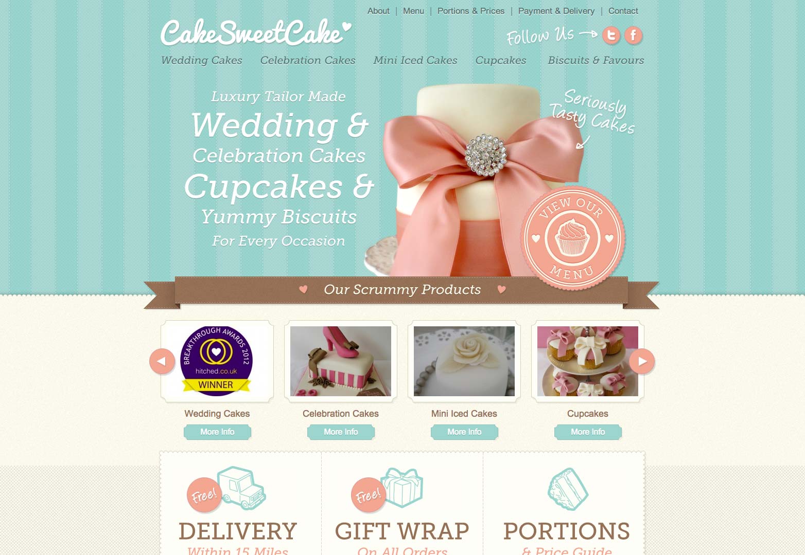
Cake Sweet Cake
Cake Sweet Cake uses a delicate and visually pleasing pattern that match its niche perfectly. The way the designer uses patterns makes this website even tastier.
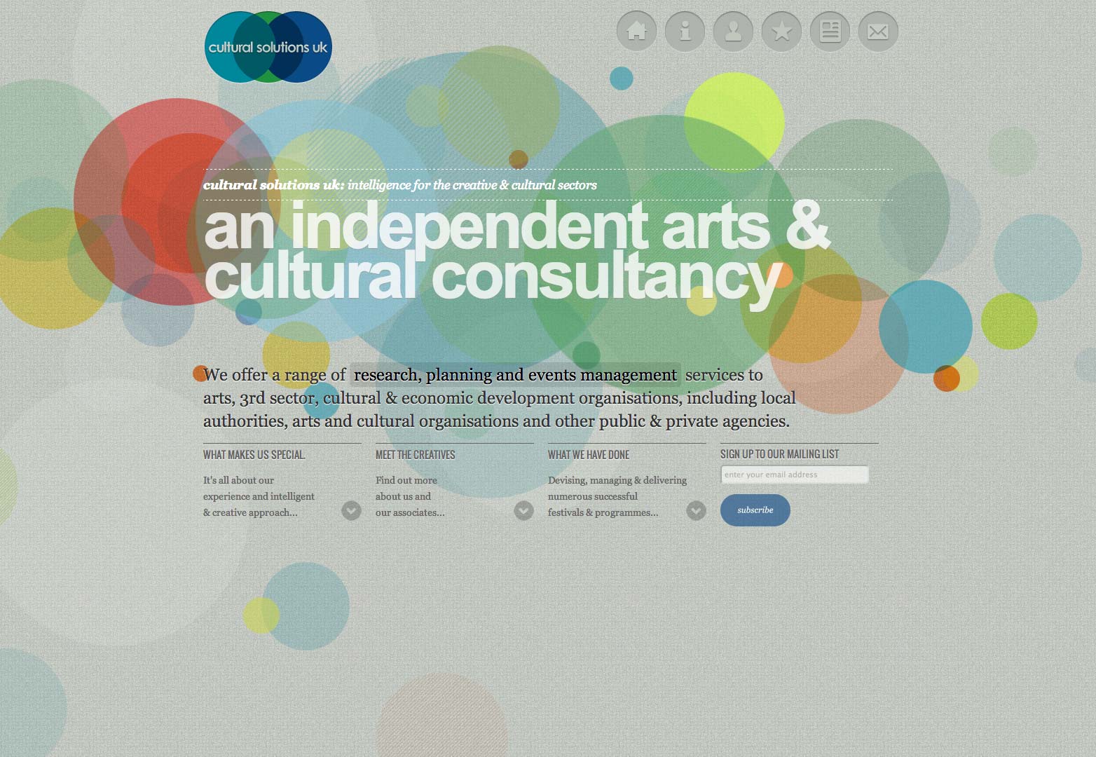
Cultural Solutions
Big bold circles, laid over a textured background, have been used as a pattern on this website. The innovative use of patterns gives this website a tactile look.
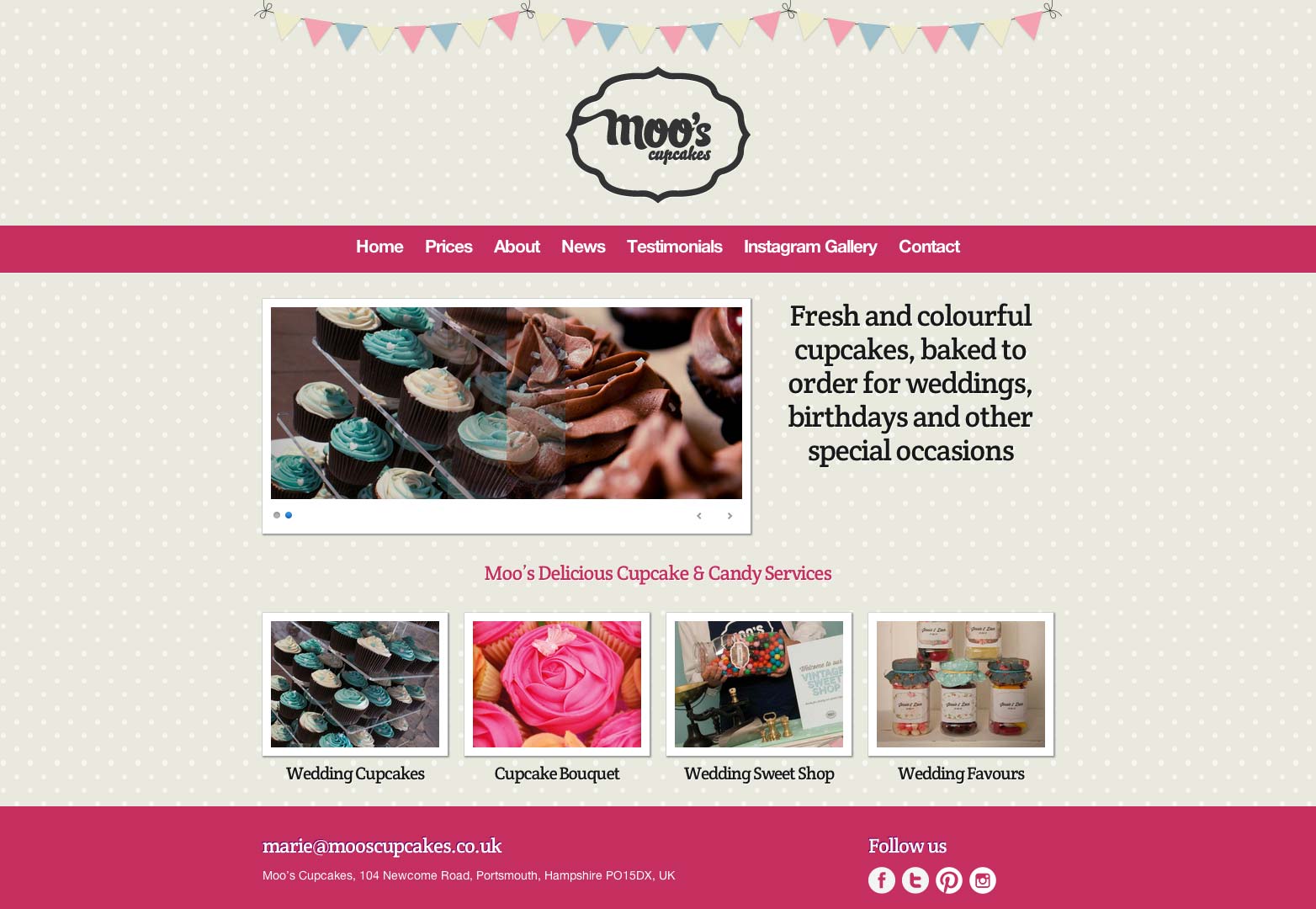
Moo’s
This cupcake website features a beautiful small circle pattern that looks very pleasing. The pattern is perfect for the design and looks great.
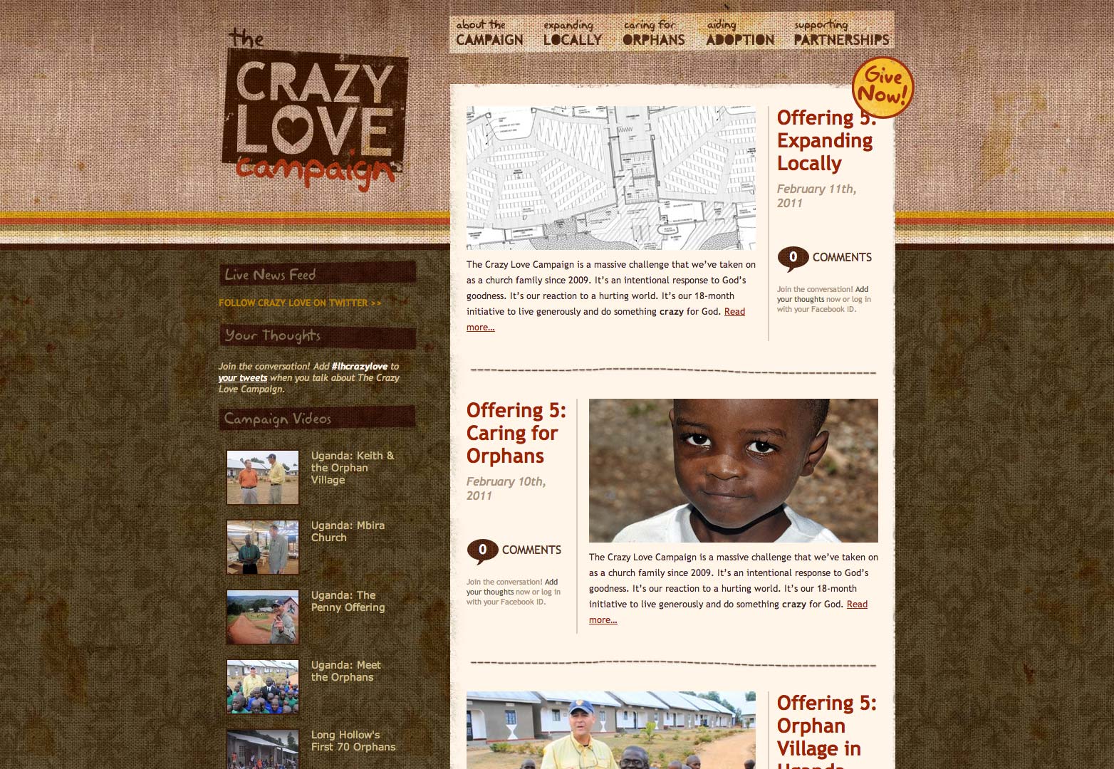
The Crazy Love Campaign
Two different sets of patterns are used here: one for the header to set it apart from rest of the website, and a second pattern for the rest of the page. Both look excellent.
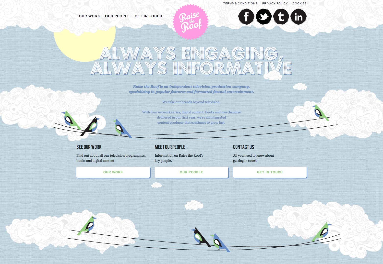
Raise the Roof Productions
Different patterns merge so beautifully here, creating a perfect scene. The intelligent use of patterns makes this design very appealing to look at.
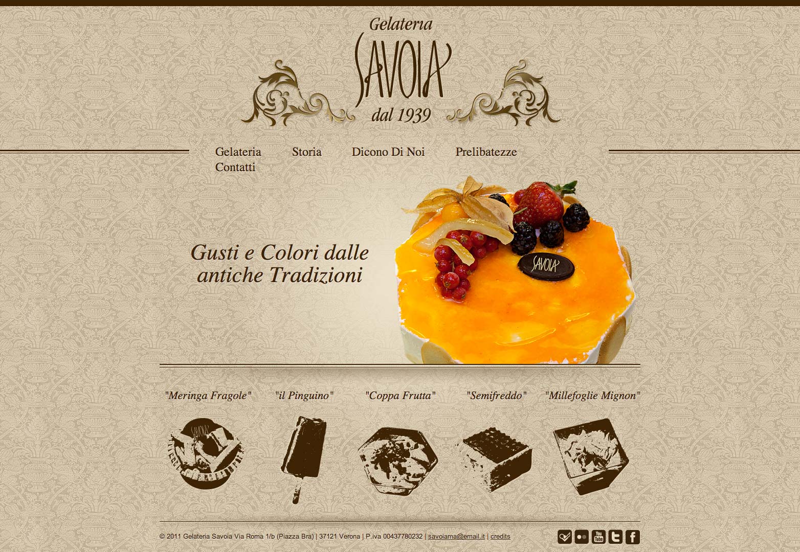
Gelateria Savoia
A fine and delicate pattern grabs attention and gives this website a pleasing look. The designer does not overdo it.
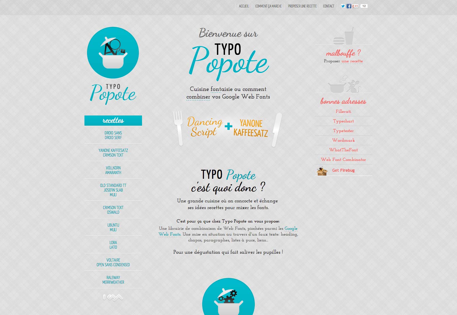
Typo Popote
The delicate geometric pattern here grabs attention and gives the website a charm.
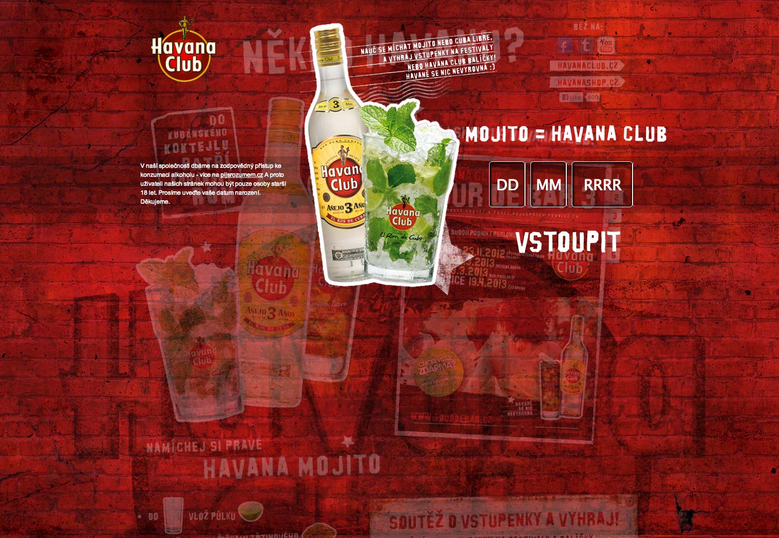
Havana Mojito
Red bricks make a strong and solid impression. The overall look is dramatic.
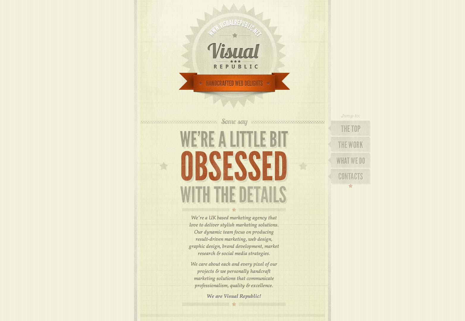
Visual Republic
A minimal and clean design is paired with a geometric pattern. It shows you do not need to overdo a pattern.
Mind Epic
Different patterns set off different parts of the website. A rather complex use of patterns but very effective when done well.
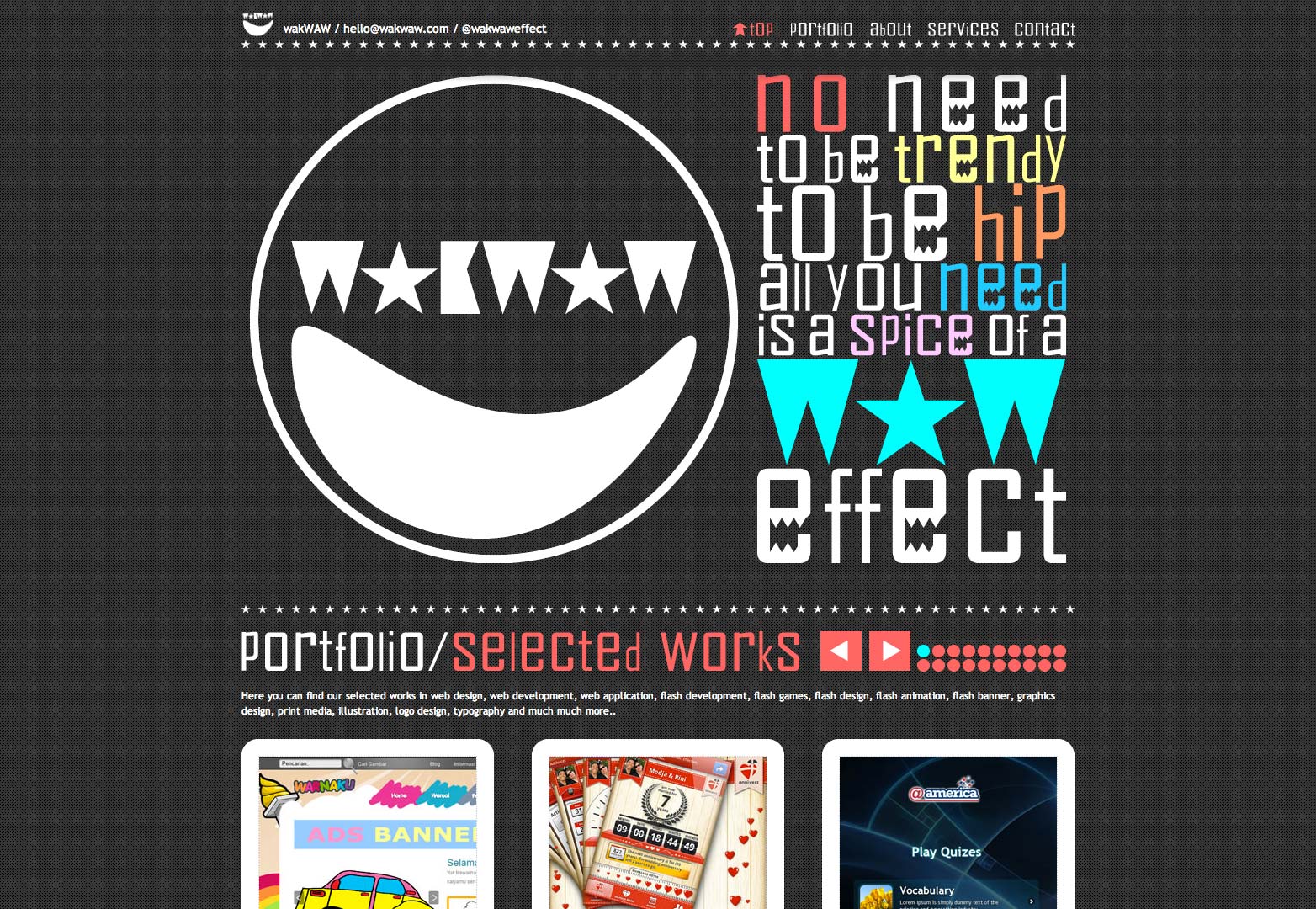
WakWAW
This star pattern looks quite appealing. You can see how one can apply a pattern to make a design look stunning.
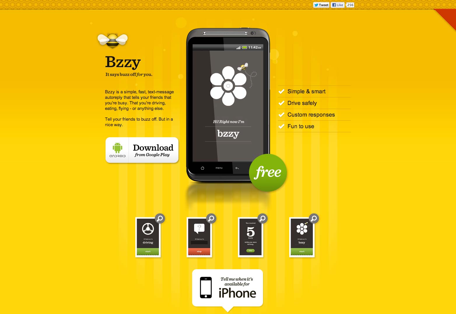
Bzzy App
The vibrant yellow bars are eye candy. The designer has done an excellent job.
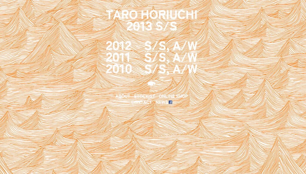
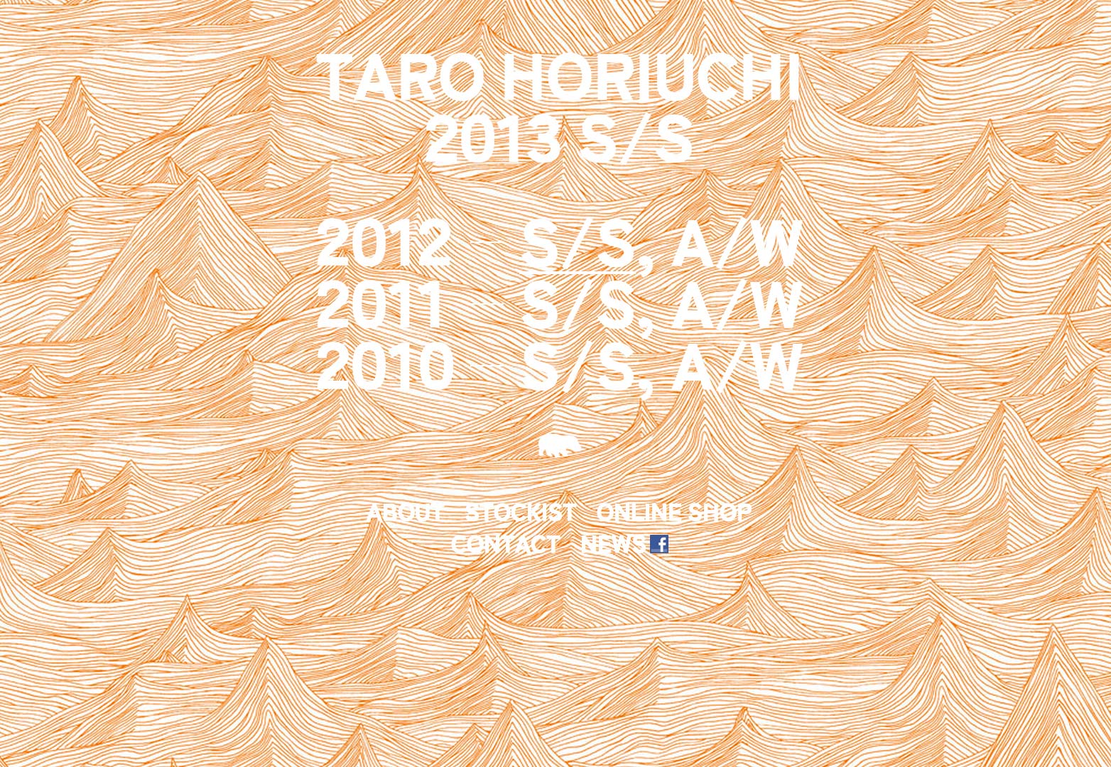
Taro Horiuchi
Different patterns here are associated with hover effects. Rollover different links to see different patterns.
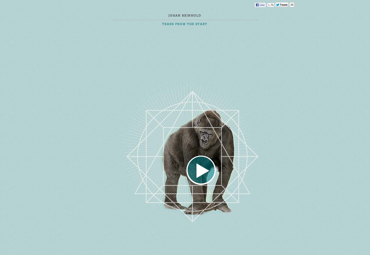
Johan Reinhold – Heart in a Jar
This pleasing colored pattern has a soothing look. The design could be used as a reference point for applying patterns.
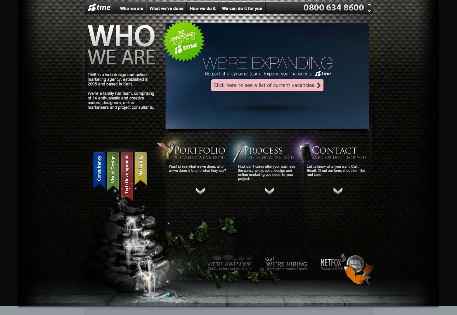
Tme Solutions
Taking a unique approach, the designer has kept it simple yet eye-catching.
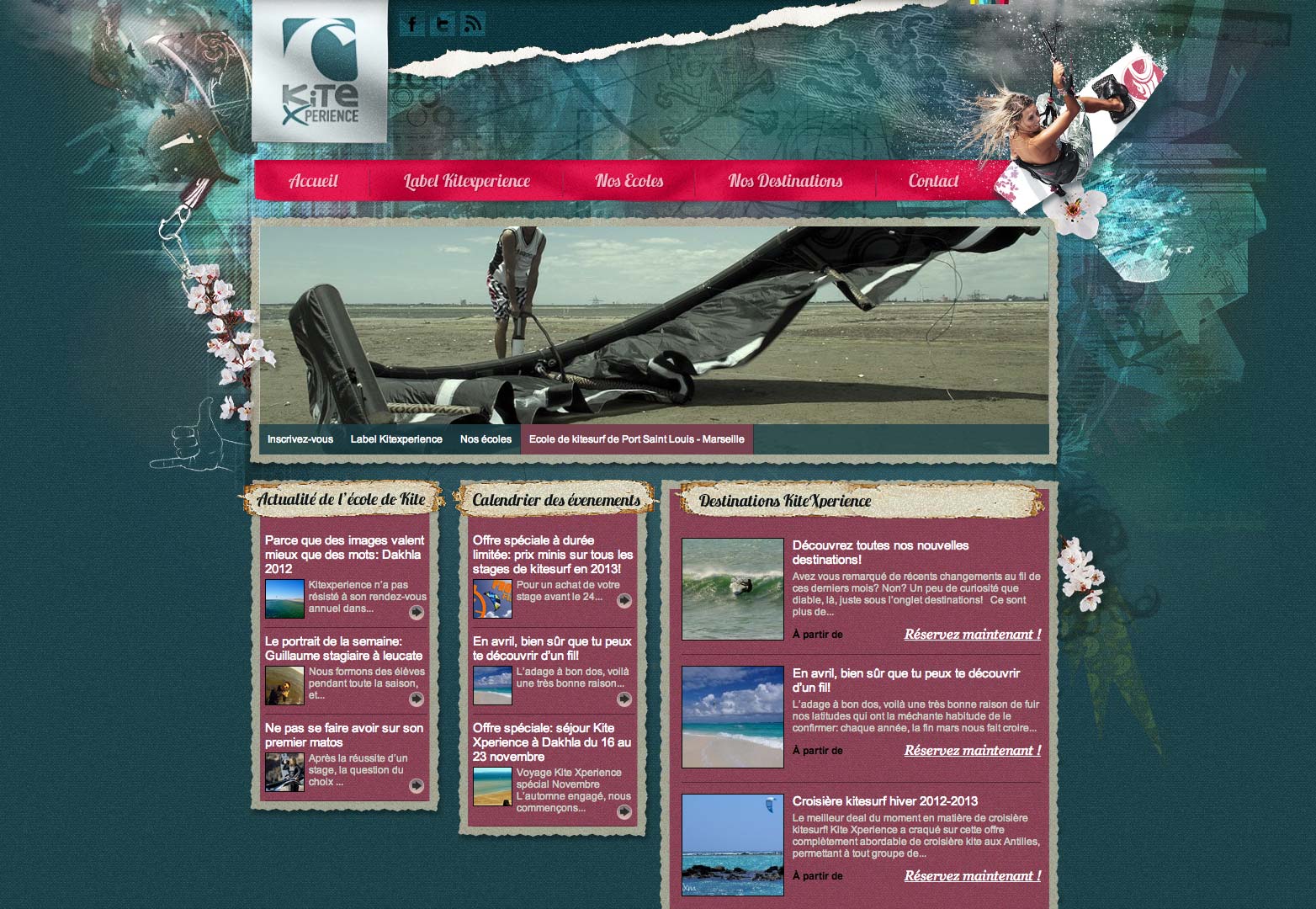
Kite Experience
This website sets itself apart with an innovative use of patterns. Kite Experience gives the website a pleasant fresh look.
Madabout Make Up
The soothing pattern might not get noticed at first glance, but it sure makes an impression, subconsciously engaging the user.
Made by Craft
Here, one can see the creative use of patterns and its impact on the overall design. For a delicate look, use subtle patterns; for a bold look, use dark and more visible patterns.
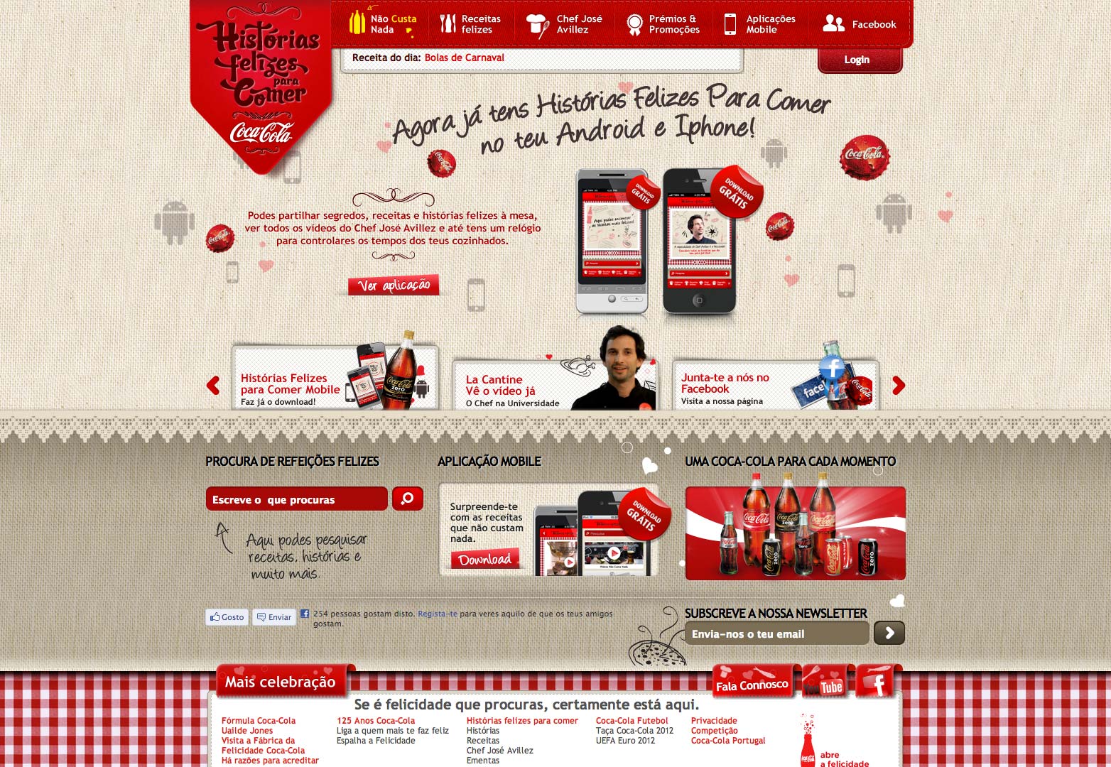
Coca-Cola
The dotted and lined pattern looks great. The designer has kept it simple and appealing, while making the whole design look stunning.
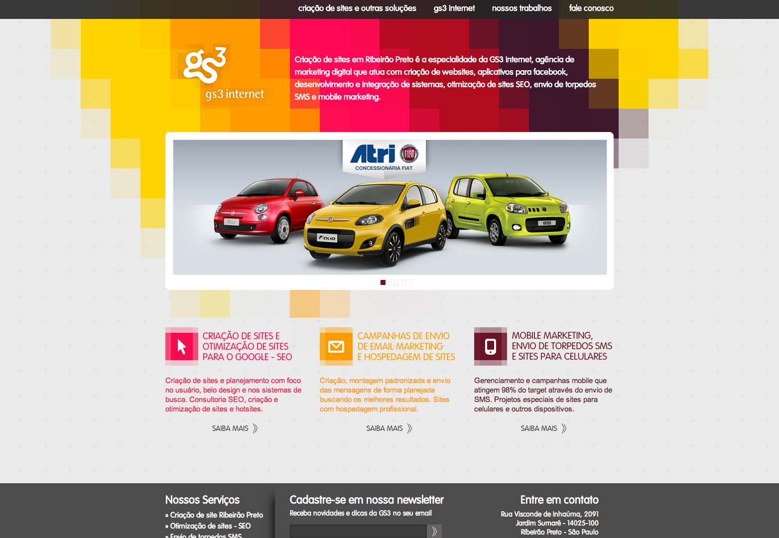
GS 3 Internet
This vibrant and lively pattern brings this design to life. While usually going unnoticed, a pattern can be appealing if used properly.
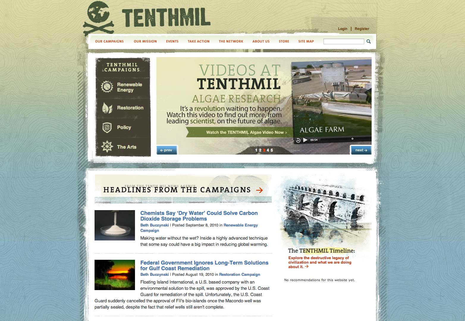
Tenthmil
Exceptional and attractive, this pattern mimics the contours found on maps.
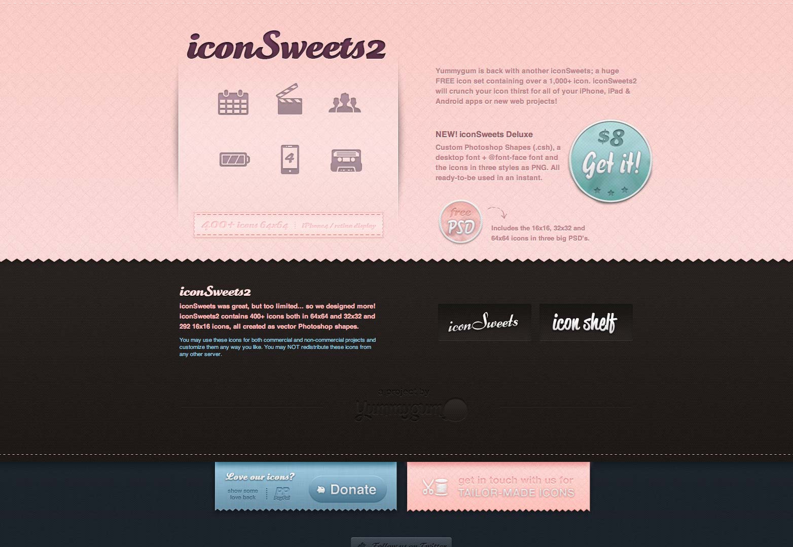
IconSweets 2
This pink geometric pattern is used intelligently and not overdone.
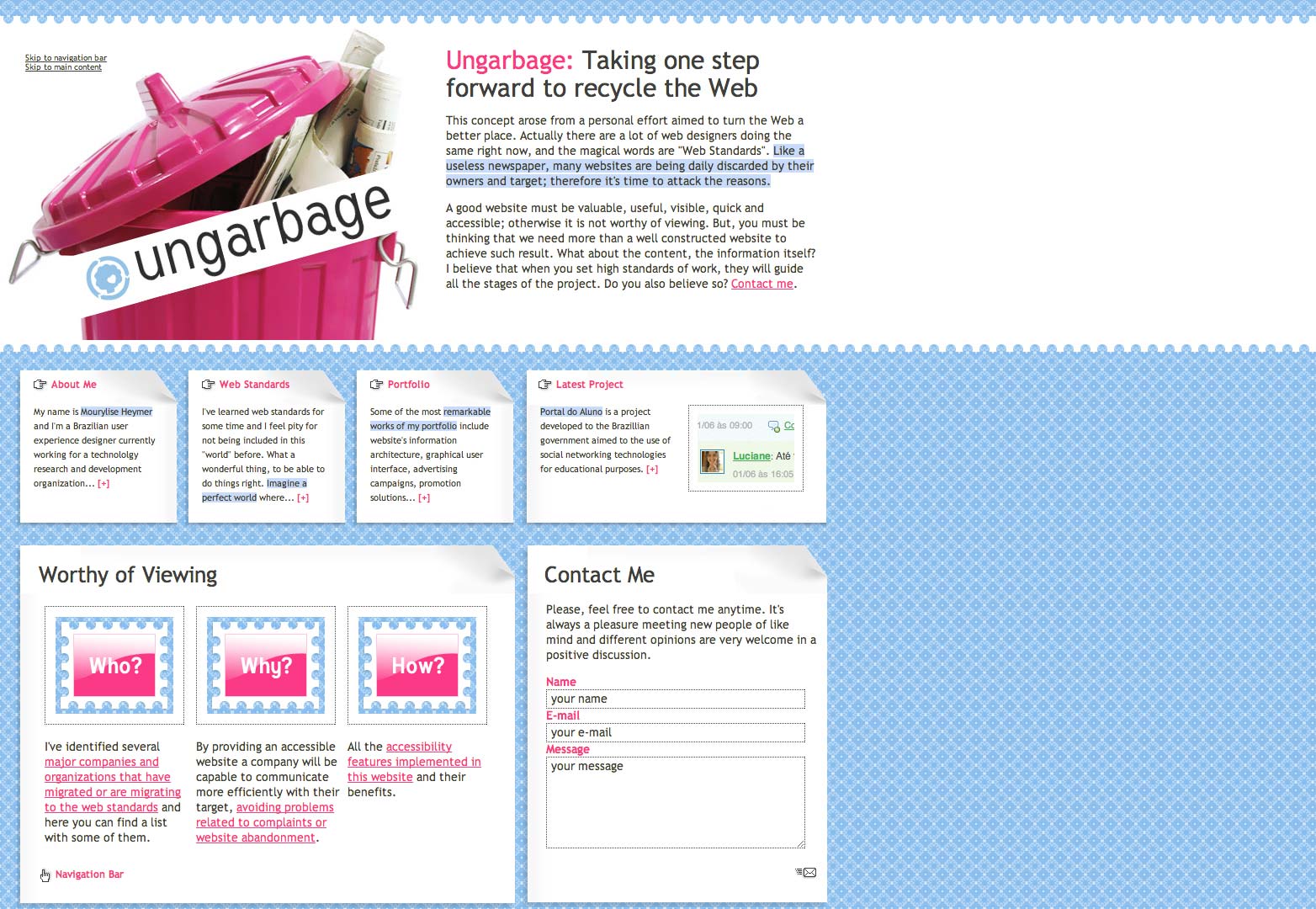
Ungarbage
This design is lively and energetic, as is the pattern. The simple and brilliant geometric pattern makes this website a treat for the eye.
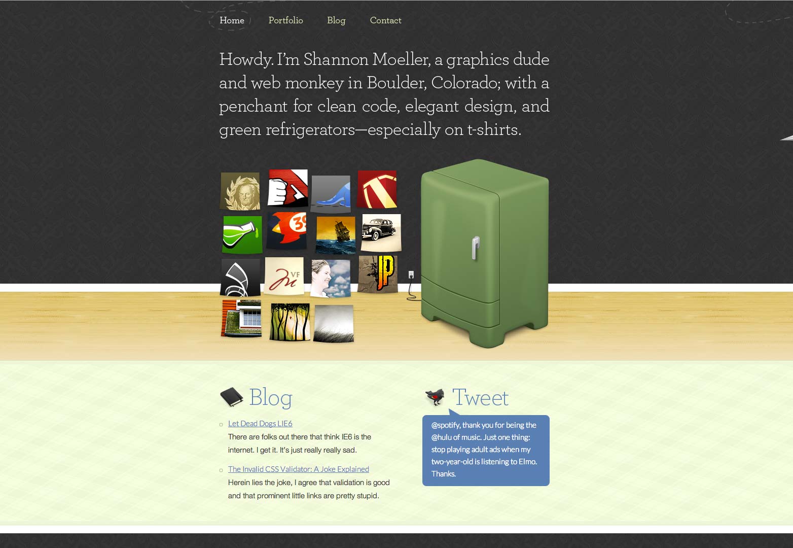
Shannon Moeller
This simple yet attractive pattern makes this website an attention-grabber.
Which of these patterns is your favourite? Have we missed any that you’d like to add? Let us know in the comments.
