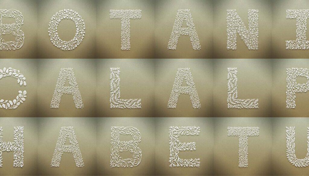
Since the very earliest illuminated manuscripts, dating back to the 5th century AD, we’ve associated flora with enlarged type. Perhaps it’s something to do with the way plants repeat the same shapes, echoed by type. Or perhaps it’s simply that we can bend an organic shape to our design without compromising its integrity.
Whatever the reason, botanic forms play a huge role in the history of illustrative typography. With such a lengthy heritage, it’s a pleasure when something fresh and new is produced in the field.
Seth Mach’s Botanical Alphabet is one such project. Drawing inspiration from more than a thousand years of embellished type, Mach’s alphabet is a reduced, minimal approach to the theme; with plant shapes simplified and characters essentially sans-serif in nature.
Suitable for large display type, possibly signage, each letter of the project was created by hand and then digitized, giving the shapes an additional organic feel. I’d love to see these characters used as the basis of fresh branding for The New York Botanical Garden or Kew Royal Botanical Gardens.
The project will be featured in the Type Directors Club‘s Typography 34 and will be shown at the 59th awards exhibition in New York.
Which of these characters works best? What other traditional forms of type are suitable for modern reworking? Let us know your thoughts in the comments.
