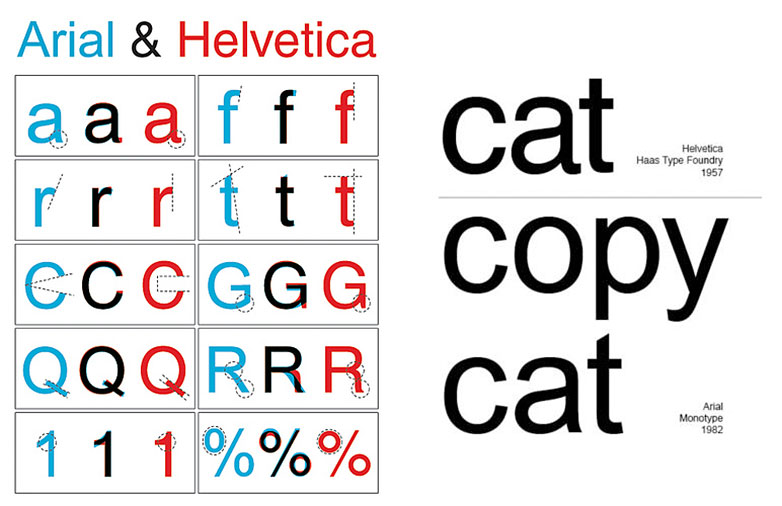
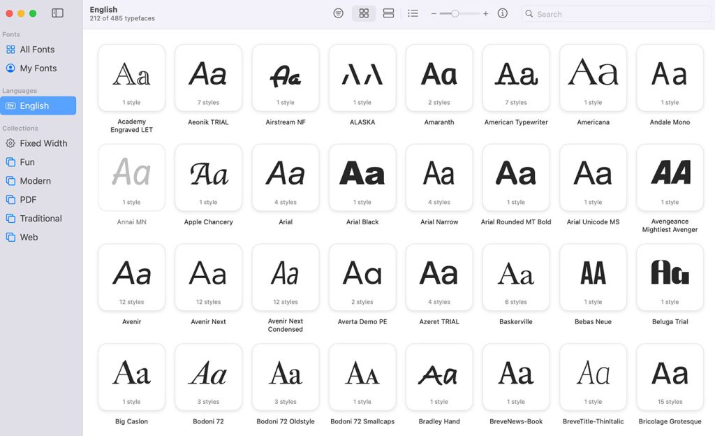
It’s long been thought that Arial is to Helvetica what the ugly step sister is to Cinderella. Helvetica was designed in Germany in the 1950s to compete with Akzidenz Grotesk; Arial was designed in America in the early 1980s, believed by many to be a move by Microsoft to supply a Helvetica-like font as part of its TrueType specification without acknowledging or paying royalties to Helvetica.
Be that as it may, to the untrained eye, the differences between the two fonts are negligible — largely due to the near identical widths. But to the savvy eye of the designer, there are dozens of subtle differences that leap off the page. For example, the ascender of Helvetica’s lowercase “t” is cut off straight, while Arial’s is cut at an angle; similarly, the terminals of the lowercase “s” and “c” in Helvetica run parallel to the baseline, whilst Arial’s run at near right-angles to the stroke.
The simplest way to tell the difference is to look at the characters as a whole and picture them as suits from their respective periods: Helvetica is sharper, with formal details; Arial is looser and less controlled.
But what would happen if everyday logos that were originally crafted in Helvetica were redone in Arial? Would the differences be easily recognizable or difficult to spot? To answer this question, David Friedman of Ironic Sans has devised a quiz featuring 20 popular Helvetica-based logos pictured side-by-side with an Arial version. Some differences are readily apparent, but others look shockingly similar.
Take the short quiz and see how well you do — be sure to share your results!
How well did you go on the quiz? What differences are most evident when comparing Helvetica and Arial? Let us know your thoughts in the comments.


