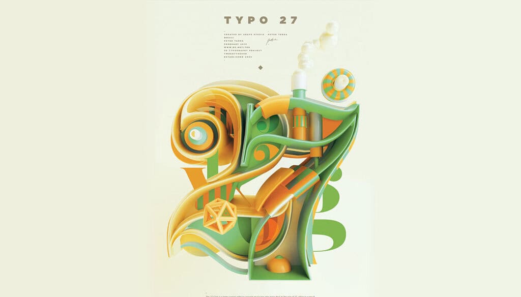
Talent, discipline, and creativity just might constitute a triple threat in the world of design; and if it does, 21-year-old Peter Tarka easily meets the definition.
Each month, the ambitious Poland-based creative produces a collection of mesmerizing 3D typographic art. Currently a graphic designer and illustrator with Grate Studio in Wroclaw, Tarka’s digital artwork has been featured on Behance, PSDTuts, and Abduzeedo, as well as in several publications. With ten collections under his belt, this gifted designer has sought to bring language to life through his exercises in typography.
“The arrangement of type involves the selection of typefaces, point size, line length, leading (line spacing), adjusting the spaces between groups of letters (tracking) and adjusting the space between pairs of letters (kerning).” — Peter Tarka
His precise approach is coupled with off-the-charts ingenuity and an eye for color, texture, and space. If typography is a discipline that makes language visible, Tarka’s work has it leaping off the page. Enjoy!
Which of Peter Tarka’s portfolio is your favorite? Is his work about design, or style? Share your thoughts in the comments.
