In 2011, the movie industry made a whopping $87 billion worldwide. With that much cash up for grabs, film studios and corner-office execs are all clamoring for their piece of the pie; and that means branding and marketing a given release is anything but child’s play. It’s interesting, then, that one approach to attracting film-goers has stood the test of time: the typographic movie poster.
Artwork with typographic elements combines the best of both worlds — namely, eye-catching imagery and ultimate readability. There’s a certain strength in well-done lettering on a poster that attracts and keeps an audience’s attention, potentially setting a mood or tone for a lasting impression. After all, a picture may paint a thousand words, but a picture made of well-placed words? That picture speaks volumes.
Dating back to as early as the 1960s and 70s — with films such as West Side Story and Taxi Driver — all the way to present day with the Oscar-nominated Zero Dark Thirty, typographic movie posters are clearly deemed effective by movie marketing masterminds. The following compilation represents 30 posters that are both impressive and inspiring; most were created by the film houses themselves, but a few are from creative minds that envisioned what could have been if typography had been used as the vehicle of choice. Enjoy!
And if you’re in the United States, happy 4th of July!
Taxi Driver
Burn After Reading
The Godfather
Zero Dark Thirty
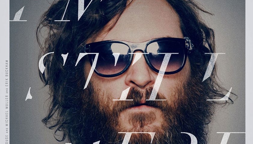
I’m Still Here
West Side Story
The Words
Bully
Big Fish
The Departed
All That Jazz
Skyfall
Invasion
42
Before The Devil Knows You’re Dead
Blindness
Detour
Beautiful Losers
Salt
Gangs of New York
Beastly
The Social Network
Dancer in the Dark
Terms and Conditions May Apply
Sex and the City
Which poster is your favorite? Do you know of others that could have made the list? Let us know in the comments.
