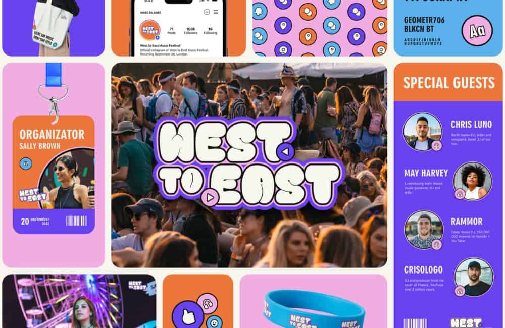
The Bento Box trend has been around for a while, but it’s only in the last year or two that it’s gained momentum, as designers have realized how delightful and user-friendly it can be.
As with a lot of design trends, the origin is disputed. Some say Bento UI took off thanks to Apple, which has adopted it for its UI elements. Other people point out that Microsoft’s Metro UI was effectively Bento UI. Wherever it came from, there’s no doubt it’s increasingly popular, and the more it’s used, the more it’s validated as a UI style.
What is Bento UI?
Bento UI might sound complicated, but it’s actually a very straightforward way of structuring a design. It’s simple and efficient; consequently, it’s popular with both designers and users.
Bento UI is rooted in visual hierarchy and organization, which have been the cornerstones of UI design since the beginning. Where Bento UI distinguishes itself is that it works really well for small, rectangular layouts. In other words, Bento UI works brilliantly on mobile devices, and as a result, it is a gift to designers creating responsive layouts.
What are the Key Benefits of Bento UI Design?
The Bento UI design trend delivers several key benefits for designers, developers, and users.
- Simplicity: Bento UI makes it easy to create responsive layouts for a range of devices.
- Structure: It’s easy to organize content in a visually appealing hierarchy using Bento UI.
- Modern: Bento Box-style design looks modern, giving your products a fashionable edge.
- Familiar: With the adoption of Bento UI by industry influencers like Apple and Microsoft, users are familiar with how Bento organizes content.
Is Bento Just Another Design Trend?
As with any visual trend, what looks modern and innovative today, must eventually look tired and dated — that is the nature of design trends. Indeed, many design experts argue that the Bento UI trend is already at peak popularity, and the only way is down.
However, we should remember that many of those same design experts called responsive design a trend, and it’s now considered best practice for web design.
Apple evolves its UI design very slowly. Bento UI is a core component of macOS, iOS, and the new visionOS, so we can expect it to be around and influencing design for a long time to come.
What’s more, core technologies on the web have evolved to make Bento UI easier to produce. Where once developers struggled to code the much simpler masonry-style UI layouts, CSS Grid means that Bento-style UIs can now be coded as simply as any other grid.
How to Get Started With Bento UI Design
Bento works best when you break up your content into bite-sized chunks. Once you’ve done that, it’s easy to get started:
- Start with a grid — Bento UI works on a strict grid system. Each cell in the grid should be a square.
- Allocate content to cells — Insert your content in different cells, but remember: not all the cells need to be filled; you can create rectangles or cloud-shaped designs by selectively filling squares.
- Create a hierarchy — Different sized squares create emphasis (bigger is more important), but they also add much-needed visual interest.
- Round your corners — Rounded corners on your cells help distinguish them from one another, and it’s a key part of the Bento Box aesthetic.
- Group related content — Arrange your cells so that related content is in close proximity.
- Have fun! — Bento UI is a fun, modern layout. Add bright colors, positive fonts, and dynamic images to your cells.
Is Bento UI Right For Your Project?
Bento UI is more than just another design trend; it’s an evolution of design. It’s an effective way to create a visually appealing and simple-to-use UX. Bento UI is no more complex to develop than any other layout thanks to CSS Grid, and it’s particularly suitable when designing for mobile.
Bento isn’t perfect for every project. It works best with simple hierarchies, so if your project doesn’t have a simple hierarchy, it may not be suitable for you — but if your project doesn’t have a simple hierarchy, perhaps you need to address that.
Bento UI looks and feels modern, and we can expect it to remain popular for some time. With new technologies like Vision Pro on the horizon, it may even evolve into something we can’t yet predict.
