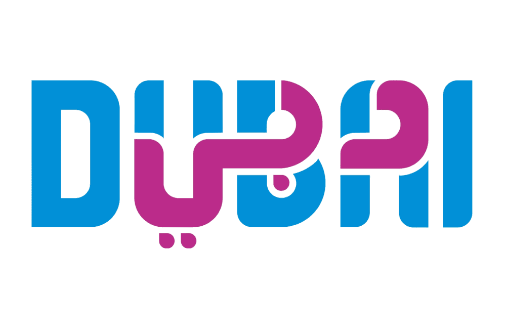
The term most Westerners are familiar with, Dubai, is colored blue. The Arabic version of the city’s name is colored pink.
The two intertwine seamlessly, resulting in a meaningful logo that speaks to readers in Europe, the Middle East, America, and beyond.
Dubai’s tourism logo hit the top of Reddit’s r/DesignPorn page recently, and most unanimously agree the logo is a big success. The intelligent color blocking to separate the Roman alphabet and Arabic script is expertly done, and many praise the logo for its inclusivity.
Dubai’s tourism industry is a key driving force behind the United Arab Emirates’ wealth, and many believe this intelligent logo will do nothing but attract new visitors to the nation.
Naturally, not everyone on the internet is convinced that the logo is all that great. Much like Musk’s recent contentious xAI logo, some users believe the overlaying of the two scripts makes both hard to read. Others think the color palette makes the logo look like a Baskin & Robbins rip-off. Ah, well, you can’t please everyone.
