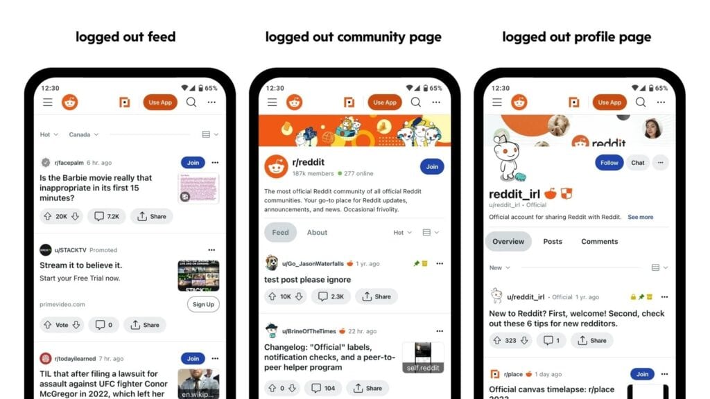
The social media organization revealed its new update in a post on Monday. Reddit’s overarching goal is to make it easier for those coming to the platform for the first time to find engaging, relevant content.
To bring this plan to fruition, Reddit has simplified the search page by introducing a new layout. On mobile, users previously received a confusing blend of posts, comments, and communities when entering specific queries. Now, the search results will prioritize posts over all other elements, making it more straightforward for logged-out users to find interesting content.
On Reddit’s desktop client, logged-out users will now see a sticky sidebar, allowing them to scroll through content to find relevant posts and communities.
To make the user experience more fluid, Reddit has also improved the layout of its landing page. Increased title sizes and improved image insets make content easier to read. The company has also optimized its site to allow pages to load significantly faster for logged-out users.
Much like Tumblr’s recent plan to make its website more accessible, it seems Reddit is attempting to change the way logged-out users interact with the website. Perhaps they are hoping to capture users from Twitter following Elon Musk’s three-month string of contentious decision-making.
That said, Reddit has also been subject to its fair share of scrutiny recently. The decision to charge third-party developers for access to the Reddit API left a sour taste in many mouths. So much so, in fact, that many subreddits temporarily shut down in protest.
Perhaps these changes are Reddit’s attempt to appeal to a new audience. Maybe the social media site is simply embracing the fact that millions of people use it as a search engine to find solutions to common problems. Either way, these improvements are a change for the better.
