Neville Brody’s list of professional accomplishments is both long and eclectic. He is best known for his work in the music industry, designing iconic record covers for bands such as Depeche Mode, 23 Skidoo and Cabaret Voltaire.
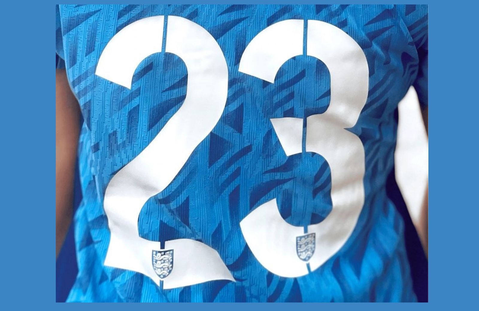
Brody’s experience makes him the ideal candidate for designing and implementing unique typefaces. He recently turned his attention to the England Women’s soccer team – commonly referred to as the Lionesses – partnering with Nike to create a unique font for display on their 2023 kits.
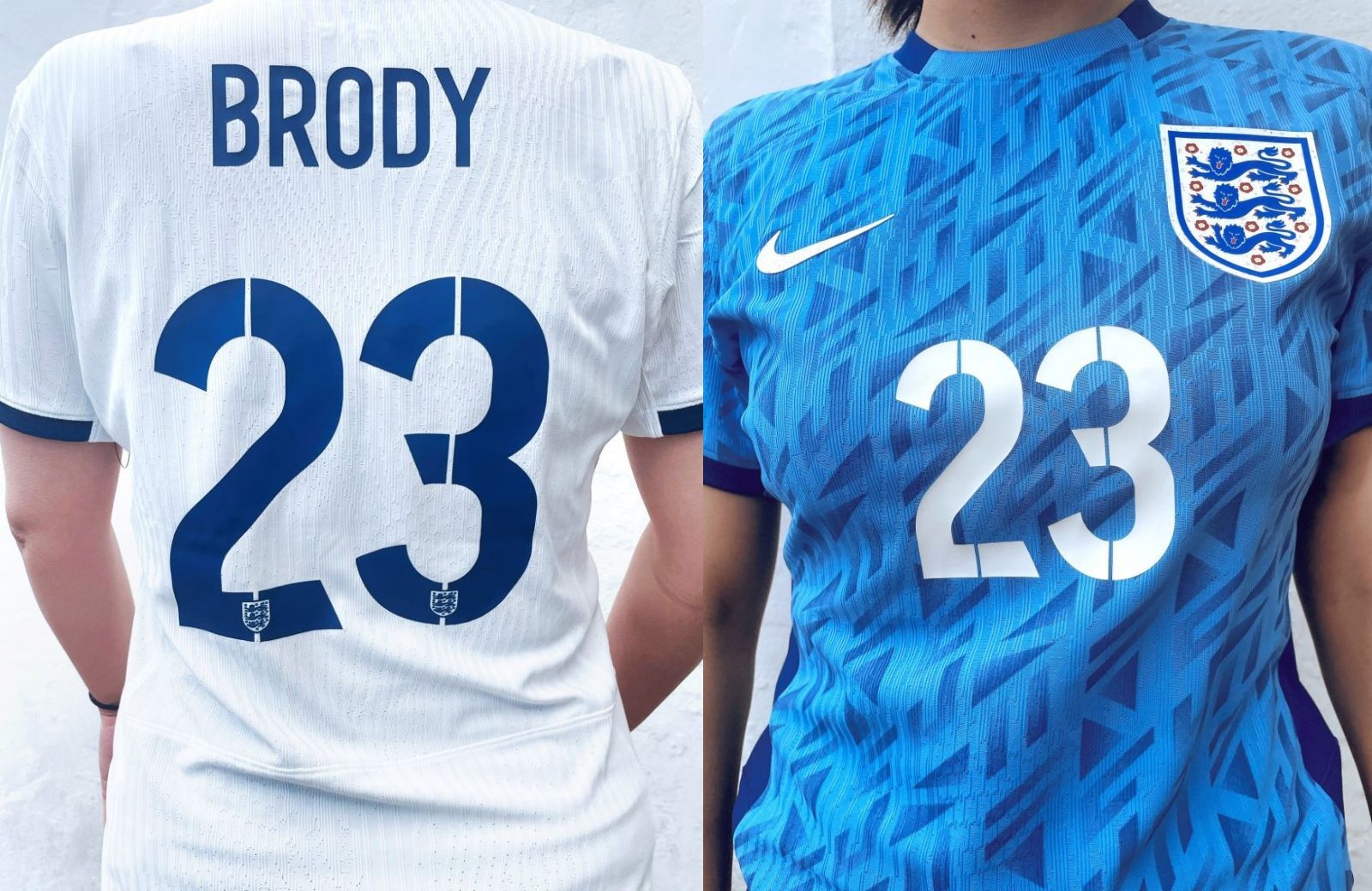
The core ambition of Brody’s typeface was to create something adventurous without compromising on readability. The clean-cut stencil lines separating the letters make the font feel distinct while emphasizing efficiency. The geometric curves and intelligent use of negative space make the design more legible—vitally important when trying to identify a player during a fast-paced match.
Brody based his design on the England men’s team kits, which he created in 2014 before the World Cup. He reduced the height of the lettering and made the font less bold to accommodate the different sizes and styles of the kits.
The color choice is the least surprising element of Brody’s typeface. The font is, after all, designed to be displayed on a soccer kit. Blue letters adorn the all-white home shirts. White letters, naturally, accompany the blue away kit.
Brody’s typeface bridges the gap between style and substance. It’s at once functional and surprisingly expressive. Its unique qualities make the England women’s kits notably distinct, but the typography always retains the easy-to-read attributes we’ve come to expect from a high-quality sports jersey.
