1
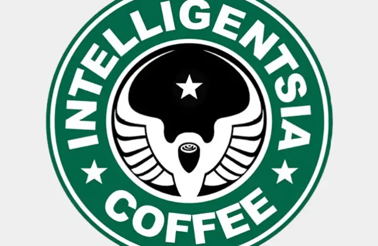
There’s a trend right now, that wavers between irritating and inspired, for redesigning corporate logos in a hipster style.
Certain that hipsters could take it as well as dish it out, and inspired by the nearly infamous hipster logo generator, recently Whit Hiler and the team at Cornett Integrated Marketing Solutions decided to turn the trend on its head and redesign a collection of hipster (or rather, hipsterish) logos in the spirit of all that is corporate.
I found the hipsterish-to-corporate exercise deeply disturbing, as if this is what hell looks like from inside a descending handbasket, but I couldn’t stop looking. It’s illuminating to see the warmth and character slowly strangled from a company’s logo to be replaced with soulless corporate gradients and sharp edges. It says as much about the popularity of hipster design, as it does big-business branding.
My personal favorite is the Urban Outfitters logo (no change). What’s yours?
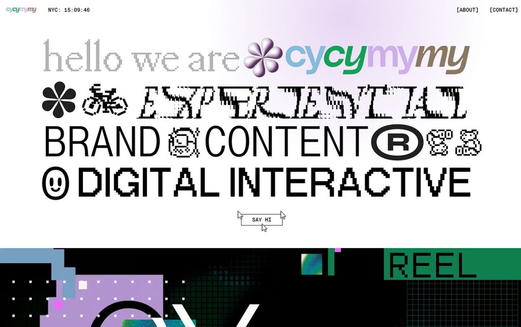
Not Useless: Why Experimental Websites Matter More Than You Think
Every once in a while, a site comes along that makes you pause, grin, and think: Wait—websites can do that? Maybe it’s a portfolio where the cursor morphs into a liquid blob,…
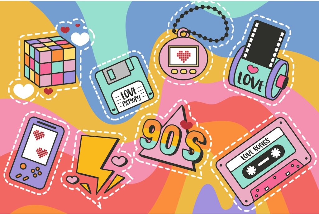
Pixel Nostalgia: Why We Miss the 90s Web (Even If It Was Ugly)
It’s easy to laugh at the 90s web now — the blinking GIFs, Comic Sans banners, table layouts held together with duct tape and hope. But beneath all that chaos…

Why Designers Are the New Bureaucrats
There was a time when design meant making something—actually making something. You’d open Photoshop (or, if you’re older, Illustrator 9), throw ideas on the canvas, and wrestle with composition, hierarchy, rhythm,…
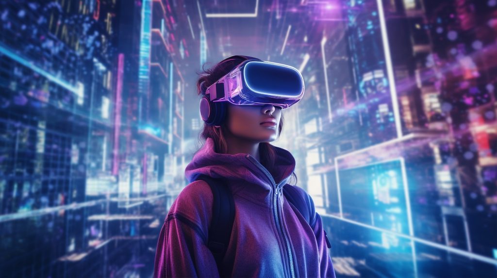
Your Brand Just Evolved: The Rise of AI-Generated Identities
For most of design history, a brand has been a fixed thing — a logo, a color palette, a tagline, a style guide locked in a PDF somewhere. The goal…
7 Real Predictions for Web Design in 2026
Every December, design Twitter fills with lists of “hot trends” that sound like buzzwords generated by an algorithm: “AI-native ecosystems,” “metaverse-ready experiences,” “contextual design synergies.” But the truth is, 2026…

Drowning in Options? The Future Belongs to Curators, Not Creators
Got it — let’s refocus firmly on curation, tighten around that theme, and balance the paragraphs — not too short, not too long — for a more natural, flowing read. Here’s the revised, more focused…