Almost every web design story has three main actors. Each of them occupies a particular place in the story, and each has different motivations and expectations. These characters are the client, the designer, and the user.
There is a particular hierarchy that is supposed to exist between the three; but due to the nature of the process, this hierarchy frequently gets mixed up. The result is a plethora of poorly designed websites that are cluttered with unnecessary extras, which exist because of a power struggle between the client and the designer.
What we need, in order to avert this disaster, is something I like to call “Design Frugality”. It sounds fancy, but it’s actually very simple. Just the way websites ought to be…
1) Being important isn’t important!
In the hierarchy I mentioned earlier, the user always believes themselves to be the most important actor in the cast because it is ultimately their money that the client is trying to earn. The client often believes himself to be the most important because he is putting up the money to make the website. And, sadly enough, the designers often believe that they are the most important because without them the website will not be the masterpiece that the client needs.
The truth is that it’s really the design itself that is most important. This is what connects your client’s business with the users. But clients often make ridiculous feature requests, and the designer often tries to impress the customer with how many “cool features” they can build into the site. Did you notice who gets forgotten in all this? That’s right – the user!
2) What clients want isn’t always what they need
When you put the needs of the client ahead of the needs of users, or your own needs ahead of both, the result is often a website that fails to achieve its task (connecting users with your client’s business).
I’ve lost count of the number of consultations that went something like this:
BOB: …And I want you to make the site in WordPress, and I want a carousel on the home page, and we need to have RSS…
ME: Why?
BOB: What do you mean “why”?
ME: I mean why do you need WordPress? Why do you need a carousel? Why do you need RSS?
BOB: Well… doesn’t everyone have those things?
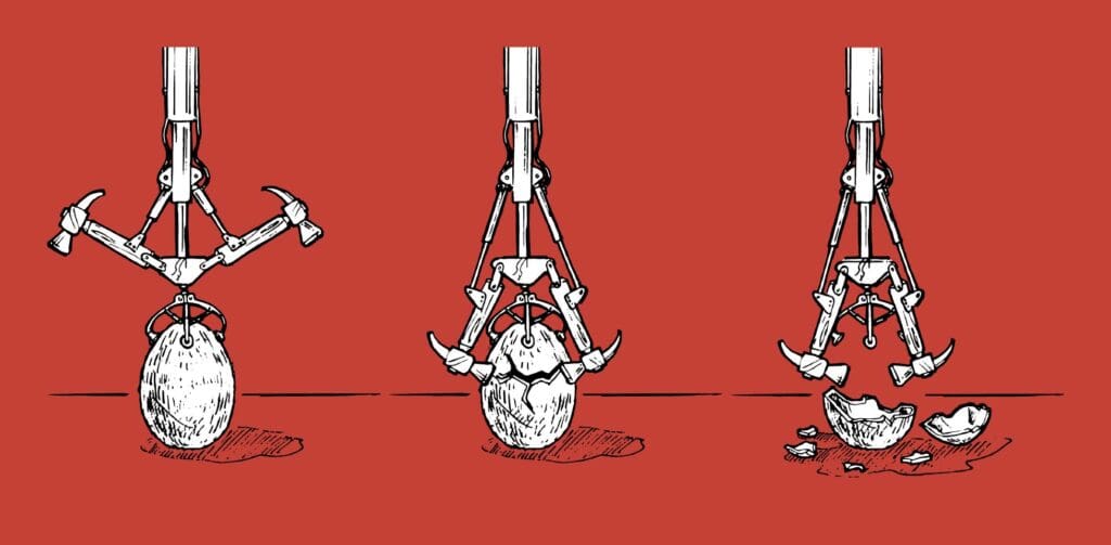
ME: No, Bob, they don’t. Let me explain something. You own a hammer factory. You make four different kinds of hammers. You’re not going to be updating the site regularly, your inventory certainly doesn’t require a carousel to display it, and it’s pretty doubtful anyone will want to subscribe to a feed about hammers.
BOB: So what are you saying?
ME: You don’t need that stuff, Bob. It’s dead money. We need to show people your hammers and tell them why your hammers are the best.
Bob’s problem is that he suffers from copycat syndrome. If everyone else is doing something, he figures he should be doing it too. Sure you could just give him what he wants, but you’ll be doing him a greater service by educating him about what his users will want.
Users visit sites to find information, or to be entertained. When you visit a supermarket for the first time, do you spend your time admiring the interior of the store or wishing it was easier to find where they keep the liquid soap? Focus on making it easy for the users to find what they are looking for and make that your priority.
3) Make your site just as awesome as it needs to be
I’m not saying you can’t make a really cool design that totally rocks. What I am saying is: Don’t just add things because they are awesome, add them because they are needed. If you don’t need something, don’t add it!
Avoid flashy technologies and stick to standards-compliant HTML5. Add JavaScript sparingly; if you only need to show 2 images then using a slideshow looks silly. Really, it does! Avoid putting too much content on CDNs, and limit the number of assets you’re loading. Optimize everything, there is literally nothing on a website that cannot be compressed, sped up, or improved in some way. Don’t go crazy with images.
Web design has inherited a lot from other design disciplines, but if there’s one thing that’s more true in web design than any other field, it’s that less is more.
Featured image, hammer cracking nut image via Shutterstock.
