If there’s a common question that web designers ask themselves, it’s usually: How can I improve user experience? User experience is always front and center—or at least it should be—in design; without users to read or view that content, click that call to action, or sign up on that form, no website would have a purpose.
Designers have a number of different tricks up their sleeve to make UX that much better, and one of those is the use of directional cues. These directional cues aren’t subtle; their job is to make it so that every last user can’t miss that big, ol’ call to action button somewhere on the page. In other words, directional cues are like huge billboards on a page, literally pointing the user in a very clear direction.
The strategy behind their inclusion is to increase all-important conversions. Anything you can do as a designer, to increase conversions, you should do. Directional cues help do this efficiently, here’s how:
What are directional cues?
Directional cues come in all shapes and sizes, and you may even be surprised to learn what can pass as a directional cue. Furthermore, there are both explicit (very obvious) and implicit (more low-key) directional cues.
Page elements that can be considered explicit directional cues include:
- Arrows
- Fingers pointing
- Eye direction (when people’s faces are looking at a call to action)
- Lines
- Curves
Kin HR’s site uses the gazes of models in the background to focus attention on their calls to action in the foreground. (The effect is particularly pronounced on a tablet viewport.)
Here’s an ideal example of an explicit directional cue from Salesforce’s landing page. Note the use of the obvious arrow directing the user’s eye to the short web form.
Implicit directional cues are far easier to miss, and those elements that constitute an implicit directional cue are debatable, but they could include:
- Color
- Repetition of size, color and shape
- Hierarchy
For an example of an implicit directional cue, check out The Daily Egg’s about us page. The email newsletter sign-up form has a green background, but white fields. This noticeable contrast draws the eye, thus providing an implicit cue to fill it out.
How do you clarify page goals?
Every page has a purpose, which is usually to get a visitor to buy, sign up for, or subscribe to something. When users don’t understand what the page’s purpose is—such as when the navigation is poorly implemented or the page is much too cluttered—the user experience will drastically decline.
This is where a crystal clear directional cue can be the page’s lifesaver. After all, when the users receive cues on what they’re supposed to do on the page, then their experience drastically improves. Their confusion and frustration is replaced by a confidence and efficiency that are brought about by great organization, design and planning.
Fittingly, a superb example of a directional cue comes to us on a page that talks about the definition of a directional cue. On Unbounce’s definition page, note the huge arrow pointing to the right and thereby prompting visitors to actually read the definition of a directional cue! Thanks to this simple page element, users can clearly understand that the goal of the page is to read and understand this definition.
Empowering users with directional cues
Visual Website Optimizer looked at a page displaying an ad for Sunsilk shampoo. The results were astounding: when the woman’s eyes in the ad actually looked to her right—at the bottle of shampoo, instead of into space—the number of users who finally looked at the bottle skyrocketed to 84%, from just a meager 6% when the original ad had the woman looking straight ahead.
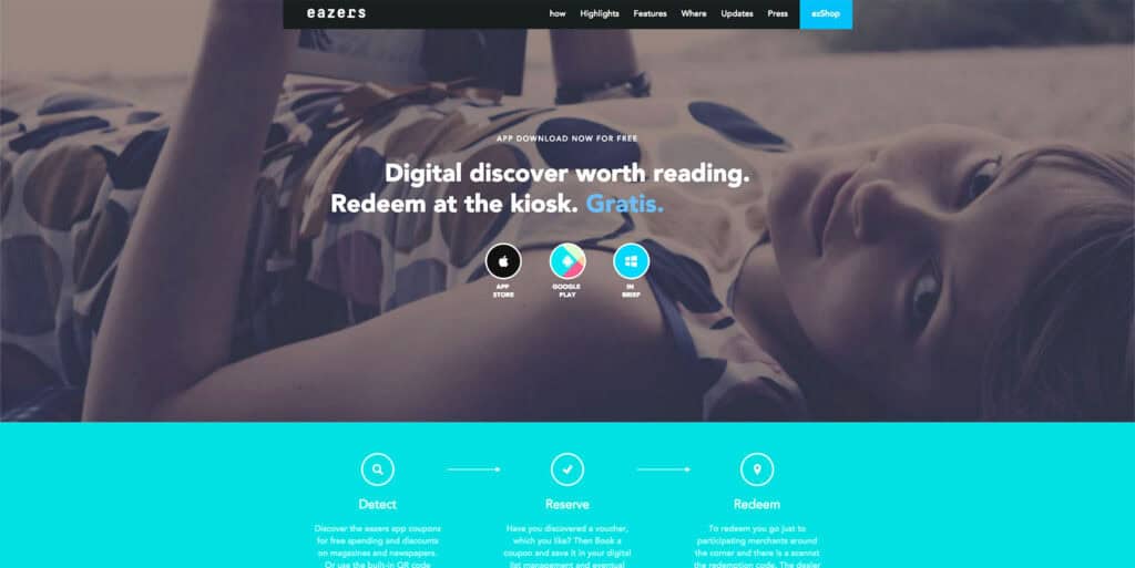
Eazers.com is a German site for coupons that effectively uses the same technique; the gaze of the model draws your eyes straight to the central calls to action.
There’s no doubt that directional cues are very beneficial on a page, and it comes as no surprise, that the improved user experience provided by directional cues also naturally boosts the conversion rate on sites, as the two are interlinked. When the user experience of your site increases, people convert at higher rates because they understand what they’re supposed to do.
Users sometimes know exactly what they’re looking for when they visit your site. These are likely return visitors who want to use what they used the last time they were on your site. For these types of users, it’s paramount that your user experience is top-notch because the last thing you want to do is repel sure-bet conversions! One of the easiest ways to ensure a great user experience for a returning visitor who wants to use the same feature again is by providing a directional cue that’s easy to spot, interpret and then click on.
Don’t take directional cues for granted
The next time you’re designing and think of dismissing directional cues as just a bunch of unnecessary arrows, lines or curves, think again! Research has shown that they’re definitively tied into the user experience and, consequently, a page’s conversion rate. To help your site visitors experience a much better user experience—and your clients obtain a much better conversion rate—you’ve got to incorporate these directional cues into your design.
More than issuing an instruction, directional cues are heavy-hints at what the user is expected to do. Some users won’t, some will, but the important thing is that they clearly understand what the ‘normal’ use of the page is. Directional cues are one of the best tools designers have for enhancing UX, and helping users to boost conversions for your client.
