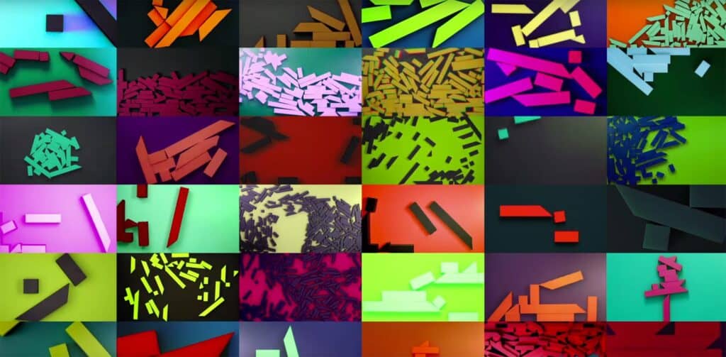
Channel 4 is today launching a major brand redesign. Masterminded by 4Creative, Channel 4’s in-house creative agency, the new identity is brave, bizarre, and striking.
The broadcast media landscape is a much more complicated place than it was ten years ago, so there’s a need to stand out more than ever before. — John Allison, 4Creative
Designed over the past three years, there are three major areas of the British broadcaster’s identity that have been redesigned: the logo, the typefaces, and the idents.
From the very start, we wanted whatever we did to be real and to be tactile, because if you look at a lot of other branding out there, it’s very shiny and CGI-led. — John Allison, 4Creative
The logo has been revised, but retains the blocks of the original logo designed by Martin Lambie-Nairn familiar to viewers. Intended to be used off-air, mostly in print, the ‘4‘ numeral has had additional space inserted to emphasize the block elements, rather than the overall form.
Two new typefaces have been designed by Neville Brody. The first is Chadwick, a rounded, warm, corporate typeface. Its forms are heavily geometric and designed for readability.
The second typeface is Horseferry, an unusual, disruptive display text. Horseferry uses the basic forms of Chadwick, but blends in the blocks from the ‘4‘ logo. The blocks can be found as additional slab serifs, and angular cuts into the shapes. There are even abrupt angular strokes across bowls, which in isolation are ugly, but in context form a typeface packed with personality.
It’s got loads of character — it’s occasionally spiky, sometimes smooth, sometimes goes against the grain, doesn’t always follow type rules. — Alice Tonge, 4Creative
Fittingly for a broadcaster, the most striking element of the rebrand are the idents — the short films sandwiched between programs and adverts — which are beautiful and in some places edgy. They are reminiscent of the opening scenes of J.J. Abrams’ “Star Trek Into Darkness”.
Shot by Jonathan Glazer, the idents tell the story of the channel’s blocks being discovered in caves, mined from the ground, and refined in labs. They’re natural, elemental curiosities.
Channel 4’s new branding is a brave approach. Some elements are more successful than others, but as a whole it’s an identity that is impactful, original, and ambitious.
