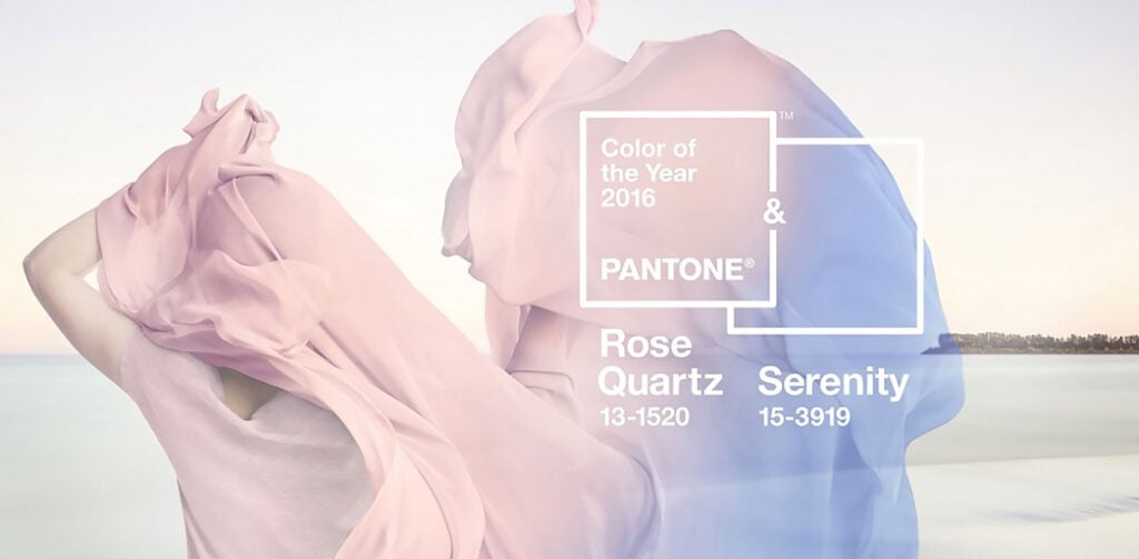
In a fairly radical break with tradition, Pantone has revealed that the ‘Color of the Year’ for 2016 will in fact be two colors blended together. Or, in other words, a gradient.
The colors selected, based on trend analysis, emerging techniques and materials, guesswork, and marketing, are 15-3919 Serenity and 13-1520 Rose Quartz.
Pantone selects its color of the year each December. The prophecy is largely self-fulfilling as the publicity garnered by the announcement ensures that the color selected is front and center of a lot of marketer’s minds, not to mention designers. Many see Pantone’s color choice as an ‘official’ selection and a way of being on-trend.
[Rose Quartz and Serenity are] a harmonious pairing of inviting shades that embody a mind-set of tranquility and inner peace — Leatrice Eiseman, Pantone Color Institute
The fact that Pantone has selected two colors highlights the reemergence of gradients in design after several years of flat color. The pastels are a calming blend that stray far from the current preference for bright, vibrant colors.
It’s notable that the two colors are blue and pink, traditionally colors associated with the two genders. The blending of the two will be seen by many as a metaphor for the growing cultural acceptance of a full spectrum of genders.
In many parts of the world we are experiencing a gender blur as it relates to fashion, which has in turn impacted colour trends throughout all other areas of design — Leatrice Eiseman, Pantone Color Institute
In addition to the colors selected, Pantone has also named a full range of complimentary colors that work well with the pairing.
