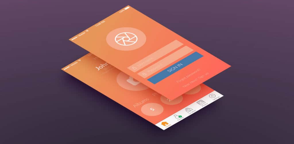
Generally speaking, application design and web design are very different things. The key difference is that typically applications are designed to do something, while websites merely show something. In recent times, however, the line between websites and applications has become increasingly blurred and there’s a lot of overlap, with many websites behaving like applications or even incorporating entire application suites into their interfaces.
For traditional website designers with no prior experience in application design, this can be confusing and may lead to highly questionable results in the end product. It’s important to understand that when I talk about application design, I’m not talking about “apps”. Apps are generally single-purpose interfaces that let phones do things that phones are not normally supposed to do. They’re a class of application, but they can’t really be considered true applications which is why they’re called just “apps”.
In the notes that follow, I’ll talk about how designing website applications is different from designing ordinary information websites, and how you can handle the cross-over and create workable hybrid pages that incorporate application elements properly.
True responsive design won’t usually work well for applications
Traditional software applications work in finite screen-space (scrolling is not normal, and you can’t usually span multiple screen lengths as you can with web pages). The application interface itself may incorporate scrolling, but it requires its own dedicated fixed space.
This means if you use responsive design, you need to think extremely carefully about how your application elements are going to fit in the space provided, and in most cases responsive designs are not going to work very well. You may need to go old-school and create separate versions of the site designed to be viewed on different platforms, or even exclude the application elements from being shown on mobile devices.
Design inline help that can be displayed without leaving the application interface
Testing is important for any website or application, but when it comes to web applications, the workload for testing increases dramatically, because you have so many more ways for your application to not work correctly under different circumstances.
Whereas with traditional applications you have the luxury of a user manual that users can consult when there’s a problem, web applications usually have to provide all the help as part of the site (and normally do a poor job of it!). Try to use tool-tips, pop-ups, modals, and if you must branch out to external pages for help info, at least use the target=”_blank” method.
Use strong error handling
Your application needs to be smart enough to know when it’s not working correctly and to be able to crash gracefully when it needs to. Nothing is more annoying to any user than when their system slows to a crawl and they can’t close your application simply because you were too lazy to use error handling and provide a way to terminate the application.
When assembling a team to develop web applications, it’s a good idea to hire people who also have experience building traditional desktop applications. Those who have such experience may help you avoid mistakes and obtain a more efficient development process.
Featured image, UI design image via Shutterstock.
