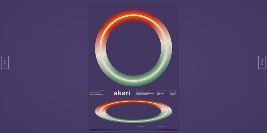
There’s probably no style and technology that are quite as well paired as the International Typographic Style and CSS.
When Detroit-based designer Jon Yablonski was looking for a way to flex his front-end muscles without client restraints, he decided to try and recreate some classic International Typographic Style posters, in CSS and vanilla JavaScript.
See the Pen Zürich Tonhalle (1955) by Jon Yablonski (@jonyablonski) on CodePen.
The inherently grid-based, almost Atomic Design-like, nature of the International Typographic Style lends itself perfectly to the rectilinear bias of CSS.
The solution for each poster was the same…Break the poster into smaller parts, take one step at a time recreating the layers, then experiment with different keyframe animations, timing-functions, and durations until it all feels right.
The recreated posters include work by Josef Müller-Brockmann, Hans Neuburg, and Pierre Keller, and range from the 1950s to the 1970s.
See the Pen Juni Festwochen Zürich (1959) by Jon Yablonski (@jonyablonski) on CodePen.
The International Typographic Style, also referred to as Swiss Style, but often now associated with 1980s corporate America, was popularized by Swiss designers in the mid-twentieth century. As World War II raged around it, Switzerland remained neutral, and its designers benefited from almost a decade of highly insular, highly focused design exploration; the result was the rational, ordered grids that we still employ today.
Yablonski’s interpretations don’t just reproduce the posters, he’s animated them in such a way as to emphasize their spirit and complexity; we can see that the mid-century masterpieces are far from simple. Minimalist without being minimal they are as dynamic and inventive as anything in the history of graphic design.
See the Pen Konstruktive Grafik by Jon Yablonski (@jonyablonski) on CodePen.
See the Pen Canadian Broadcasting Corp. Annual Report by Jon Yablonski (@jonyablonski) on CodePen.
See the Pen Ausstellung Eidgenössisches Kunststipendium by Jon Yablonski (@jonyablonski) on CodePen.
See the Pen Akari by Jon Yablonski (@jonyablonski) on CodePen.
See the Pen Berlin-Layout by Jon Yablonski (@jonyablonski) on CodePen.
See the Pen Tonhalle-Quartett by Jon Yablonski (@jonyablonski) on CodePen.
See the Pen Zürich-Tonhalle (1958) by Jon Yablonski (@jonyablonski) on CodePen.
