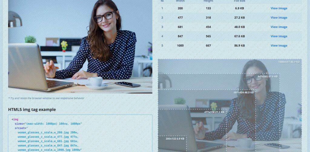
One of the biggest gripes that designers and developers face today is working with responsive design. While this design style is a boon for users everywhere—ensuring that they see content displayed properly across all devices—designing for it can be a bit of a headache.
This is particularly the case when one considers how images fit (or don’t) into the responsive-design model. As designers well know, one of two things usually happens when they work with images in responsive design. Either the images end up being super-large and so slow sites down, or they end up with a multitude of different image sizes to try and accommodate different screens, which is pure chaos. Either reality isn’t good enough from the perspective of designers.
Now, there’s an image-service company that seems to be listening to these designers’ frustrations.
Recently an intelligent responsive-image breakpoints solution debuted, that goes right to the heart of the problems designers have experienced when attempting to figure out the correct image dimensions for their responsive-site designs.
Instead of designers continuing to either design images that are too big or too many, they’ll now be able to rely on technology that assists them in automatically locating the optimal image dimensions required for the best viewing experience on both mobile and web apps in a range of screen sizes. Responsive Image Breakpoints Generator is an open-source tool lets designers interactively study their images and create responsive image breakpoints.
Here’s how it works: designers can quickly and simply generate the best-matched breakpoints for every image they upload to the tool, based on their given thresholds. Retina display customizations and multiple aspect ratio adaptations give designers additional room to customize their images.
The tool encourages designers to determine image width values that seriously decrease file sizes, which is always welcome to ensure that sites don’t lose their speed. The company’s algorithms interpret the images to always locate the best breakpoints. This gives designers the freedom to come up with contemporary picture, as well as img, HTML5 elements based on the calculated breakpoints.
This freedom means that designers have the responsive-image breakpoint generation abilities through an API, which makes it easy for them to instantly create breakpoints for every popular image format: JPG, GIF, WebP and PNG. These can be created either in their original format or a new format determined in image transformation settings.
Thanks to this tool, designers now have the luxury of not having to rely on their best guesses when it comes to getting their image sizes right for their responsive-design sites.
