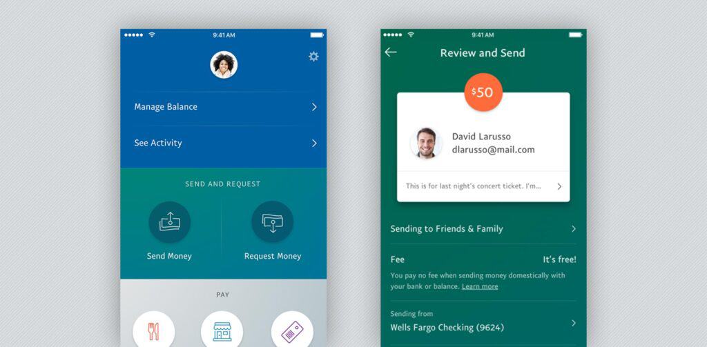
In a move that’s a first in the company’s history, PayPal has redesigned its mobile apps completely from scratch. The bold decision comes as PayPal seeks to satisfy various business goals.
The redesigned apps feature a more thorough framework on the back end, which will let PayPal continue to add improvements in the future. At the same time, the company has tweaked the apps’ user experience to ensure that customers can make simpler and more efficient peer-to-peer payments, store payments and food orders. In-app account management also gets a facelift.
[pullquote]25% of all PayPal transactions now take place on its mobile apps[/pullquote]
PayPal says that these design improvements come on the heels of listening to and implementing customer feedback over some time. It’s also consulted with thousands of its customer service reps to get a finer sense of specific problems that users of its apps normally encounter.
Unsurprisingly, the company also says that the surge in mobile played a big role in this redesign, as 25% of all PayPal transactions now take place on its mobile apps.
The apps’ user interface looks very different from the old version. In a sign that minimalism is still very influential in design today, the apps have modern and cleaner colors, layout, fonts and iconography. Interestingly, this makes the apps’ new iteration something you’d perhaps expect from a scrappy, Silicon Valley startup looking to compete with a bigger and more established brand like PayPal.
The home screen now features a blue section that conveniently displays a customer’s account balance while Activity Hub lets them quickly see all of their transactions including funding sources, if applicable. This was something that many users had been demanding for some time.
Send-and-receive-money call-to-action buttons are now a very stripped-down white-on-green, signalling the most minimal of contrast at work. On the bottom of the apps, other prominent features of PayPal are more visibly displayed, such as ordering food on the apps, paying in stores through the apps, and even access to store loyalty cards.
While the biggest changes definitely relate to the design, user interface and user experience, there are also subtler improvements in play. For instance, there’s a push to make the apps more appealing to a worldwide customer base. To do that, the mobile apps have a better platform that makes it a cinch to localize and customize the apps in the 145 markets across the world where it’s already available.
Going forward, plans for the apps are even more ambitious. The company wants to let consumers manage their money more expansively while on the go. Since lots of PayPal users already keep a balance in their accounts and apps, PayPal envisions eventually assisting them with basic money-management tasks like setting financial goals, budgeting and keeping tabs on their financial viability.
Consumers can look at this huge redesign as merely a part of the longer PayPal goal to eventually transition from a transaction brand to one that actively helps people manage their money more effectively.
The apps’ new versions are available now on iOS and Android.
