There’s a process that we go through at least once a month in the design community. It goes something like this:
- A company decides that it’s the right time to update their branding.
- A bunch of people write comments and articles about how it’s great, or it sucks.
- A bunch more people write about how that first bunch of people are all wrong.
- Another company decides that it’s time to update their branding.
Rinse and repeat. People seem to get quite worked up about it too. It doesn’t help that big companies love this sort of harmless controversy. If I put my tin-foil hat to my ear, I can hear the ocean, and Facebook executives sighing with relief, glad that we’re not bothering them about the way they messed up Instagram’s timeline.
Okay, but seriously, let’s talk about that new logo. It’s pretty. It has soft round corners, as you might expect. It’s colorful. Yay?
I personally find myself somewhat indifferent to the logo redesign, and pretty much all others. I have yet to encounter a redesigned logo that has actually changed my life, or indeed, my perception of a brand. That is usually defined by any direct experience I’ve had with the company. I’m much more interested to know whether they accomplished their primary goal for the redesign.
That is to say, what exactly did they want this redesign to achieve, and did it?
Was it to create the abstract form of a Polaroid-ish camera? If so, they did it, I guess. Though with cameras increasingly becoming split between phones and professional gear, that association will become less recognizable to all. (And this could be an issue in the future, perhaps prompting another redesign.)
Was it to adapt to the latest trends? I doubt it. As others have pointed out, Instagram stuck to the previous, skeuomorphic, iteration for years after everyone else went flat.
Was it to steal a gradient from Microsoft Office? Probably not. Convergence happens all the time in design, usually by accident.
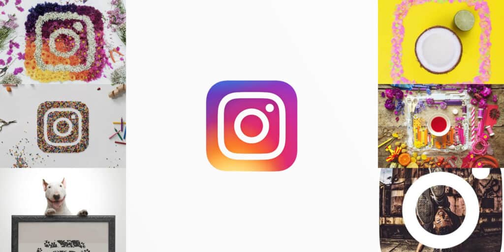
My theory, based on the way they’ve had Instagram users remixing their logo, and the way they tested it everywhere they could before launch, is that they just wanted a logo with greater flexibility. It’s a matter of practicality. Simple, abstract logos lend themselves more easily to animation, remixing, scaling, and usage in third-party UIs.
It’s probably as simple as that. If I’m right, then I think that they did a fantastic job redesigning the icon. The people complaining will get used to it, and the people who like it will keep being happy, I guess.
Take satisfaction in a job well done, Instagram people. Then fix the timeline.
