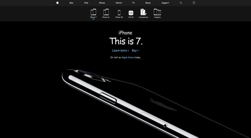
You’re a designer: you use Moleskine notebooks, the stickers on the back of your MacBook Pro are artfully arranged, there’s a motivational poster hung over your standing desk, and…you wear your hatred of Comic Sans like a badge of honor.
Forget the “no bad typeface” rule, Comic Sans offends your very being. The infuriatingly omnipresent font is used by everyone, from your grade school teacher, to your grandmother, and every time you see it, you die a little on the inside.
But do you really loath the world’s least-endorsed typeface? Or does seeing Vincent Connare’s magnum opus everywhere from gravestones to financial reports, give you a secret thrill?
Which of these pairs most offends your aesthetic senses, and is it Comic Sans?
[wp_quiz id=”89066″]
Spotted a hidden gem in there? Alongside Comic Sans, the typefaces used were (in order): Comic Relief, Jollygood Sans, Architect’s Daughter, Comic Neue, Komica Text, Cartoonist Hand, Jollygood Sans (again), Suplexmentary Comic, Comic Neue Bold, Comic Relief (again).
