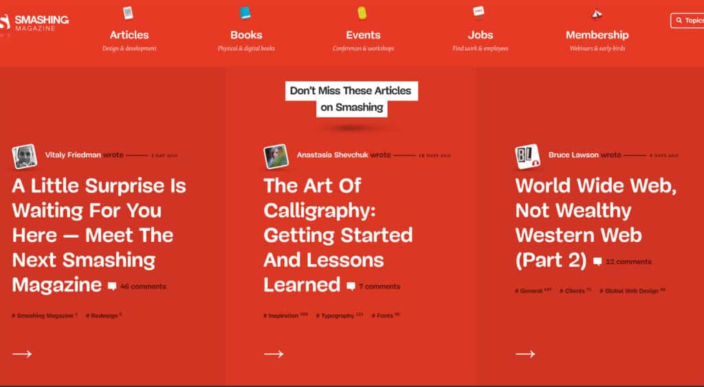
Smashing Magazine, long one of the most highly read publications on the internet about anything and everything web design, is imminently heading for a drastic site redesign. For many years, site visitors have been used to a certain look and feel to the site; certainly, it’s been part of the Smashing Magazine brand.
All that’s going to disappear, as soon as the next few weeks.
The changes are set to go live only in April or May, but you can get a sneak peak of the public open beta right now. As you can see, the changes are quite radical, and a little surprising for longtime readers of Smashing Magazine.
For one thing, the redesign features a lot of red above the fold on the new homepage—which definitely captures your attention, but is very different from the neutral, white color of the current homepage.
Along with the major change in color is also a change to the site’s content layout. Whereas the current site features a column design where new articles are simply “stacked” on top of each other, the redesign features card-based design in earnest. Articles are now going to be organized and sorted by cards, with three cards on each row of content.
Another marked change to the site is found in the typography. The site seems to be a big believer in “bigger is better,” as the fonts for headlines and the body are noticeable bigger, making them easier to read at a glance for users who enjoy skimming.
Overall, this site redesign is part of a broader strategy by Smashing Magazine to also debut a new print magazine along with a new Smashing Membership for its community.
The radical redesign is still in its beta phase, so expect possible bugs that hopefully won’t be around when the redesign officially goes live in the next few months.
