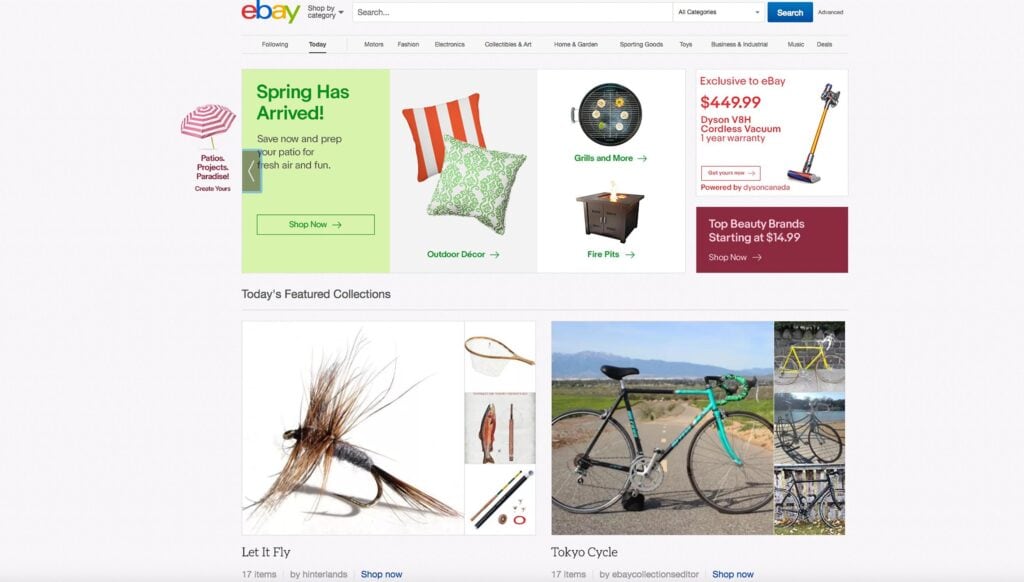
They say that three time’s the charm. Maybe for eBay, two is all that it will take when it comes to its homepage design.
In late 2013, the auction site last attempted a homepage redesign that wasn’t all that user-friendly. While the then-redesign was supposed to surface relevant goods based on the interests and browsing habits of each shopper, the end result actually forced the site visitor to do a fair bit of work instead.
This time around, four years later, the company is again trying another homepage redesign, one it hopes will be met with more approval.
The idea behind this attempt is a better user experience that simply enhances visitors’ user behavior of browsing and shopping like they’re used to doing.
Horizontal image carousels are a distinctive feature of this new look; they’re stacked on top of the other in a sort of card-based organization. The rows are sorted by products that users have recently looked at, products that have been included in a list of items shoppers are keeping track of, and both products and eBay shops that an eBay algorithm recommends to users.
The big difference between this second attempt at a redesign and the failed one from four years earlier is the absence of the requirement for users to either follow sellers or save products. Such a requirement is what contributed to the poorer UX of the last redesign attempt, even though it was a stab at increasing the personalization of the site.
Don’t think that eBay is shying away from personalization, however.
The newest personalization scheme involves an initiative that sorts eBay’s collection of goods by product type instead of any individual listing. The company is hoping that this change will fix the bad UX from the earlier attempt at personalization.
eBay’s big advantage over other e-commerce retailers like Amazon is that it also features rarer goods that you can’t find on any other site. Of course, if eBay’s new personalization design won’t allow visitors to quickly and easily find said rare goods without a hassle, then this big differentiator will be a moot point.
This redesign, though now limited to just the homepage, will eventually spread to the rest of the entire site, as eBay seems to be using the homepage redesign to test the waters, for now. It’ll be in the site’s best interest to have the redesign effective on all pages site-wide since the majority of eBay visitors don’t first land on the homepage. In fact, on Cyber Monday, only 17% of visits from American users started on eBay’s homepage.
Look for the redesign to engulf the entire eBay site sometime before the midway point of this year while the mobile version will see the redesign effective before the end of 2017.
