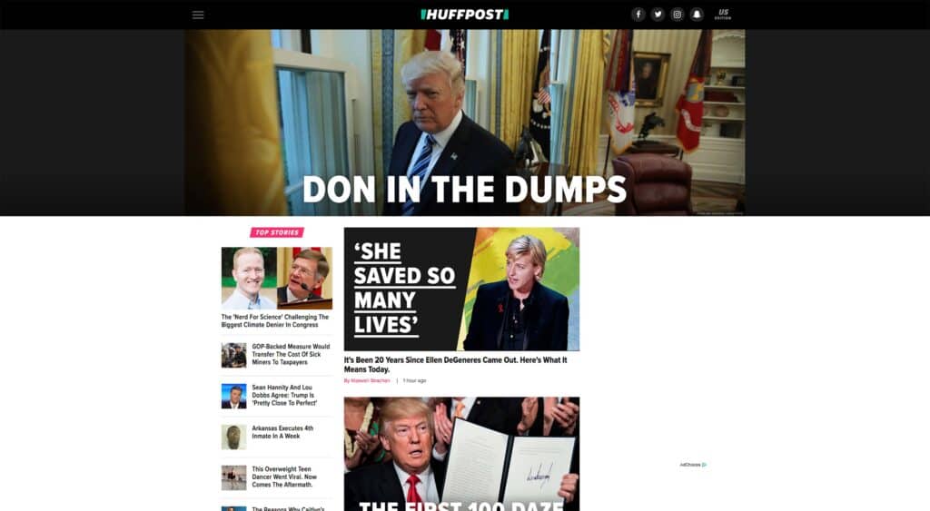
The Huffington Post, now officially referred to as “Huffpost” has a completely new site design to go with its name and logo change. It has added a fair splash of black to go along with the white and green. Gone are the classic heading styles as Proxima Nova takes their place in the headlines, and in the body text. They’re really only using one typeface for the whole thing.
If you’ll recall, Huffpost used to have a distinctively newspaper-style feel to it. This is because it launched back in the days when larger, more mainstream media outlets still held sway. You know, before they started freaking out about Youtubers. Back then, making your website look like a newspaper was almost the only way to get taken seriously.
Heck, the Drudge Report did it. And for some reason, the rather small hero image and red headlines of Huffpost’s old hero elements always reminded me of their competitor across the political aisle.
The Old Huffington Post
All of that is gone now, replaced by a design that, when I first saw it, made me think of tabloids first and foremost. Upon further reflection, it feels like a cross between the tech blog and tabloid aesthetic, but with a super serious color scheme. It’s an odd duck.
Let’s be clear: I don’t think it’s a bad design. I even kinda like it. But is it the right design, and is this the right time for it?
The New Huffpost
Reportedly it’s their attempt to appeal to a more working-class demographic, while they bank on their name brand to keep existing readers on board. Huffpost’s own post on the subject doesn’t do much to confirm or deny this theory.
I can’t help but recognize the influence of sites like Buzzfeed and Upworthy. I’d say that it’s more likely that Huffpost wants a piece of the “viral content” crowd. That crowd does include working-class people, but it includes pretty much every other class too. Most importantly, it includes a younger class of readers.
[pullquote]it’s more likely that Huffpost wants a piece of the “viral content” crowd[/pullquote]
However, they don’t want to go full tabloid to do it, as evidenced by the more serious, almost Silicon Valley tone of their UI. Now, is this going to work out for them? That’s the big question, isn’t it. The demographic they are targeting is just old enough to have read real newspapers, but young enough to wholeheartedly embrace new media. Moreover, they’re likely to have read the Huffington Post on and off for a while, and so have a vested interest in the brand. The general impression? That the new design feels “cheap” like the budget wasn’t there this time.
Knowing what we know about web design, they probably spent a lot more money on this redesign than people think. But this new design may make long-time readers worry about the future of the site. Meanwhile, readers who maybe never have touched a real newspaper themselves might feel right at home. It’s one of those instances where only time will tell.
