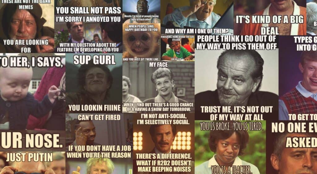
What is a meme? Now, maybe you’re a bit out of the loop. Maybe you have a job, a couple of kids, and not a lot of time to browse the Internet’s most ephemeral form of content. Maybe you’re single, but prefer outdoor hobbies, like hiking or friendship. But someone in a meeting just said that it would be cool if you started using memes on your company site, and you’ve gotta figure out how.
We’ve got your back. We’ve. Got. Tips.
But back to the original question: Memes are viral ideas and behaviors. They spread from person to person, bringing joy and irritation in equal measure. Memes performed offline (though documented online) include planking, the apparently mis-named “Harlem Shake”, and “dabbing” which is a word I’ve begun to use as an invective.
Online-only memes take a thousand different forms. But the most common, the “classic” online meme, is the image meme. Image memes have adopted a fairly standard format, with a recognizable image in the background, and large, white, bold text. These memes are used to tell jokes, commiserate and celebrate shared experiences, tell stories, and more.
Sharp-eyed readers will notice that this article is about using memes in your content, rather than in your site’s actual design. Unless your site is dedicated to memes, don’t use them in the actual design. It’ll make your site look dated inside of a month, if not at launch. Keep them in the content, if you’re going to use them at all. The only exception to this rule would be easter eggs. Finding an amusing meme where you didn’t expect one can be fun.
You know, if you’re into that. Which is my next point.
1. Know Your Audience
Look, not everyone is into memes, and of those who are, not everyone is into the same memes. While people in all age ranges can be found on meme sites, the usual demographic is millennials and younger. But the memes millennials will share (and can relate to) will be drastically different from those a teenager might share and relate to.
Then there’s the international issue. Meme culture varies from country to country, in my personal experience. The memes shared by my Canadian friends and American friends are usually fairly similar. Mexican memes are a whole different ballgame, while still sharing similarities in terms of the format. Basically, you’ll want to look into your target demographic, and see what they post online.
2. Know your memes
Okay, the thing you need to understand about memes is that people can get really attached to them, and take them very seriously. Some people go so far as to tell their most private stories and thoughts to thousands or millions of strangers in meme form, which makes using the right meme for the job all the more important for them. For example: there’s literally a pair of memes (Foul Bachelor Frog, and Foul Bachelorette Frog) that people use to tell stories of their grossest behavior when they’re at home alone.
If you use memes wrong on your site, you don’t just run the risk of looking a bit out of the loop. It can be interpreted as a sign of laziness, and even incompetence. If you can’t research a simple meme, how can you do anything else for them? Also, one or two memes out there that never had anything to do with politics before have become weirdly politicized lately, and you don’t want to accidentally use one of those.
Fortunately, research is easy. There’s a huge database of memes called Know Your Meme, which covers everything from the classics to the most esoteric niche memes out there.
3. It’s OK to use older memes
Don’t worry about always using the newest memes to communicate with the kids out there. I mean, stay away from older performance memes, like planking. Those are dead and buried. However, it’s generally regarded as acceptable to use older image memes, because they’re tied to specific ideas and shared experiences. This gives them a much longer shelf life.
Indeed, using the right older meme can actually hit people with a weird feeling of nostalgia. Nostalgia sells. Just ask Hollywood.
4. Don’t oversaturate your content with memes
Unless your website is dedicated to memes, you’ll probably want to limit the number of memes in each post, or on each page. Even on meme sites, few stories are told entirely through memes, unless the stories are very short. Anything that requires more detail is usually a few paragraphs of text, with memes acting as a form of visual title and subheadings.
Heck, I’m writing a whole article about memes, and I’m keeping the number rather low. They’re best used for emphasis.
5. Time your memes right
Using a meme at the wrong time can make people feel like you’re not taking them seriously. For example, let’s examine the right way, and the wrong way to use “Minor Mistake Marvin”. Here’s the right way:
See? A fairly minor mistake anyone could make. It would be fine to use this meme in your apology.
Now here we have the wrong way to use it:
If the company which made this mistake were to use this meme, or any other, people would rightfully be very, very annoyed with them. I could go on, but I think I’ve made my point, here.
Conclusion
With these tips in hand, using memes in your content should be simple enough. As long as you’ve done your research, the basic concepts and usage of memes are pretty simple things. The only real complexity comes from the shear amount of memes and sub-memes. Sub-memes is a word now.
Lastly: Avoid rage comics. Those were never funny.
