Welcome to our roundup of the best websites launched (or relaunched with significant updates) this August. The Summer’s almost over, vacations are less frequent, and we’re starting to see businesses gearing up for the Fall. This month we’ve included some great e-commerce, some design agencies with a difference, and some products with marketing challenges.
There’s a huge trend for bold color, subtle animations, and scrolling effects this month. And not before time, big type is making a comeback. Enjoy!
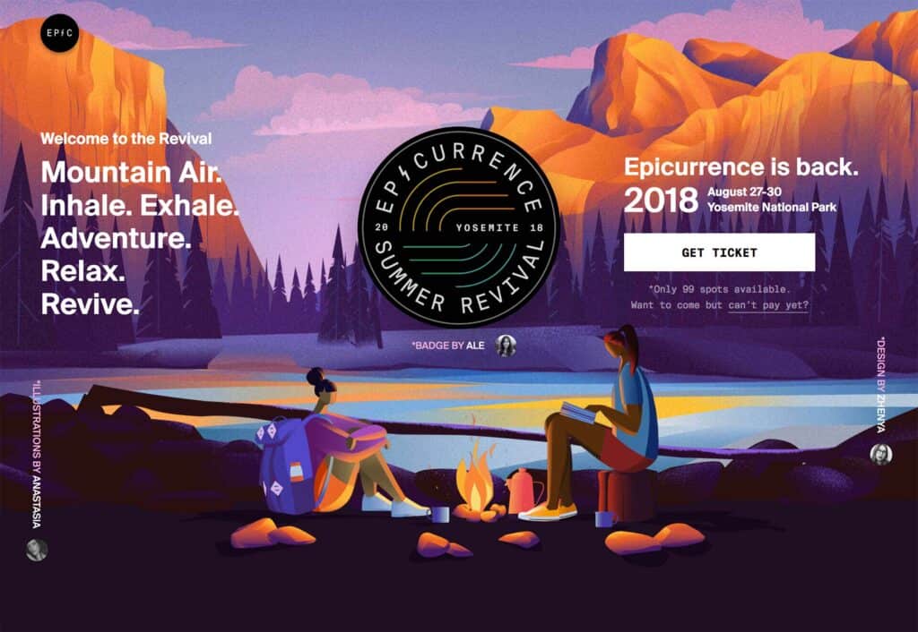
Epicurrence
The creative conference for creatives that don’t do conferences, Epicurrence 2018 takes place in Yosemite later this month. The accompanying site uses stunning illustrations and subtle parallax to draw the user into the spirit of the event.
Angelo Sanvito
Angelo Sanvito is an illustrator, UI and UX designer, and motion graphics designer from Milan, Italy. His simple site shows off the very best of these skills with a series of portraits of famous artists. When it comes to personal sites, it’s the epitome of “Don’t tell, show”.
Atomize Design System
The Site for the Atomize Design System is beautifully minimal. It of course follows its own best practices, but there are also some excellent details. Take a look at the custom icons for the different features all based on the branding. Detail like that takes time.
Lisa & Ryan
Picking a design agency to take your brand forward is a difficult task. Lisa & Ryan do a great job of explaining who they are, why they’re a great team, and why you should pick them.
Bellvoye
If you’re looking for a wee dram, then the Scottish Highlands is probably your first port of call. But if you’re looking for something a little different, then you might consider meandering south to France, thanks to this exquisite website for Bellvoye.
Swiss Typefaces
Swiss Typefaces is a type foundry with an audacious attitude to color. With so many type designs presented in black and white, it’s refreshing to see hot pinks, acid greens, and lots of magenta all thrown into a single design.
Eleven Plants for Dum Dums
Part design exercise, part typography sampler, part horticultural guide, Eleven Plants for Dum Dums is a beautifully designed single page site with awesome illustrations galore. You’ve rarely seen green so lovingly applied.
Posthaste
Do you remember the video arcade classic Paperboy? No, me neither (ahem). For those too young to have wasted hours on Atari’s worldwide smash, MailChimp have released this fun game. Steer Freddie through the streets delivering as much mail as you can.
Boy Smells
Purveyor of scented candles for men and women, Boy Smells have gone super bold with their type, and super committed with their restricted color palette. The result is a site that feels very modern, and very confident.
End Family Fire
Family fire is the unhappy occurrence of an accidental shooting as a result of an improperly stored firearm. The End Family Fire website leverages art direction and interaction to educate on the potential risks, so you can keep your family safe.
Appointed
Great work is helped by a great workspace, and of course by great design tools. Appointed’s site perfectly captures the spirit of the workspaces it is trying to create by exuding pure calm.
Goat
Goat are selling something difficult: second hand shoes. Professionally cleaned, and graded, they offer everything from rare sneakers to everyday kicks. To grab your attention, Goat uses intrigue right from the get-go, this is a great high-impact design.
Coralie Reiter
Coralie Reiter makes exquisite jewellery out of natural materials like shells. The delicate nature of the items being displayed is perfectly balanced by the use of pastels throughout the site to add life, and energy to the collection.
Art & History Museum
We’re used to hero images featuring smiling models peering out at us. Art & History Museum brilliantly subverts the cliché with a comical look from a stone figure. The rest of the site for the Brussels museum is just as carefully curated.
Renegade Craft
Renegade Craft is another site using bold typography, subtle (and not so subtle) animation, and bold color blocks. Promoting craft practices across the USA, the site’s a positive use of parallax.
Hawkins New York
Selling interior design products is difficult in a competitive market, but sites like Hawkins New York are finding a new design direction by merging classic minimalism and a new-found love of color to ply their wares.
Arche68
The color blocking and dynamic typography of Arche68 is almost an assault on the senses. It takes some clicking to discover the purpose of the site (they sell accessories) but the bold approach to design is right on-brand.
Curate Labs
There are lots of design ideas on the web, but rarely does a design agency lay its cards on the table to the extent that Curate Labs have. They tell you what they believe, because that’s at the heart of what they do.
Moving Brands
Moving Brands present their portfolio split across the screen using the unique geometry of their logo. With clients ranging from Apple to Sony, you’d be right to expect a creative approach, and they deliver.
Stack
Stack offers subscriptions to a diverse range of magazines for those who like their print media a little more random. As a source of design inspiration, not least thanks to its bold color palette, it’s fantastic to browse through.
