The purpose of almost every web design is to entice customers into buying your products, or subscribing to your services. However, your website can’t accomplish that goal without providing a superior user experience, which is largely defined by a great user flow.
User flow refers to a series of steps that will help your prospects interact with your website without any distractions or hindrances. Thus, it improves your conversion funnel and reduces the bounce rate. The better the user flow is, the higher the sales conversions will be.
However, designing a great user flow is easier said than done. It is a complicated process that involves creating and evaluating different stages. However, if you keep a few things in mind, you can enable a superior user flow quickly.
1. Know Thy Customers
When you build a user flow, the first thing you should think about is your customers. In-depth understanding of the target audience is fundamental to creating a well-defined user flow. If you know what solutions they expect from you, designing a suitable user flow is a lot easier. It will allow you to design a perspective similar to your users, resulting in higher conversions. This is why you need to create user personas as well as map out customer journey of your prospects.
Creating Buyer Personas
You can think of user personas as a set of characteristics that define the majority of your potential users. These are not fictional guesses. Naturally, creating buyer personas involves a lot of qualitative and quantitative research. You need to study and recognize behavior patterns, goals, skills, attitudes, and background information about your customers.
[pullquote]Collect as much information about your users as possible[/pullquote]
Collect as much information about your users as possible. Make sure your user persona focuses on the present. You must know how the users are interacting with your product right now, and not speculate on how they will do so in the future.
You should also tie every characteristic of your buyer persona to real data. You can create more than one persona. In such a case, however, you will need to prioritize them as the primary (most relevant) and secondary personas. You will also need to design different user flows for each persona.
Mapping User Journeys
The next critical aspect of knowing your customers is mapping their journey. A user journey is a timeline of user actions that will show you different touch points between the customers and your website. It allows you to understand how users interact with your site and what you can do to improve this engagement. For example, you may be able to find that removing or realigning a particular stage from the journey can improve your conversions.
It usually consists of personas, timelines, touch points, and engagement channels. Detailed customer personas will allow you to identify the trigger points or problems of your consumers. The timeline determines how long the journey will take, while touch points are the stages where users will interact or take specific actions such as registering for your email list.
Engagement channels are nothing but various ways to interact with your customers such as sending promotional emails, text messaging or online chatting. However, a customer journey map will largely depend on your market niche and customer personas.
Identify the Entry Points
In addition to the user personas and buyer journey, you also need to know the various entry points. Entry points are the way your potential customers reach your website. Usually, they will get to your site through one of the following entry points.
- Directly typing the web address of your site.
- Through social media sites such as Facebook and Instagram. They will click on the links provided in your promotional content to reach your site.
- Through organic search (or pay-per-click ads if you are running a PPC campaign) by typing the search queries in search engines such as Google or Bing.
- Through advertisements and referrals on other websites, online forums, and blogging sites.
- Via email links sent in your promotional emails or monthly newsletters.
Knowing these entry points is crucial because they will affect your user flow. For example, a user coming to your site by clicking a link in a promotional email is likely to be a recurring customer. This user is more interested in availing a specific offer mentioned in the email rather than exploring your site.
On the other hand, someone coming through organic search or social media promotion is more likely to be a first-time visitor. So, they will browse your site for a while and try to find out more about your business before taking any action. They will have a longer user flow with several micro-interactions compared to a returning customer.
2. Avoid Overwhelming Users with Too Much Content
In their attempt to engage users, UX designers often end up creating user flows that are overflowing with content. Unfortunately, this creates the opposite effect. Overwhelming content or features are more likely to distract or frustrate users, resulting in increased bounce rate.
Scrape off Excess Content
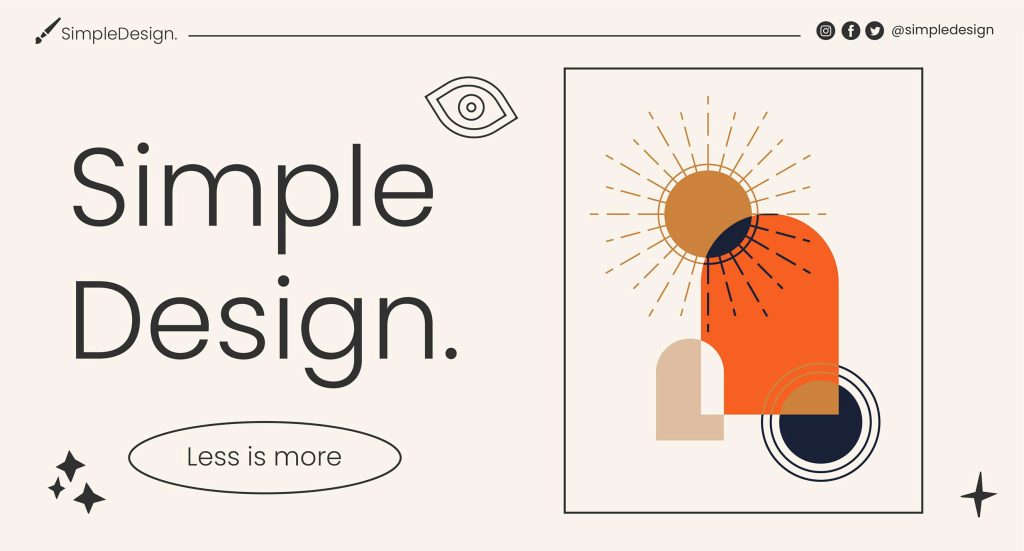
Whether it is excessive content or UI elements, you need to minimize as many visual distractions as possible. They are not only unnecessary, but also unattractive. So, make sure to remove all the excessive content, graphics, animations, flashy text, and flickering logos. In other words, you need to embrace simplicity.
If possible, go for a minimalist design. Most static and service-oriented websites can use a minimalist approach to design simple, yet remarkably attractive user flows for their websites. Create site layouts with only the essential elements. Use a balanced mix of images, text and other features that compliment your user flow.
Shorten the Number of Features and Options
A minimalist design also works for various features or options on your website. You need to minimize the features or choices on your site. Too many choices can lead to decision paralysis. Always make sure to provide clear-cut choices that will lead to a specific action.
The easiest way to make that happen is to create the right Calls-To-Action (CTAs) and place them suitably on your site. For example, if the primary goal is to increase your email list, your CTA should focus on asking your prospects to share their email ID with you. You can tempt them with a discount coupon for their next purchase or entice them with a monthly newsletter.
3. Create and Test Your Prototypes
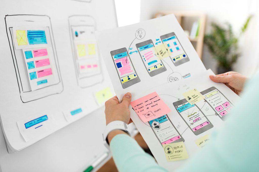
Once you have a firm outline for the user flow, it is time to create different prototypes and test them. A prototype is the tangible variant of your site’s user flow. It will allow you to troubleshoot potential issues before the actual design is built, saving time and money.
Test Your Prototype with Real Users
It is always better to test your user flow prototype with real users. You can use a small group of your target audience (that matches your buyer persona) for testing. Create as many prototypes as you need. Ask this group to check out your prototype and find out what actions they take. Encourage them to provide honest feedback.
[pullquote]It is always better to test your user flow prototype with real users[/pullquote]
Once you have their feedback, try to address the bottlenecks and areas of frustration using A/B testing. You can provide more than one alternative to fix a specific issue. A/B testing will help you choose the best possible solution with certainty.
Of course, getting real customers involved in prototype testing is expensive. However, consider this as an investment in building a website with high sales conversions. Alternatively, you can also hire a UX expert to find out potential issues with your existing user flow. It will be less expensive, but may not be as comprehensive as testing with real customers.
Keep Optimizing
Creating a user flow is an ongoing process. Consumers will use new entry points, your competitors will incorporate better user flow elements, and the web will also keep evolving. You will also need to keep optimizing your user flow regularly to stay relevant to these changes.
You can ask your user the following questions:
- What do they love about your site? Is there something unique that encourages them to keep coming back?
- Which is the most attractive feature of your site and why?
- Which part of the site do they find unattractive?
- What else would they recommend your website should have?
- Finally, how will they rate their user experience (or shopping experience)?
Take this feedback into account when updating your user flow. For example, you can try to change the unattractive elements on your site based on the customer feedback and see if the changes can improve your sales.
Parting Words
User flow and user experience are closely interlinked. If you improve user flow, user experience is also elevated. But, before you set out to design the user flow, make sure to go through these three points. They will help you to prepare for a major user flow overhaul of your website. Once you know what needs to be built, nothing can stop you from attracting your prospects.
Featured image via Unsplash.


