Welcome to our roundup of the best new sites to be launched (or relaunched with significant updates) in the last four weeks.
After last month’s flirtation with monochrome, this month’s set of sites return to the overriding trend of 2019: color. Huge images are still popular, and parallax is still finding its way into our scrolling experiences. Enjoy!
Middle Fork Rapid Transit
Middle Fork Rapid Transit is an adventure vacation company that transports you over 100 miles down the Middle Fork river in Idaho. Its site packs in as much as one of its trips, and there’s tons of little details to get you fired up; I love the animated raft, and the grub looks amazing.
To Taste
To Taste is my favorite recipe site of the moment. Packed with food ideas for every occasion and palette, the simple site is laid out perfectly for browsing, and choosing something to make is a culinary treat. What really makes it, as with all food sites, is the mouth-watering photography.
The Face
Style bible The Face returned from oblivion this month, with a new team behind the iconic publication. Its site opens as daringly as you’d expect, before slowing to a more traditional, and more usable blog format.
Kia ProCeed
The site for the new Kia ProCeed is precisely the type of site we used to build back in the day. With interactive video, a unique navigation system based on established design patterns, and carefully designed usability, it’s an enticing experience.
Hiraeth
Co-founded by Rooney Mara, Hiraeth is a fashion label that produces desirable clothes free from any animal product. Its elegant site exudes quality with generous white space, and an almost Scandinavian minimalism, matching the garments perfectly.
Future of Sustainability
According to some estimates, we have just 12 years until we face not just climate change, but climate breakdown. Future of Sustainability wants to inspire you to change the 2020s, before it’s too late. It communicates a complex, and difficult message engagingly.
Nicholas Jackson
Nicholas Jackson is a New York based designer and art director. His portfolio site is a bold, confident expression of the work he loves to do for clients including Canon, The Wall Street Journal, The NY times, and Siemens.
Mansi
Mansi makes some of the best pasta this side of Naples, and it has an equally delicious website. Dotted throughout the site are pasta shapes, some of them animated, making Mansi’s site the most appropriate exponent of the blob trend I’ve seen to date.
Azab
Azab is an architecture firm with a love of mouse trails. Despite most designers abandoning them more than a decade ago, Azab’s site is built entirely around the path of your mouse on the screen. It’s surprisingly compelling.
Corpus
Corpus is an all-natural, all-vegan company producing deodorants that don’t harm you, or the planet. Its site intriguingly turns a standard e-commerce layout on its head, by presenting products up front, and the traditional hero video, down below.
Calidad Beer
Calidad Beer is a Mexican-style beer, brewed in California. With Levis-worthy art direction, and brand appropriate animation, its site is ideal for an unknown company trying to tap into a saturated market. Constantly reinforced, the brand identity is key here.
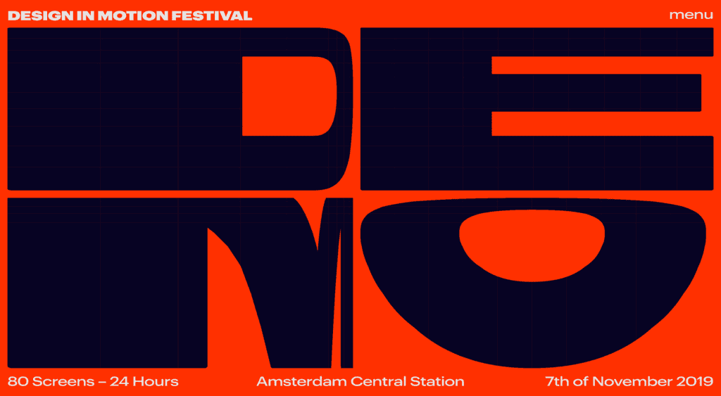
DEMO
The Design in Motion Festival, or DEMO for short, takes place in Amsterdam in November, when 80 screens in the central train station will showcase the best motion design work. The site itself features beautiful interactive lettering that Saul Bass would be proud of.
Camille Pawlak
The online portfolio of Camille Pawlak is based around a beautiful central animation that rotates as it transforms into the next project. It’s a simple, but elegant way to navigate between projects, and the work that she’s showcasing is excellent too.
Green Chameleon
Green Chameleon’s site is only temporary, with a full website redesign on the horizon. But with a portfolio like this, packed with parallax effects, and dead simple navigation, I think the Bristol agency should stick with what it’s got.
Flwr
Flwr is a New Zealand based florist with a modern approach. Its site uses text to mask its beautiful photography, creating an intriguing and inviting mini-site. It even embraces the split-screen trend to great effect.
Daly
Daly is a PR agency founded by Alex Daly, from her contacts built helping some of the world’s most successful crowdfund campaigns reach their targets. Its site is bold, colorful, and fun. The period after its name isn’t new, but I love the way it follows you down the page as you scroll.
Pacto Navio
When the finest Cuban rum is introduced to French wine making traditions, you get Pacto Navio. The rum, distilled near Havana, is served by a beautifully art directed site, featuring brand illustrations, and a distinctly Caribbean feeling.
Cheval Blanc
The French have a reputation for refined hospitality, and that trend is reflected in their love of sophisticated web sites. The site for Cheval Blanc is no exception, with a just-right level of parallax scrolling and refined typography.
Staat
Staat is a design agency specializing in event design for some of the world’s best known names. Its site features video case studies of its work, and the site itself takes a step backwards and allows the portfolio to shine.
Festa da Francofonia 2019
The 2019 festival for Francophones, is a festival celebrating the 220 million people worldwide who speak the French language. Celebrated from Morocco to Canada, the event’s site is a colorful, international feeling affair, appropriate for a multi-cultural event.
