The old saying “a picture is worth a thousand words” is still relevant to today’s experiences. People are attracted to visuals faster than text, and this natural property of photos and illustrations make them very useful for visual design.
In modern user interfaces, both photos and illustrations became functional elements along with text and interactive elements. Illustrations are a versatile way to create a unique design. From hand drawn hero-style illustrations, to small icons, everything about a sketched image feels like art. In this article, I would like to review some of the functions of illustration from the perspective of modern UI design.
How Illustrations Help Improve User Experience
Similar to other visual elements, illustration can be a powerful communication tool. Well-crafted illustrations have following benefits:
- Can attract user’s attention and deliver the most critical information in easy-to-understand visual format.
- Can add clarity to a complex idea. There is no need to use any words if you can provide this information using visuals.
- Can engage users. Beautiful illustration not only attracts user attention, but it also makes users interested in a product itself.
- Can play with users’ imagination. It’s possible to merge reality and imagination by using illustration.
6 Ways Illustration Improves UX
There are a lot of cases where illustrations can improve user experience of a product. Here are 6 of them:
1. Deliver The Main Point Faster
As said before, illustrations have an excellent potential for explanation and clarification. In the context of websites and mobile apps, there are a dozen ways of using illustrations improve UX right from the first screens. For example, it’s possible to make the onboarding process more engaging by using illustrations on tutorial screens. This approach has the additional benefit for mobile apps of helping to avoid too much text on screen.
Image credits: Divan Raj
Using illustrations, it’s possible to show the difference between product plans.
Illustrations demonstrate the difference between service plans. Image credits: Dribbble
Last but not least, when user encounter a problem, illustrations can be used to add a little sense of humor to humanize the problem.
Error page in Flights by Google. Image credits: Dribbble
2. Create a More Memorable Experience
As users, we use a lot of products on a regular basis, but only a few of them create a truly memorable experience.
As designers, if we want to create a memorable experience, we need to learn how human brains work. Barbara Fredrickson and Daniel Kahneman proposed a psychological heuristic called peak-end rule which dictates the way our brain works with information. The peak-end rule states that people judge an experience largely based on how they felt at its peak (i.e., its most intense point) and at its end, rather than based on the total sum or average of every moment of the experience. The effect occurs regardless of whether the experience is pleasant or unpleasant.
In other words, when we remember experiences, we tend to recall not entire experience but only key events that happened. A pleasant illustration is an opportunity to become such key event and increase brand awareness.
Using mascots in a user interface is a popular way to apply illustration techniques in design to create a more memorable experience. Branding elements such as mascots become the elements of identity and inter-connector between the user and the product.
Silverback, an app for Mac that makes Guerrilla usability testing easy, uses an illustrated gorilla as a mascot.
3. Create an Illusion of Direct Communication With User
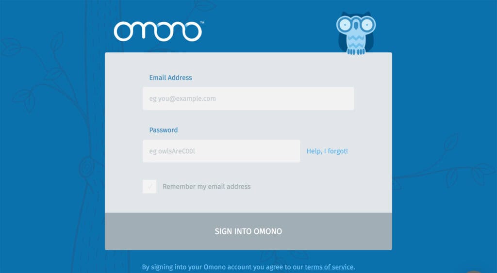
Each user interaction with a product is a journey. Behind each journey is a goal the user wants to accomplish by using the product. For some experiences, it’s possible to convert a journey into a story in which the user will be a character, and the goal will be a final destination. Illustrations can act as a proxy between user and app by engaging users in the experience.
One good example is Omono. The app uses an owl to guide users through the interface and reinforce the user-friendly nature of the application.
Illustrations can make the user feel confident in their tasks and inspired to continue the journey.
4. Reinforce Existing Stylistic Concept
Illustrations can be applied in a user interface to provide visual support of the general stylistic concept of the app or website. Along with other branding elements, such as logos, fonts, color schemes, illustrations have a significant impact on product’s style. When illustration is created according to the style, it provides more natural and harmonic feeling of the product (and brand in general). But for that to happen illustrations should feel consistent, like they came from the same source even if they were created by different people.
Image credits: Zurb Foundation
5. Live up the process of interaction
When we think about our apps and websites, we rarely think of them as static pages linked together. The concept of interactions requires us to add animated effects and transitions to make the experience look and feel more natural. Same as any other parts of a design, illustration can be enriched with animation. Illustrations combined with animation can deliver not only a truly memorable experience, but they can also make the experience more dynamic.
For example, Readme.io, a service that provides beautiful documentation to the world, makes users smile each time they enter the password. People love such little touches because they make the experience more human.
6. Add Elements of Gamification into UX
Gamification is a popular technique used by product designers to increase user engagement. A designer can consider using illustration in the interface when the user should be rewarded for some achievement.
