When I was a kid I was desperate for a Polaroid camera: to be able to take a photo and see it—almost—right away was fantastic to me. With ‘normal’ cameras, you had to wait until you finished the whole film, then you had to take it to get developed, and that could take a week. So, quite often, by the time you got to see your photos, the connection to them was a little more distant. With polaroids, it was there and then. Not only that, the format of the classic polaroid included the white frame with the space at the bottom where you could write something: the date, where it was, who you were with, what you were doing—whatever you wanted to say about the picture or the moment.
[pullquote]the classic polaroid included the white frame with the space at the bottom where you could write something…Sound familiar?[/pullquote]
Sound familiar? So much of social media takes it’s visual cue from the classic polaroid—80 years old this year. The influence can be seen in Facebook posts, Instagram, Twitter, and, of course, Pinterest. This in turn has had a knock on effect on website design generally. It is an interface style that users have become comfortable with through social media. It is based on a grid, but the items, or cards, are compartmentalized in such a way that they feel like separate entities. (Rather like a bunch of polaroids pinned on a wall.)
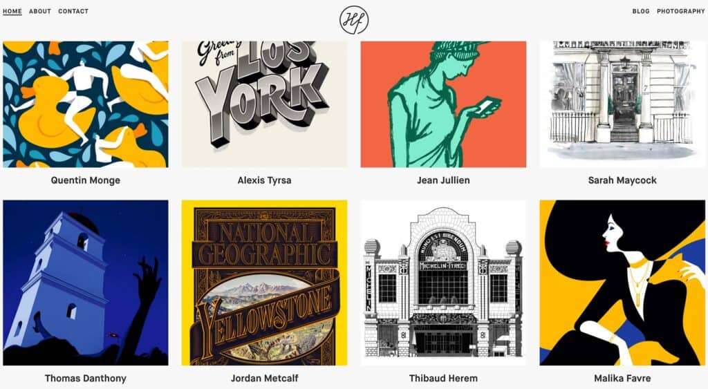
Card layout is an integral part of material design. The separation is often achieved by using shadows, which gives the illusion of depth, or a slight color difference. It is a popular choice for news websites, magazine sites and blogs, all of which are presenting the user with ‘snapshots’ of stories that they may then choose to click on to read more. It is also popular for portfolios as it allows a lot of different content to be presented simultaneously, but clearly.
As this card layout style has become more popular it has evolved as designers play around with it, finding ways to create card layouts that feel fresh and interesting. Some use asymmetry to great effect, some put lots of space between cards, others put none at all. Most card layouts use images, but there are a few that just use text, at least on some of the ‘cards’. Some have the image and text visible on the ‘front’, others display their text only on interaction.
What is great to see is this functional, practical layout style being adapted and shaped by different creative approaches, so that it does not become stale.
