7 Top Plugins For WordPress (2025 updated)
Designers understand the importance of pushing boundaries while keeping user experience at the forefront. Yet, not every creative idea is easy to implement through a theme alone—or even with solid…

We are always looking for ways to improve our skills and services and what we create. Sometimes that desire to improve is a conscious one. Most of the time it’s in the back of our minds, yet active. Short term results can be OK, but good long term results are what you want if you […]
We are always looking for ways to improve our skills and services and what we create. Sometimes that desire to improve is a conscious one. Most of the time it’s in the back of our minds, yet active.
Short term results can be OK, but good long term results are what you want if you are to grow in your profession. In terms of web design, that means subscribing to, and adhering to, design trends that have staying power.
You might have to stray from your comfort zone a bit to ensure your website users are engaged and allowed to remain in theirs.
And “What’s in it for me?” you might ask?
It’s not about you – but you’ll do just fine.
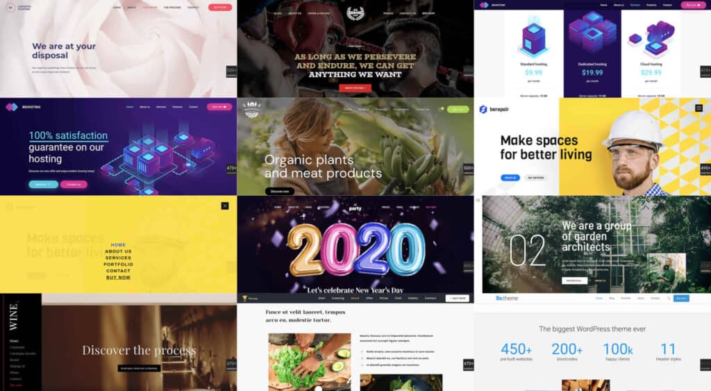
Browse BeTheme’s collection of 500+ pre-built websites to see what we’re talking about. These professionally-crafted design aids have precisely what we’re talking about – staying power.
Web designers didn’t so much lead the way into minimalist nav design approaches as were pushed into it because of mobile design requirements. One result is that websites viewed on desktops have over time become much easier to navigate.
It’s something like trying to shorten sentences when writing, where you find you can convey as much information in fewer words and even do it better.
In the case of mobile navigation, it’s a matter of working with fewer links and less allowable space. Designers addressed the issue by limiting the number of pages in the primary menu and relegating links to sidebars or footers.
The result? An equally effective but much cleaner design.
BeRepair is an excellent example. This pre-built website tucked its nav menu neatly away beneath the hamburger menu icon.
Open the pop-out menu and you’ll see a good example of the increasingly popular less-is-more design trend with the easy-to-navigate links in a sea of white space.
BeGarden’s non-traditional navigation also benefits from the minimalist approach it utilizes in its left-aligned menu.
Brevity rules here. It’s all about doing more with less.
This even applies to videos; as illustrated at the bottom of this BeWine pre-built website.
The BeWeddingPlanner site demonstrates the power simple imagery can have in telling your brand’s story.
This example also shows how extremely effective a bare minimum of text can be.
Avoid a “reader board” website design approach. Give your site a personality.
Adding warmth to your site is almost always effective. BeEcoFood’s lively header coveys a warm, personal message.
BeCatering also does a good job of adding a human touch. Doesn’t it appear as if the food is being prepared just for you?
The point here is that not all font styles are 100% browser or device friendly. You need to test them or stick with sans-serif fonts like Arial and Tahoma, or a serif font like Times New Roman. There are others of course, so you should consider doing a little research.
Make it a point to pick a web-safe font so you can devote your creativity to other tasks. BeParty’s animation for example.
Or, an attention-getting design like you see on BeTheme’s website page with its minimal text, generous white space, and appealing and informative imagery.
The dark mode trend is relatively new. It’s also very popular. So much so that it’s easy to see why it definitely has staying power.
It’s easy on user’s eyes; a good thing since it appears to these same users will be spending even more time looking at their screens and not less.
Although darker websites tend to be popular, good design dictates it is accomplished in the proper contexts. As is the case with this powerful BeBoxing hero image.
In this BeHosting example note how the dark mode trend can be used to make a site’s key messages dramatically stand out in a delightfully pleasing way.
The nice thing about the 5 trends discussed in this article is that you won’t be wasting time and energy in investing in any of them as none show any signs of becoming a passing fad.
When traffic and/or conversions start to drop off it may be because a design trend has stopped working for you; in which case it’s time to try something else.
That should never be a problem if you stay focused on those design trends that aren’t going away any time soon. That will always be the case whenever you select one of BeTheme’s 500+ pre-built websites for the foundation for your web design.
[– This is a sponsored post on behalf of BeTheme –]