Happy New Year! If the website design trends we are already seeing are any indication, 2025 is going to be a great year for visual communication. This month’s collection of trends features a resurgence of shapes, text as a background element, and lovely high-drama imagery.
Here’s what’s trending in design this month:
1. Circles
The circle is a great shape with a lot of flexibility for design purposes. It also helps to create a vibe of harmony and consistency that other shapes don’t convey in exactly the same way.
Add on the soft, smooth edges of a circle, and you get something that contrasts with the medium – a hard-edged browser window – that instantly sets this shape up to attract eyeballs.
This shape is versatile as well, giving you plenty of ways to use it without looking like what everyone else is doing. Each of the examples here takes a different direction, providing some unexpected inspiration.
Yzavoku leads with a group of small images that grow as an animated circle. You can click into any of the projects to see the portfolio site. What’s neat about this design is that it is not the standard portfolio with rows of photos. The circle makes you think a little differently and with the small size images, it encourages those click interactions.
Te Whare Taonga uses circles – and hidden circles – to create an interactive “Easter egg” in this design. (Make sure to click through to this design and interact with the circles!) Circles here help get you interested in the content and are used below the scroll as click and interactive elements. Because of the high interactivity on the homepage, the design primes you to engage with circles later on.
Landways takes a totally different approach and uses circles an element to help you determine where to look next on the screen. The circles serve as navigational elements throughout the site, directing the user experience in a rather seamless way. In the animated version of the Landways logo in the footer, circles fill some of the letterforms. The hamburger icon is also contained in a circle, creating a great overall feeling with a consistent circle theme.


2. Background Text Elements
While this might not be the most accessible – or easy to read – website design trend, it does look pretty cool. Background text elements are bold and can help emphasize other design elements in a full-screen aesthetic.
While every one of these designs is different, there seems to be a common theme. Often, when there is a background text element, there’s a paired animation that contributes to the final design.
Agency Eats has a set of scrolling text elements behind a fun photo. The text works because even without reading it, you know the context for the words, thanks to the smaller text below.
Dao For Design uses a similar technique with an image over the text, but instead of animated text the entire screen switches between three different image and color combos. Secondary text provides just enough context to pull it all together.
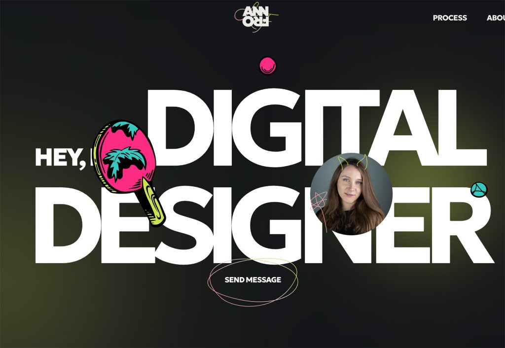
Ann Frol’s portfolio site is super simple with a few elements on top of the text. Animated balls pop around the screen to keep your interest. (They also provide a glimpse into her personality.) Whimsical illustrations sit on top of oversized text elements throughout the design for a nice, consistent design theme.


3. Dramatic Photo and Video
If you want something with high visual impact, this is the website design trend for you. Using dramatic photos or videos in the hero header will draw immediate attention and ensure visibility for your design.
This website design trend takes some planning and vision so that you can get exactly the shots you want to showcase your product or service with a lot of impact. If you want to try this website design trend in 2025, it’s probably time to start talking with your creative team to plan when and where to get just the right shots.
And More does this with a still image that has a lot of depth and drama. With a pair of hikers scaling a mountain, you can feel their emotion here. A large text element adds extra emphasis to this dramatic image.
Cinco Jotas uses drama in an unexpected way. The moody video reel is for a meat product. The high-drama video makes this product look especially high-end.
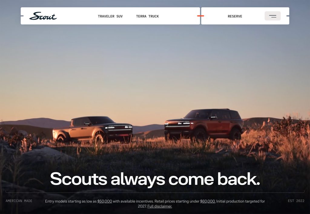
Scout also uses a lot of video to showcase its trucks. The lead video shows a sunrise over the vehicles. (Sunrise and sunset imagery can be some of the most dramatic around, thanks to amazing lighting.) The video continues into the vehicles driving through some unexpected terrain, contributing to the dramatic effect.


Conclusion
While all of these trends are highly usable, the use of dramatic photo and video might just be the best for creating an immediate impact. Even if you don’t have a super dramatic image, applying some filters can do the trick.
Have fun with this month’s website design trends, and keep designing!
