It’s that time of the month, everybody. We recently wrote an article regarding Elon Musk’s strange decision to alter the ‘X’ logo. Now, he’s done it again. I can’t even feign surprise anymore.
So, what’s the massive change this week? What major overhaul is Twitter’s overlord going to bless us with today? Hold on to your hats.
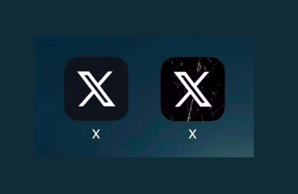
Distress marks. Distressed white lines covering the black background, to be precise.
That’s right. It’s the ‘X’ logo – but edgy. The icon was unveiled on iOS and Android today.
If your first thought is that this new logo more closely resembles the icon of a knockoff app than that of the world’s largest social media site, you’d have a lot of supporters backing you up.
Multiple users have already taken to X to poke fun at the new style. Most agree the app is a perfect representation of Elon Musk’s trademark edginess. We’ll let you decide whether that’s a good thing.
Musk’s justifications for his abrupt design changes are becoming similarly vague. In response to the update, he revealed that the “cracks & scratches better represent this product that I love”.
Perhaps this is Musk’s acknowledgment that ‘X’ is a scuffed product. The distress marks may represent the gradual damage he is inflicting on one of the world’s biggest social networking sites.
Wishful thinking? Probably. Without unprecedented access to Musk’s mercurial mind, we can offer little but guesswork.
Robert Reeve
Robert is an experienced marketing professional with extensive experience working with brands to refine go-to-market plans, SEO campaigns, and content marketing strategies. A committed writer with a keen eye on the latest developments, Robert specialises in producing content across all things tech and marketing.
Read Next
The 10 Best Logos of 2023 – Ranked
We’ve witnessed a plethora of exciting logo designs in 2023. Some have been absolutely awful (we’ll miss you, Twitter). Others have been incredible and a much-needed breath of fresh air…
Everything You Need to Know About Image Formats In 2024
With the world around us becoming increasingly visual, it’s essential that the modern-day designer has a firm grasp on file formats. From PSDs and PDFs to BMPs and SVGs, every…
Weekly Design News #2
7 Important Visual Hierarchy Design Principles 2023 This article discusses the most important visual hierarchy design principles that new designers need to follow if they want their app interfaces or…
Weekly Design News #1
Every Sunday we’re rounding up the best of the previous week’s stories from webdesignernews.com, and in this issue #1, we picked typography trends, creating a parallax slider with Anime.js, and…
Elon Musk calls LinkedIn ‘Cringe’—Announces Competitor
It seems we can’t go for one week without talking about Elon Musk, but the news simply writes itself. In a recent post, The Tesla, SpaceX, and xAI owner announced…
WhatsApp’s New UI Redesign—Here’s What You Need to Know
WhatsApp has been millions of Americans’ go-to messaging service for over a decade now. And it’s showing no sign of slowing down. The social media giant has been continually adding…