Every month we put together this roundup of the best new fonts we’ve found online in the previous four weeks. Enjoy!
Publish Serif
The Publish family consists of Publish Gothic, Public Sans, and Publish Serif. It was originally designed for the short-lived Danish newspaper “Dagen” and is now available publicly. It’s a versatile set of fonts with a range of weights, making it ideal for editorial work.
Octavia
Tida Tep designed Octavia as part of her degree project at Type@Cooper in New York. Inspired by 1940s and 1950s film noir titles and end credits, it is highly legible at small sizes and works brilliantly in dark mode. The regular weight is available now, and fifteen further styles, from hairline to black, will be available soon.
Ipar
Ipar is an experimental typeface with zero contrast, not even optical corrections, intended to create a clean and modern look. Styled after Austrian street and city signs, it’s a very usable typeface for UI design, and it has a series of stylistic alternatives that are useful for logo design.
Sena Nespora Brush
Sena Nespora Brush is a bold all-caps display font with a charming wavy outline that looks like you’re viewing the text through water. It’s a perfect choice for logos related to all things aquatic.
Matcha
Matcha is a beautiful retro stencil font with swooping organic shapes and open counters. It’s an excellent choice for editorial or branding work in the lifestyle sector.
At King
At King is a slightly rebellious old-style serif. It features sharp serifs and rounded terminals, giving it a vintage feel suitable for branding or headlines. The lowercase f is particularly characterful. It’s available in seven weights and has a variable font version.
Decagram
Decagram is a neo-grotesque font that draws its influence from the international style, with a hint of 90s-era aesthetics. It has a wide skeleton, and a generous x-height, making it readable and relaxed. It’s a very robust choice for almost any application. There are ten weights, plus italics and a variable font.
Jokker
Jokker is a geometric sans serif that eschews the trend for humanist leanings in constructed typefaces. The forms are circular, straight, or diagonal, and it has short ascenders and descenders to make headings feel compact. Look carefully, and you’ll see subtle smiles hidden amongst the forms.
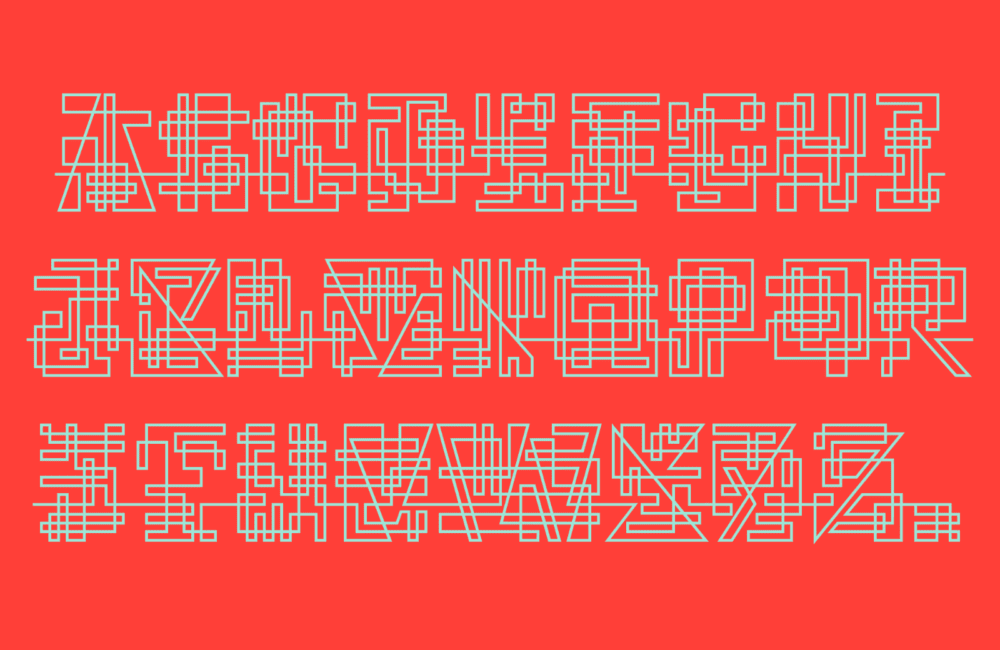
WEG
WEG is an experimental type system that doesn’t care if you can read it or not. The letters are made from a single stroke that connects words, and the legibility increases as the thickness decreases. It’s a nice starting point for logo design or just for playing with, to understand how letters are formed.
Manisans
Manisans is a sans serif with high contrast between the vertical and horizontal or diagonal strokes. The contrast gives it a particularly offbeat look, and it’s a great choice for branding or display type.
Runholdy
Runholdy is a narrow, all-caps serif just a short hop from Blackletter. The flared serifs create a very precise look, and some beautiful alternate characters are included that lend the type a medieval aesthetic.
Spezia
Spezia is a sans-serif typeface designed to be contemporary and visually balanced. It features a modern spirit and a neo-grotesque structure, which together create a sense of simplicity. The typeface is available in standard and variable versions, with a range of weights and widths.
Gretha
Gretha is a modern serif with high contrast, pointed serifs, plus tons of ligatures and alternatives. It’s a good option for branding or display use when you can be selective about the glyphs you use.
Invertida
Invertida is a decorative slab serif that uses reverse contrast to evoke the style of the Old West. There’s a stencil version available that’s a nice companion. It’s a great choice for editorial work or even branding that needs to feel vintage but only use it at display sizes.
Mozaic
Mozaic is a family of geometric sans serifs that complement and support each other. It’s a workhorse set ideal for corporate branding, with extensive coverage of Latin-based languages, plenty of alternates, and specialist characters like fractions and tubular and old-style numerals.
