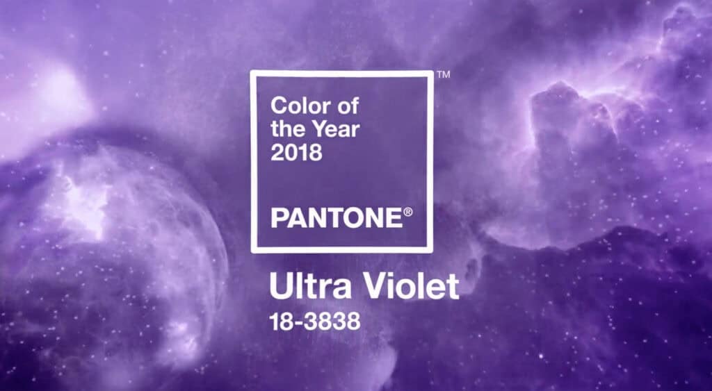
Pantone have unveiled their official color of 2018, Ultra Violet (Pantone 18-3838 to be precise.)
Pantone have been nominating a color of the year since 2000, and it’s often seen as a barometer for the prevailing cultural mood—although with designers jumping on the annual selection as an easy option for an on-trend palette, it has frequently been a self-fulfilling prophecy.
Violet is not, as commonly perceived, a shade of purple but rather a hue in its own right. Technically ultra violet is similar to infrared in that it can’t normally be detected by the human eye. So Pantone’s Ultra Violet is named more for marketing purposes than scientific accuracy.
Whether Pantone’s Ultra Violet will be representative of 2018 remains to be seen. 2016’s dual-choice of Rose Quartz & Serenity should probably have been replaced with funereal black; 2017’s Greenery (which symbolized a fresh reconnection with nature) was laughingly misjudged, and should probably have been replaced by an angry red. If we take Pantone’s color of the year as an aspiration, rather than a prediction, then it makes a lot more sense.
Pantone’s color institute selected Ultra Violet for 2018, in part to reflect the complexity of the world we’re living in:
[Ultra Violet] is a very provocative shade, but it’s also a thoughtful color…this is the kind of color attached, historically, to originality, ingenuity, and visionary thinking…It’s intriguing, fascinating, and magical
—Lee Eisenman, executive director of the Pantone Color Institute
Perhaps the most telling thing about Pantone’s color for 2018 is that it’s a color often confused with another, and is named after a point on the spectrum we can’t actually see.
