Facebook is a stupid name for a social media site. Facebook: a book of faces; a directory of the cool kids; an elitist tome to which most of us, with our thick-rimmed glasses, obscure music taste and high school hangups will never be invited. Facebook is possibly the least socially inclusive domain name ever thought up.
A much better name for a socially inclusive site is Myspace. Myspace: an area devoted to me; a site that lays out a welcome mat and invites you in; a place I control; a place I am safe, free from trolls and able to be myself; home.
It’s a mystery then that Facebook has a gagillion users and Myspace has about four. (More accurate estimates are 955 million users for Facebook and 25 million for Myspace.) Even Google+ out performs Myspace about seven times over.
The reason, at least in the eyes of Myspace is its design and in an attempt to reignite its flagging fortunes Myspace is undergoing a(nother) redesign.
It’s not a strategy that has worked in the past, Myspace has already redesigned several times and failed to revive its market share.
The current Myspace site.
So why is Myspace still with us? The reason is two-fold: firstly it is heavily music-centered and the music industry—run by middle-aged men with bad hair and high waist-bands— isn’t too good at keeping pace with technology; secondly Myspace does something by accident, it acts more like a wiki-page than an account profile.
Having identified those strengths, Myspace’s latest redesign looks like being a triumph. And it’s something we should all be excited about: this is a huge presence in the industry, staking its future not on clever advertising; not on pushing a few unwanted features; not on buying a cool app studio; but on best-practice web design.
The Myspace redesign focuses on the site’s purpose, it provides flexible ways to connect users and most importantly, it does it all with well-structured information design.
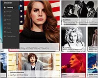
A preview of the new Myspace.
If the current Myspace is a dated fixed-width relic of what we thought was a good site design ten years ago, then the new layouts make the old Myspace look like…well…Facebook.
The interface is light, modern and looks like it’s probably designed to be easily skinnable. It is similar in feel to sites like Tumblr and Pinterest. Co-owner Tim Vanderhook described the new site as “a social network for the creative community to connect to their fans”.
A preview of the new Myspace.
We will of course have to wait for the relaunch to see if the Myspace delivers on the promo-video’s promises, but at first glance it appears to be a very large step in advancing how we interact with a social network.
Myspace may have found its niche at last.
You can view the full preview video yourself at new.myspace.com/play and if you’re excited about the new Myspace you can register your interest for an invite here: https://new.myspace.com/
Do you use Myspace? Do you think Myspace has a future, or has its time past? Let is know your views in the comments below.
