The world is a strange place at the moment, but design moves on apace, and sites are still being launched.
Every month we post a roundup of the freshest sites we’ve come across in the previous four weeks. This month we’ve included some exciting portfolio sites, a strong selection of health and beauty sites, and some fabulous new takes on technology. Enjoy!
Lynn Fisher
We love the homepage illustration on Lynn Fisher’s website. It’s pretty cool right? Now try resizing your browser window and see what happens. Hats off to her, it’s not often we find such a knowing, humorous, responsive site.
Sonantic
We’ve seen a few sites in the last few months that have tried to present sound visually. Sonantic does a great job of doing exactly that, with an awesome animated logo, gradients, and random texture.
Zand Harirchi Architects
Based in Tehran, Iran, Zand Harirchi is a modern architecture firm with a confidently modern website to match. We can’t get enough of its thumbnails, which as well as piquing interest, are reminiscent of small windows.
Amino Mason
If you’re designing for a health & beauty product, the obvious route is clean and minimal. Amino Mason has gone the other route, producing a site that screams energy. It’s the epitome of modern Japanese design.
Cone
How many sites have you seen for apps that feature a small demo of the app inside a hastily debranded iPhone window? Now look at how expansive, and how filled with potential Cone feels precisely because it isn’t confined.
Queen Garnet
There are two things that make Queen Garnet stand out in its market. The first thing is the excellent brand typography that is completely different to the usual choice of sans-serif. The second thing is the beautiful product photography.
Mike John Otto
Mike John Otto is a designer, creative director, and artist. His portfolio leans towards high-end sound clients, which helps to explain the hypnotic wave form that fluctuates behind the content of this beautifully designed site.
Ester
We love the hand-drawn quality of the illustrations and animations on Ester’s site. The color scheme feels modern and suitably unisex, and we like the way its portfolio is presented in a straightforward, no-nonsense manner.
Goodfish
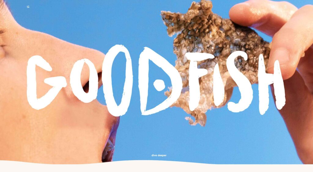
Crispy fish skins don’t leap to mind when we’re planning which chips to buy, but that’s what Goodfish is selling. The lettering, artwork, and copy are all enough to make us at least try it. Who knows, perhaps the taste matches the health benefits.
Limnia
Limnia is a making a name for itself in fashion circles for its modular jewellery. Its site does a great job of showcasing its product range with fullscreen video, and we love the way the content is divided up with a strong grid to mimic the product’s modularity.
Outer Reach
Stretching is so important for our physical, and mental health, but so many of us get it wrong, or don’t bother at all. Outer Reach is aiming to change that, and we love the way its hero video rotates through perspectives, as if we were already stretching.
Forward
Forward Journal is an online magazine dedicated to creativity. Unlike most blogs out there, it publishes rarely, and in editions, giving it the feel of a traditional print magazine and heightening the sense of occasion by limiting availability.
Minervo
There’s a distinctly latin feel to the Minervo website from Ecuador. The hot pinks and the sun-blasted desaturation of the color scheme feels suitably South American. We love the cropping on the custom typeface.
Helo
If there’s one thing we hate more than coding for IE, it’s coding for email. Helo is an email testing and debugging tool. Its site is an excellent example of how to do responsive design right.
Midi Fighter
Midi Fighter make a range of physical inputs for DJs and musicians who need reliable, and fun equipment for performing. The colorful site uses subtle illustration to expertly add dynamism to otherwise static product shots.
Future London Academy
There’s a long-standing, and highly respected tradition in this blog series that anyone who makes good use of yellow gets in. Future London Academy certainly does that, but what we really love here is the depth created by the typography.
Abbotsford Convent
Abbotsford Convent is a creative arts venue in Melbourne, Australia, situated in a former convent building. To honor the heritage the shapes employed in the UI blend creative motion, with architectural forms.
Lucky Beard
Lucky Beard has a surprisingly restrained color palette considering its penchant for bold statements. It’s hard to go wrong with animated geometry, and we really like the fact that the navigation has been relocated to the right.
USSR Design Almanac
The Soviet Union was, for a brief period — before Stalin denounced modernism as decadent — the world’s first design super-power. The USSR Design Almanac is a fascinating overview of this extraordinary, and often overlooked history.
East Fork
Okay we admit it, when we first came across East Fork’s website we thought it was about chocolate. Look closer and you’ll see these guys offer some really high-class home products, not least their unique pottery.


