January 2020 is picking up where 2019 left off, with lots of animation and even more bold, bright color schemes. We’re also seeing an unusual number of luxury sites this month, and as always there’s a strong set of startups trying to break into the market. Enjoy!
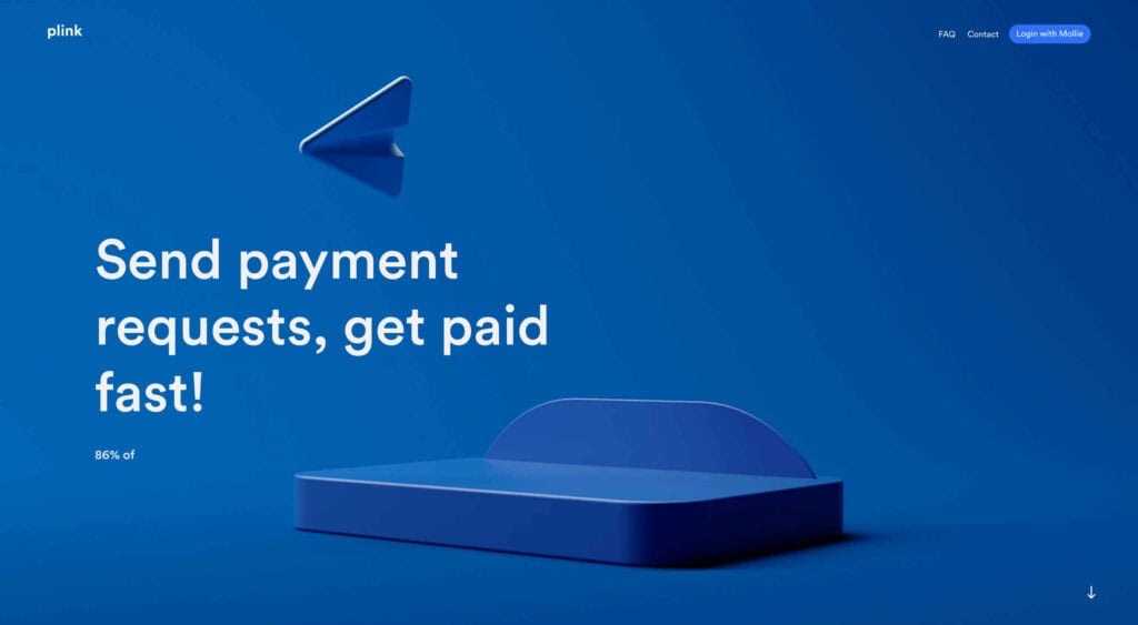
Plink
To take on giants like PayPal, you need a compelling brand and a simple message, that can also wow with its first impression. Plink hits the nail on the head with its 3D animation.
Madame Turfu
Are you wondering what 2020 will hold for you? Why wait to find out when Madame Turfu can predict the future with this wonderfully fun set of digital tarot cards.
Nathan Taylor
What’s not to love about Nathan Taylor’s playful site? There’s so much to explore and do, but our favorite part is the different lighting modes.
Meatable
Selling Meatable is a tough prospect; it’s real meat, grown in a lab instead of taken by animal slaughter. The simple step-by-step site does a great job of explaining.
Sussex Royal
Whatever your view of Harry and Megan, there’s little doubt that their website oozes class. For a promotional site that isn’t actually selling anything, it’s a strong presence.
Emotive Feels
This fantastic manifesto from design agency Emotive Brand illustrates an A–Z of potential brand emotions with simple animations that would grace the cover of a Bluenote release.
UNREAL
Swiss design agency UNREAL’s site is a wonderfully chaotic love affair with web animation. It’s the type of site we can click around for hours, enjoying the sharp transitions.
Kate Jackling
Sometimes the best design takes a step back and allows its subject to bask in all the attention. Kate Jackling’s site does this, letting her gorgeous photography take center stage.
Helias
Helias has fully embraced the blob trend with a flood-filled area of color supporting each of its various products. It’s appropriate, engaging, and breaks up the formal grid well.
Klokki
Sometimes the hardest sites to design, are the ones for products about which there’s very little to say. Klokki is one such product, but its site is bold, confident, and persuasive.
Jonnie Hallman
Jonnie Hallman’s simple résumé site benefits greatly from the household names he’s worked for. We really like the details, like the way the monogram changes color as you scroll.
eaast
eaast is a design and development partnership from Paris that’s fully embraced the Memphis style. Their simple site proves you don’t need years’ worth of work to sell yourself.
Pantheone Audio
Proving that elegant scrolling is still very much a thing in 2020, Pantheone Audio uses the scroll to seamlessly navigate a luxurious site with a complex grid underpinning it.
Leaf
After decades of the best a man can get, the half of the species that shaves daily seems to be obsessed with reinventing the process. Leaf taps into that simple marketing approach.
Mociun
Most sites that sell jewelry miss the spirit of the pieces by focusing on the financial value. Mocuin gets it right with an on-trend color palette and stunning product photography.
Jon Way
Jon Way’s portfolio features work from over a decade of art direction. There’s a clear, consistent aesthetic thanks to a lovely ‘static’ effect that plays across the whole site.
Kota Yamaji
There’s some amazing work in Kato Yamaji’s portfolio, but what really strikes home is the amount of color he manages to squeeze in.
Robb Owen
We’ve seen lots of animated vector avatars over the last couple of years, but rarely do we see one with as much personality as Robb Owen’s. The cursor tracking makes it feel real.
Glasgow International Festival 2020
The Glasgow International Festival takes place between 24th April and 10th May 2020. Its site features some distinctly celtic typography, and tons of bold color.
Megababe
Megababe is taking on the beauty industry with a range of body products that are insanely popular, and as positive as its super-confident sales site.
